Sliver is a display face inspired by plants and modern serif forms. The goal for the project, was to combine a modern serif font with graceful curves.
a display face inspired by plants and modern serif forms
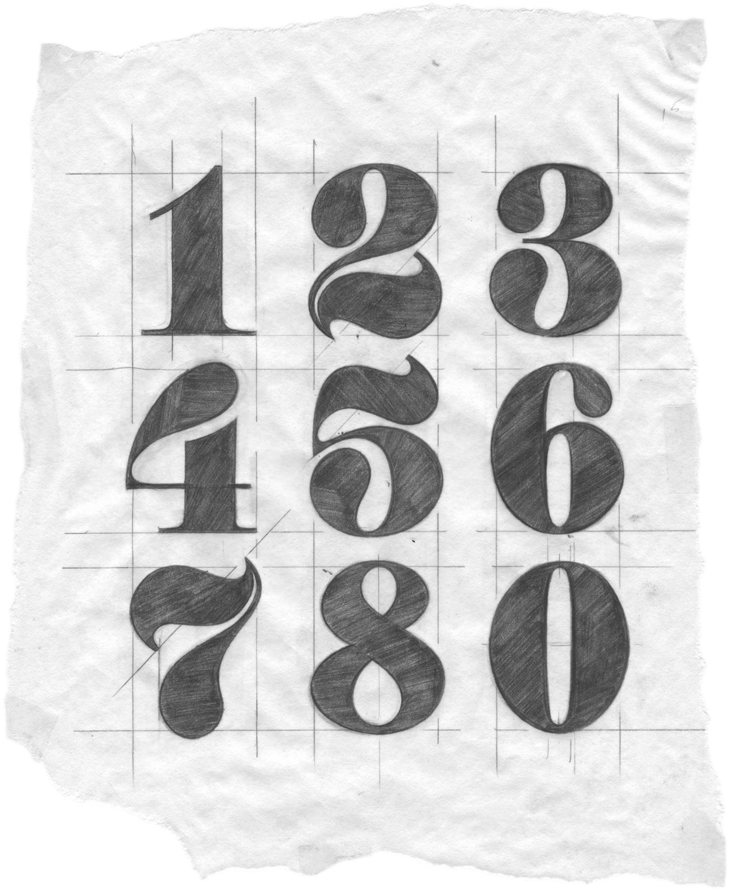
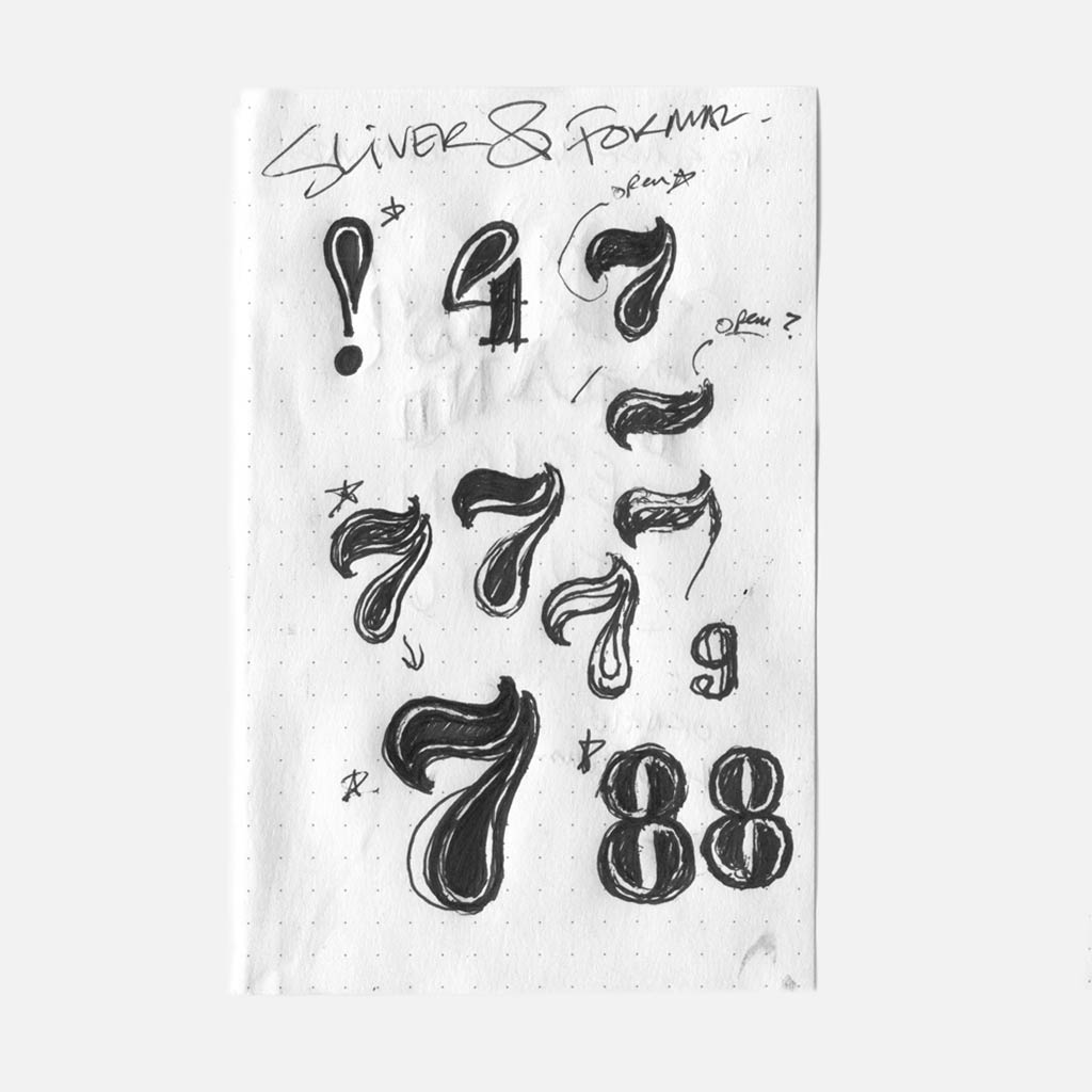
Sliver began as a set of bold numerals, inspired by modern serif forms. The goal for the project, was to combine a modern serif font with graceful curves. This was a challenge because the style is dominated by straight lines.
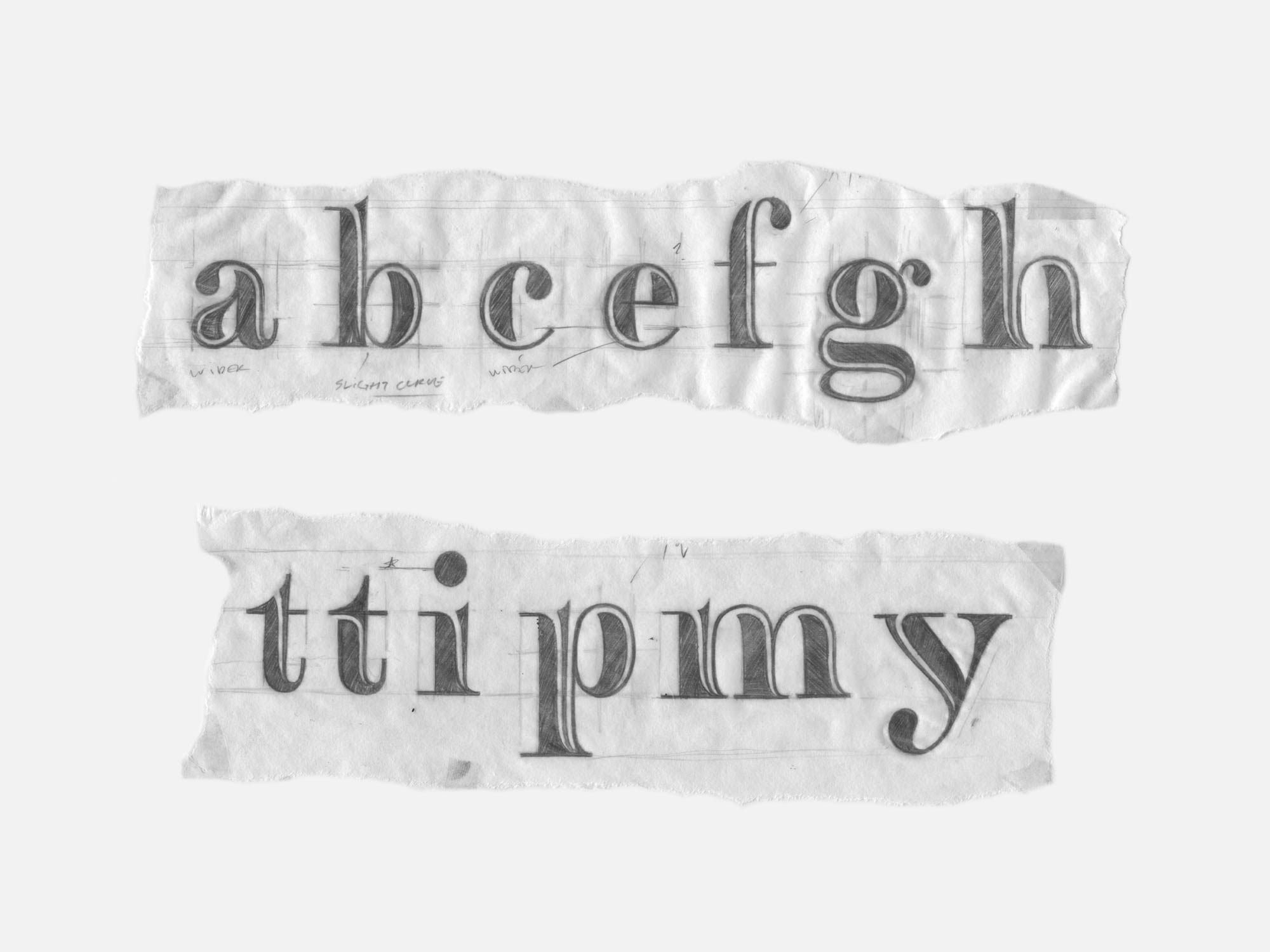
Part 1. Rough Sketches
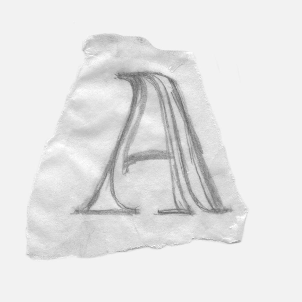
Ultimately, curves that cut through the form’s interior was the most natural solution. This allowed for the straight forms to incorporate curves without the need to significantly distort exterior lines.
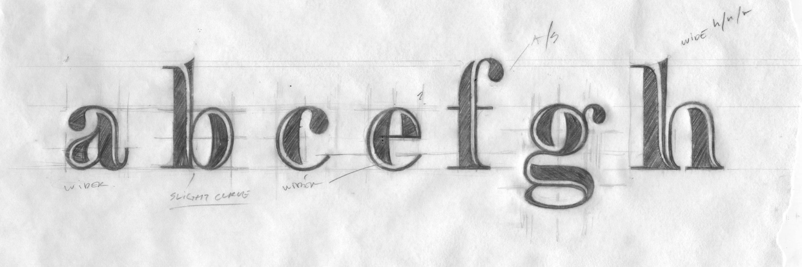
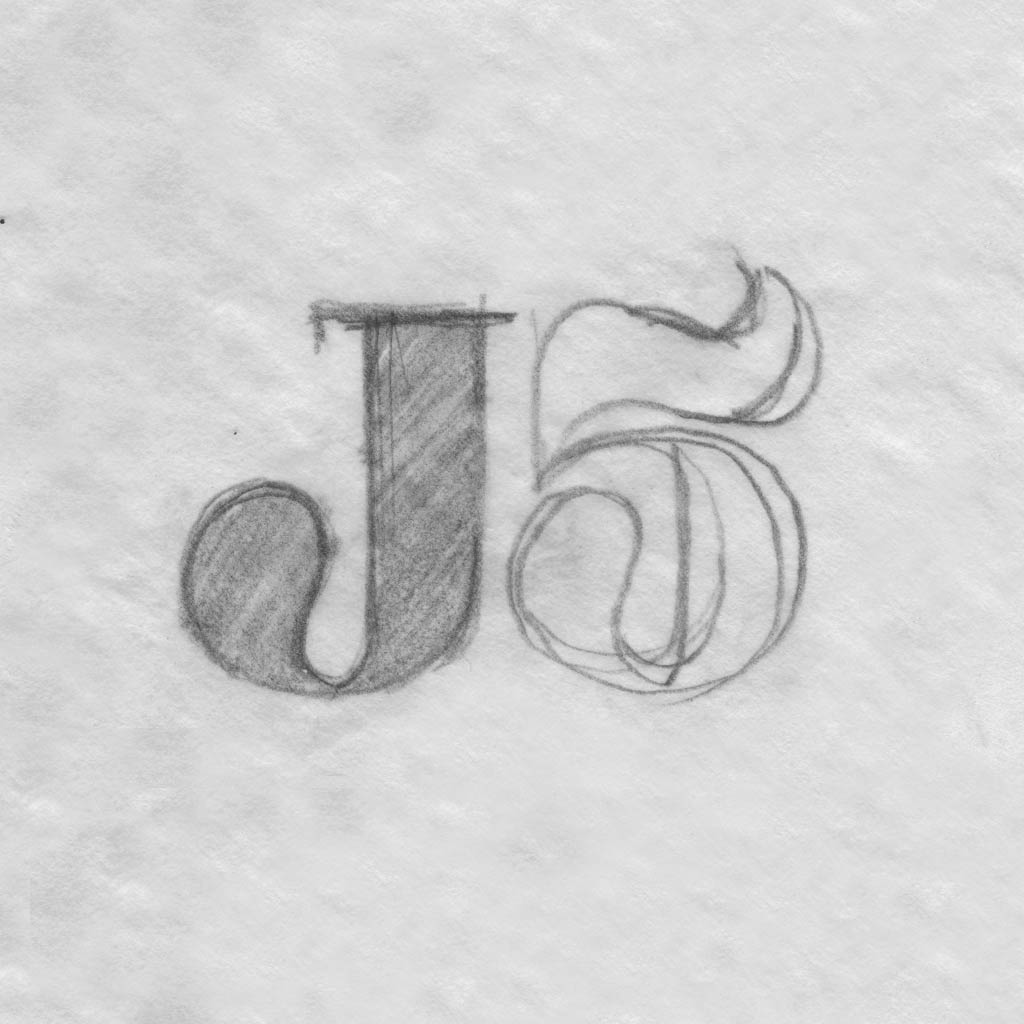
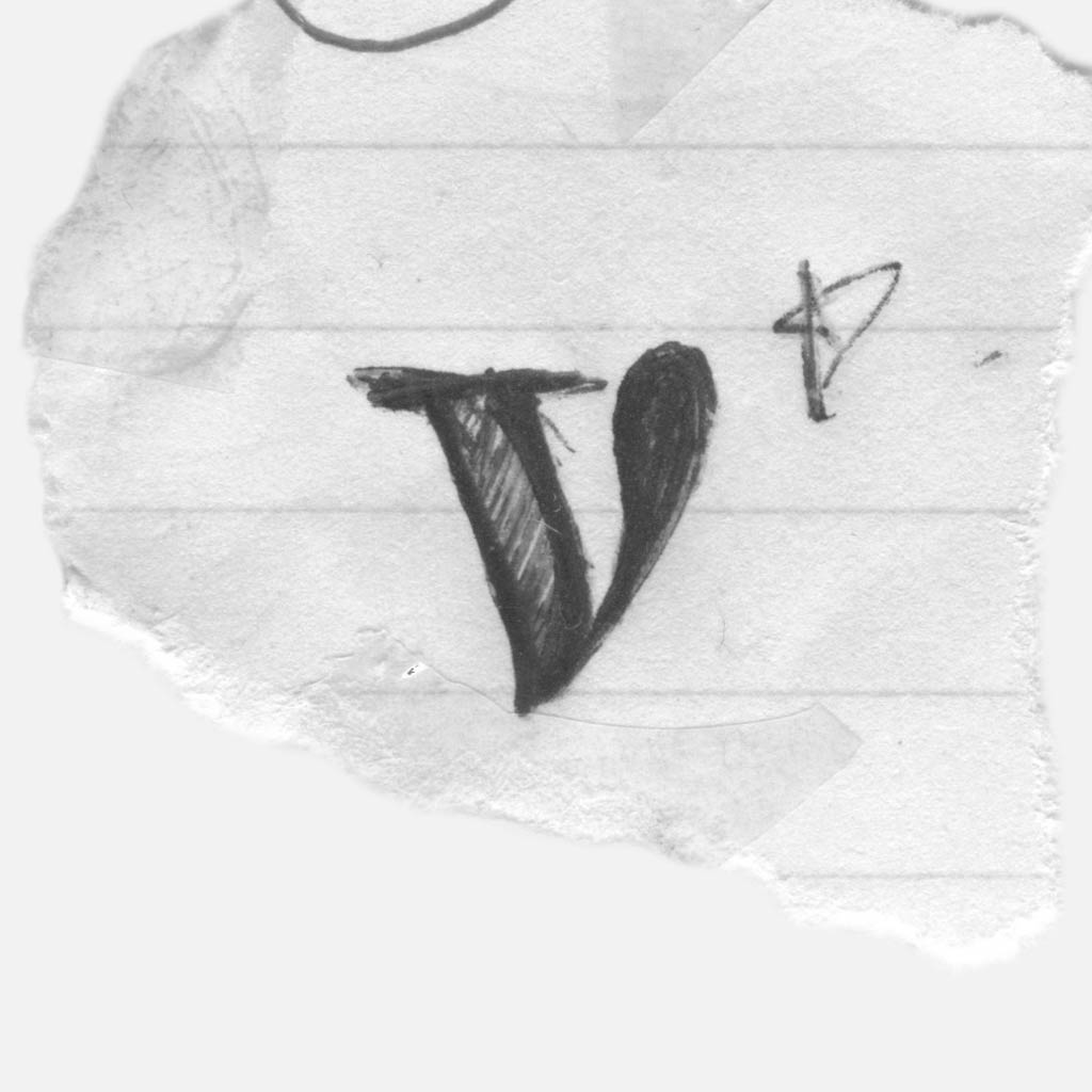
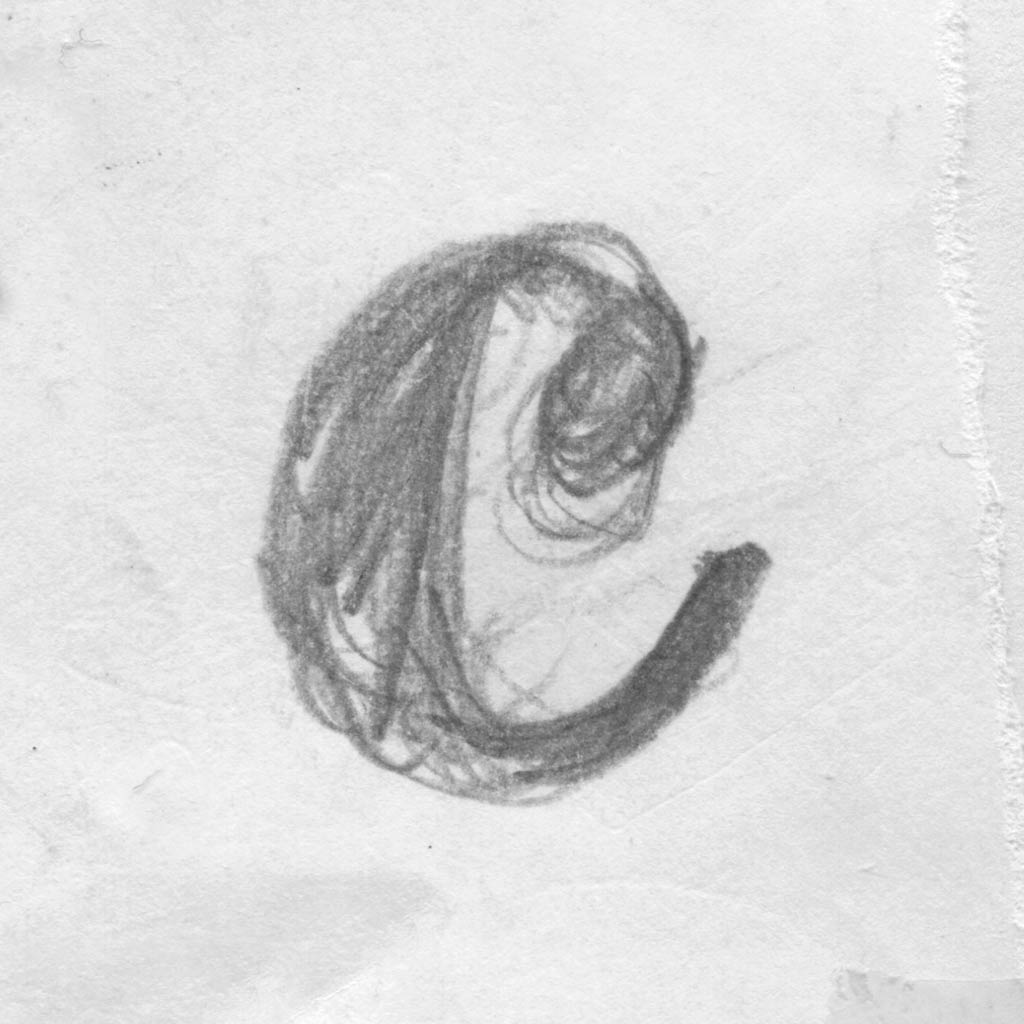
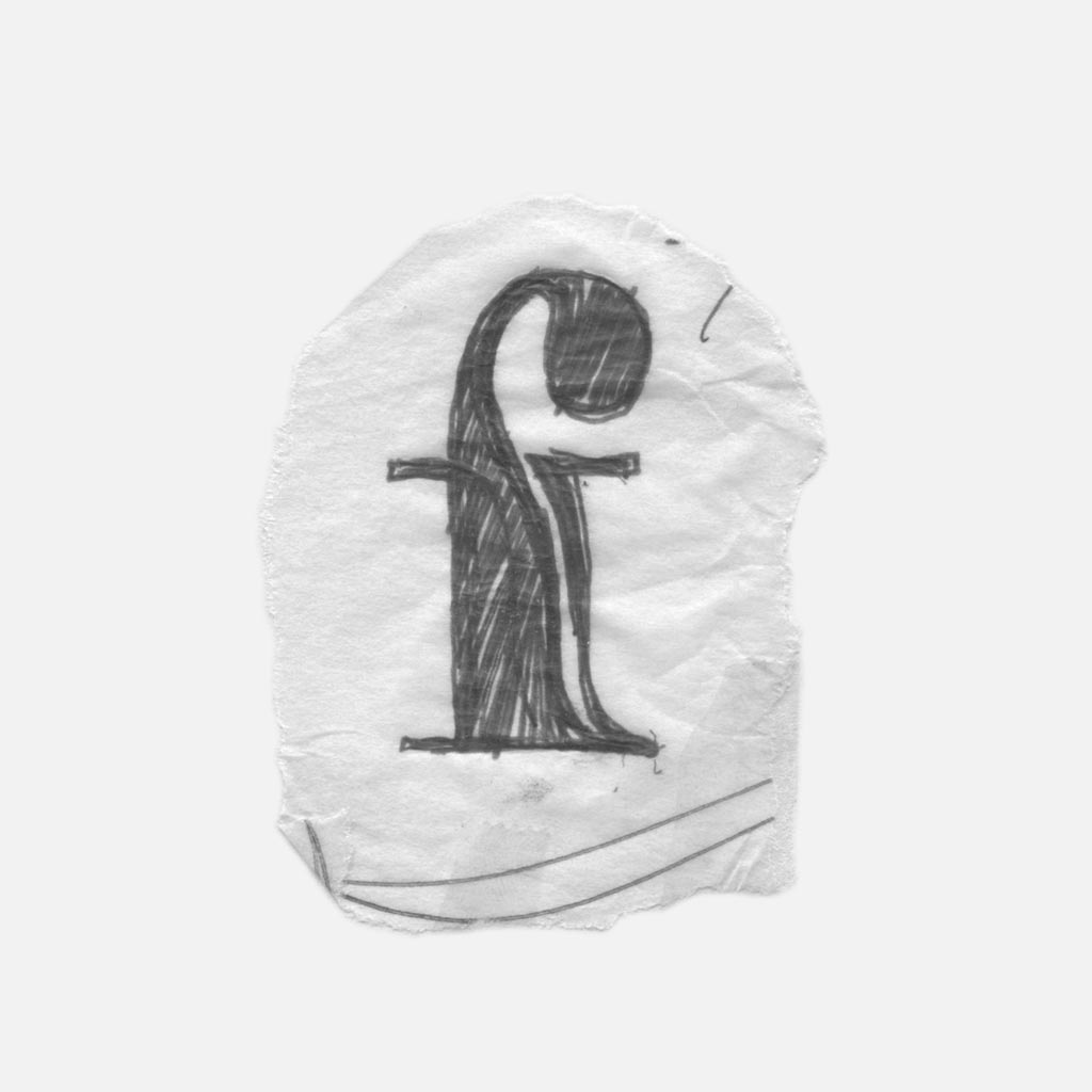
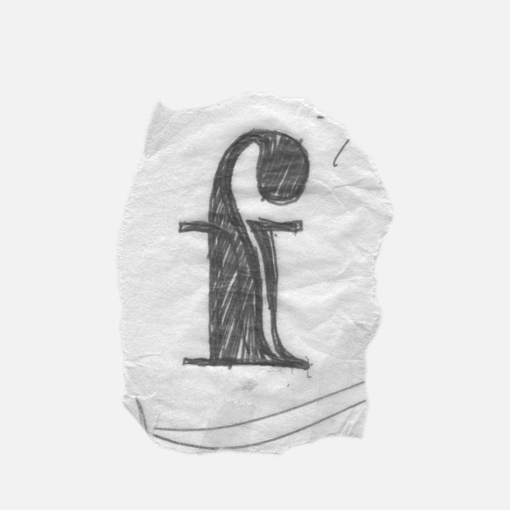
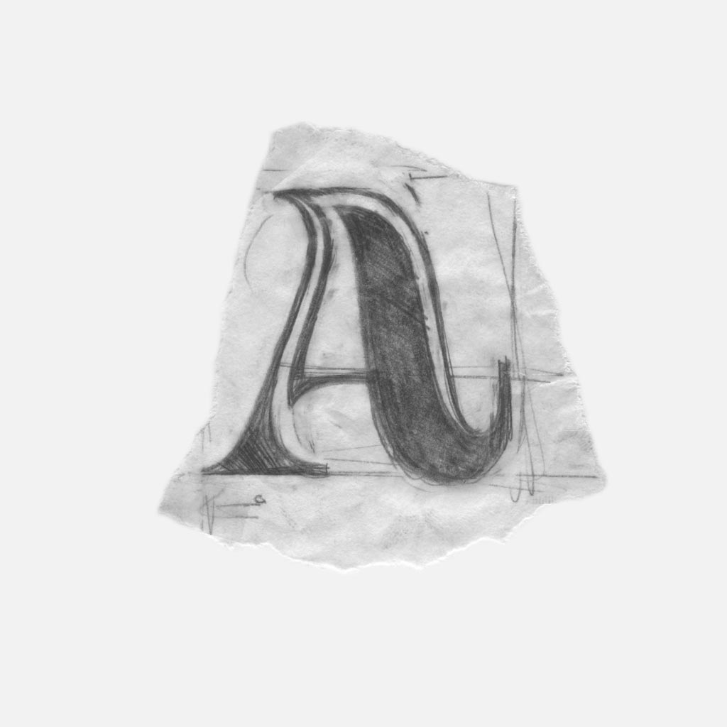
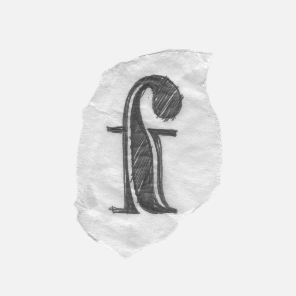
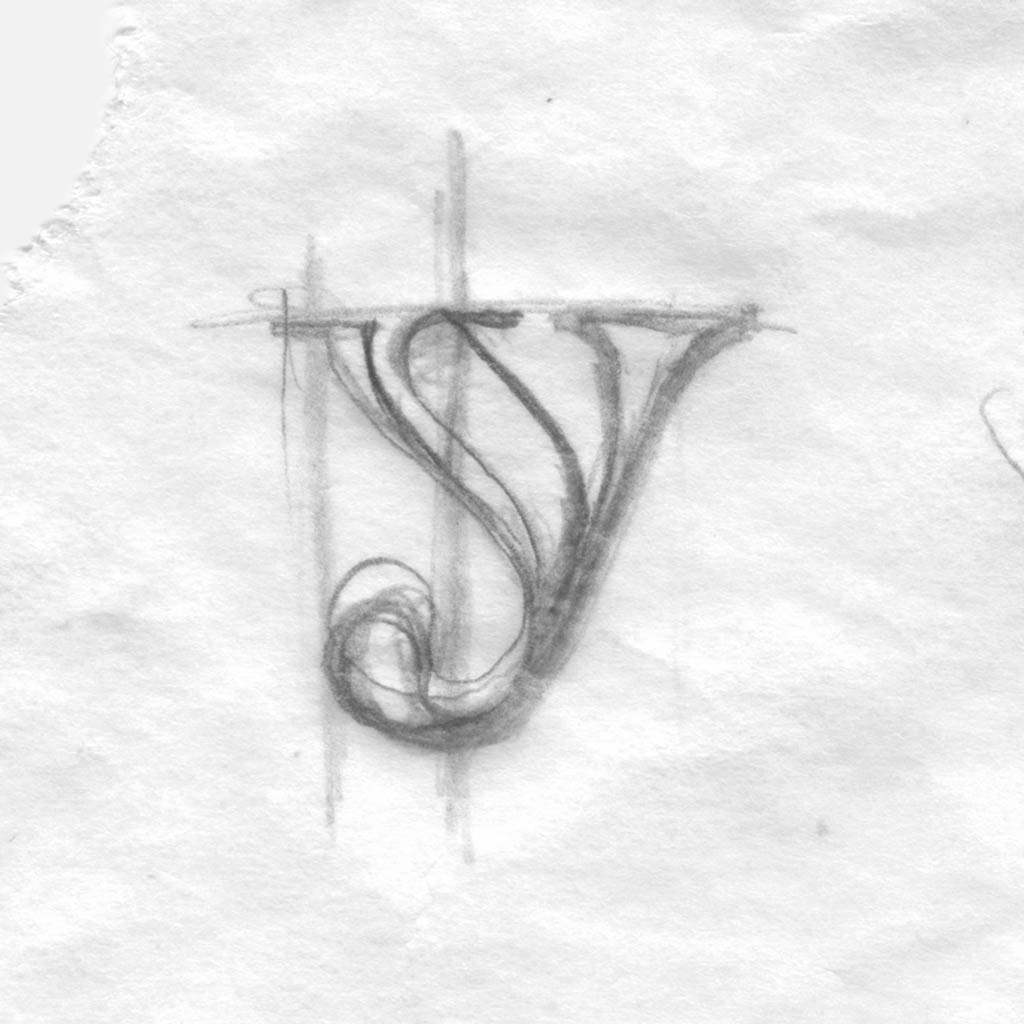
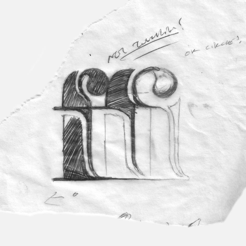
I started by exploring different ways to add in curves. The sketch above shows two solutions: rounded upstrokes (a, h, k) and tear-drop shaped terminals (a, b, c, f, g, j, k) that replace rigid serifs.
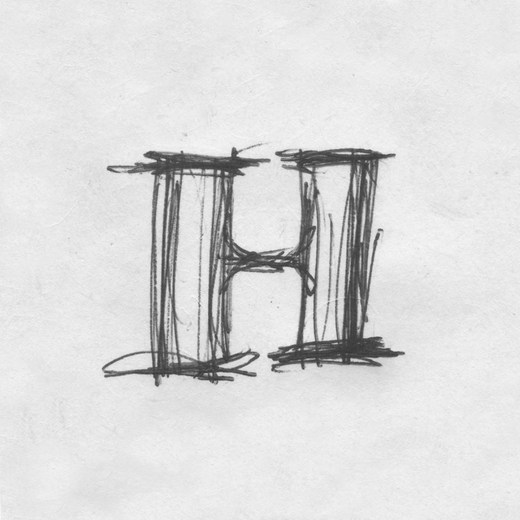
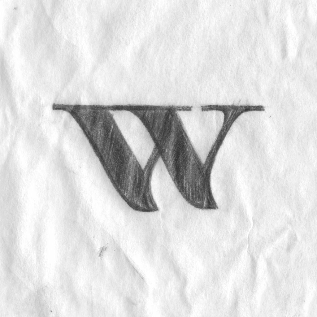
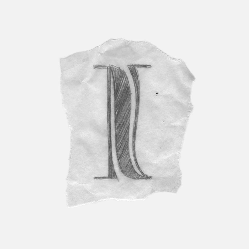
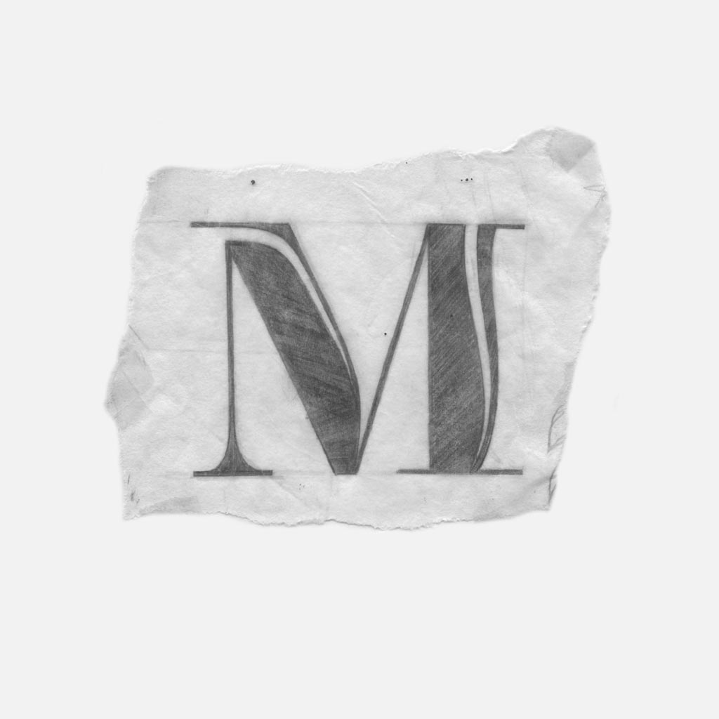
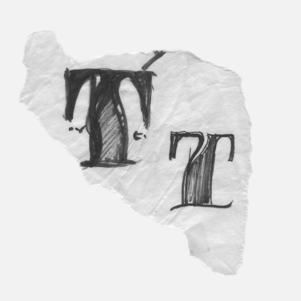
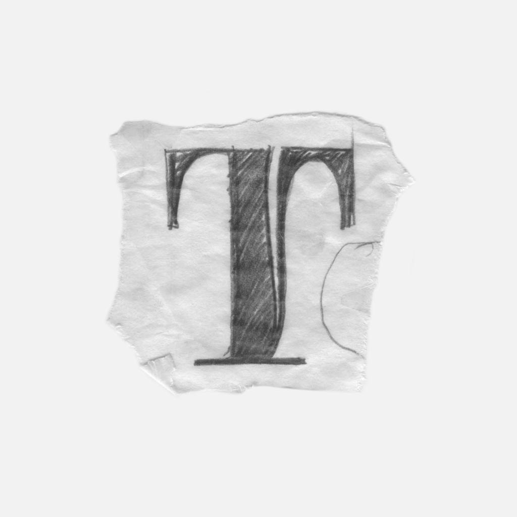
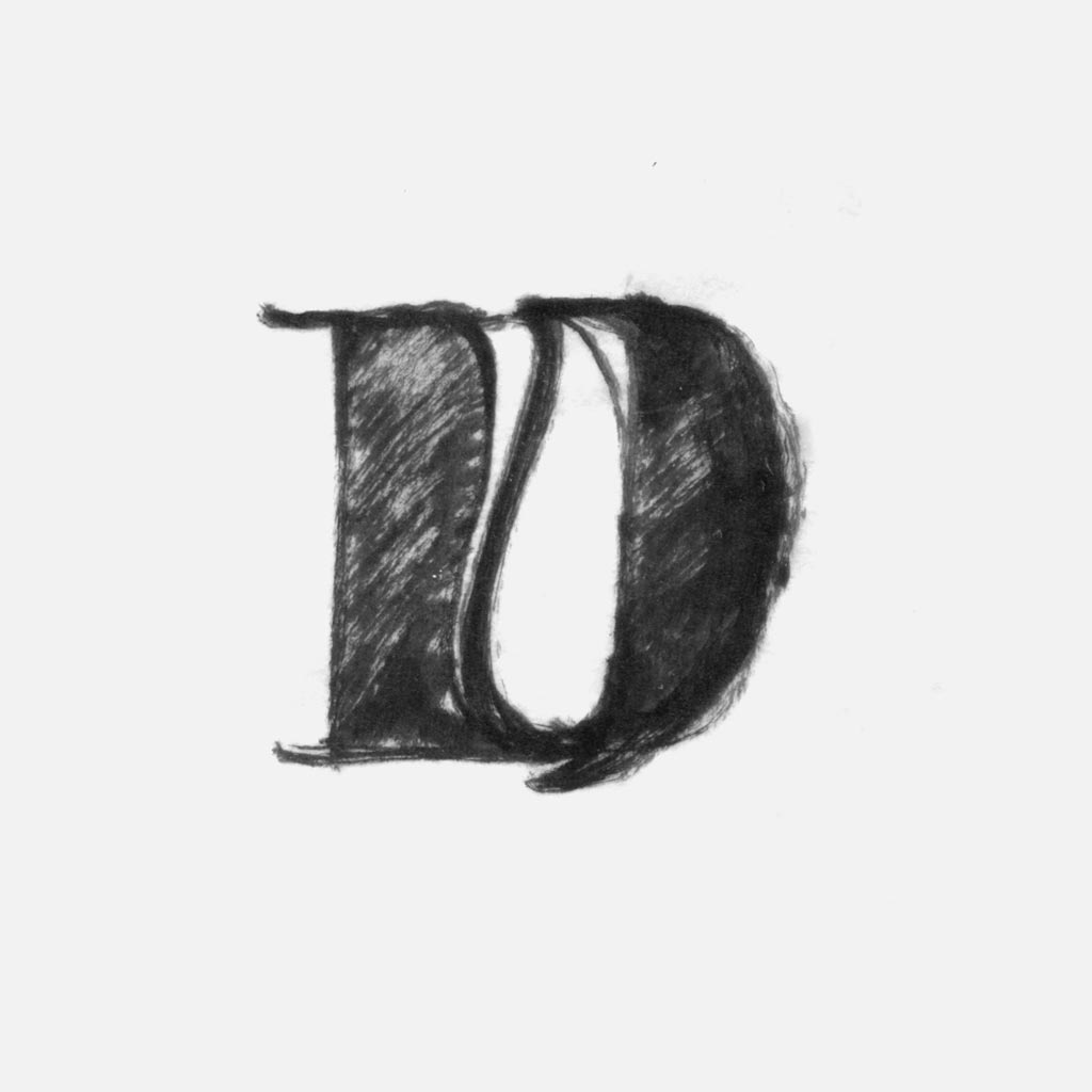
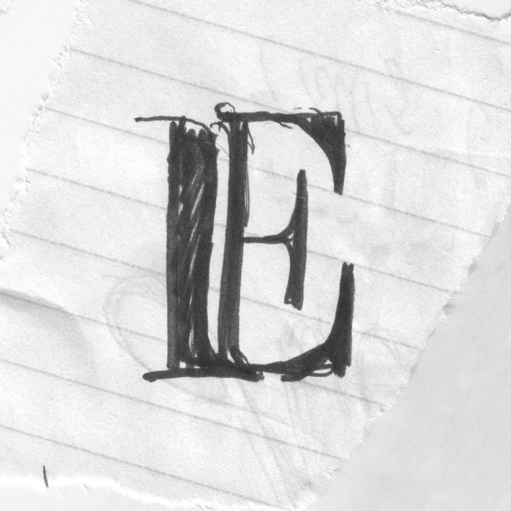
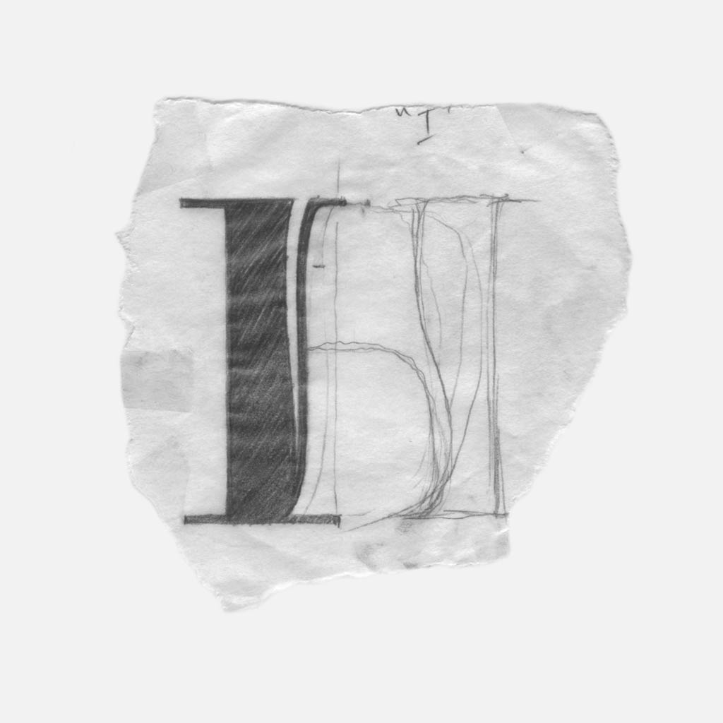
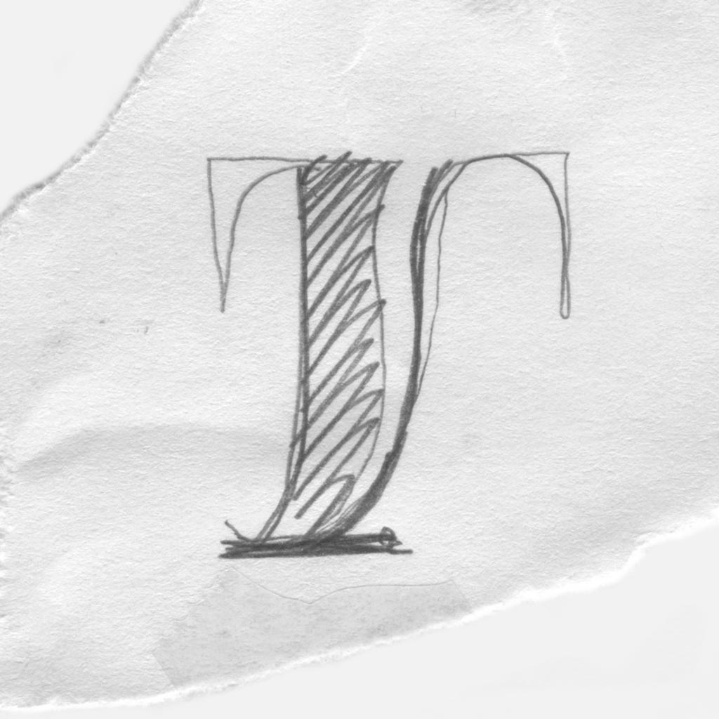
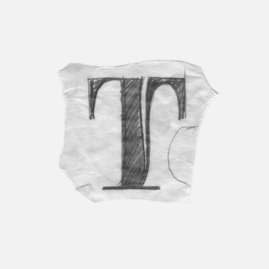
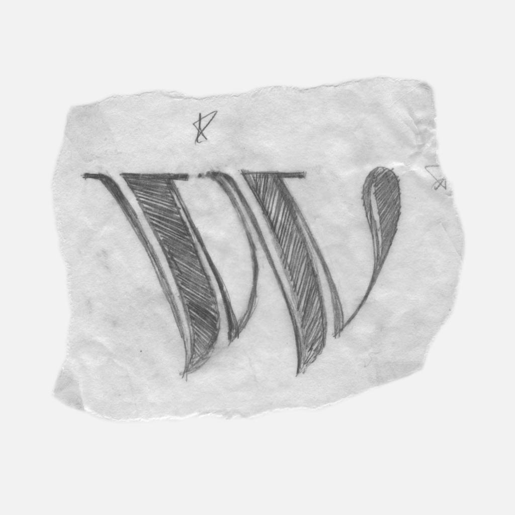
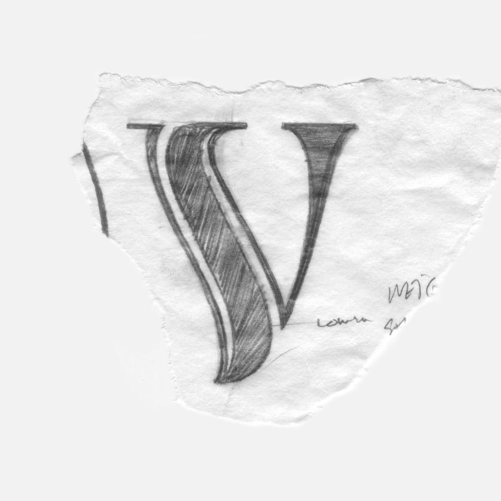
The two solutions were moving in the right direction, but they didn’t provide completely straight forms like I, E and W with an opportunity for a curve.
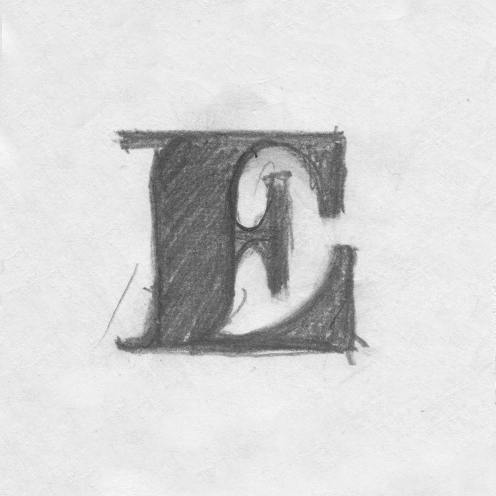
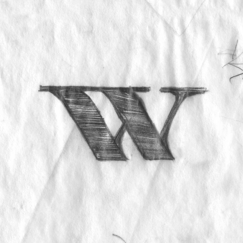
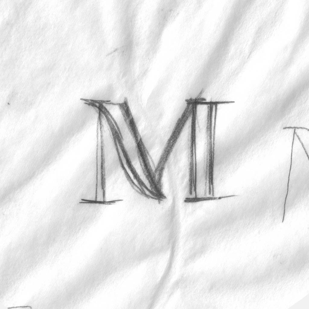
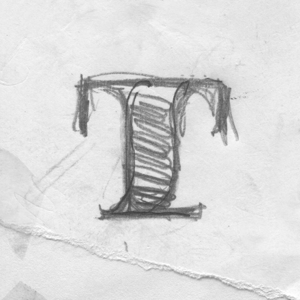
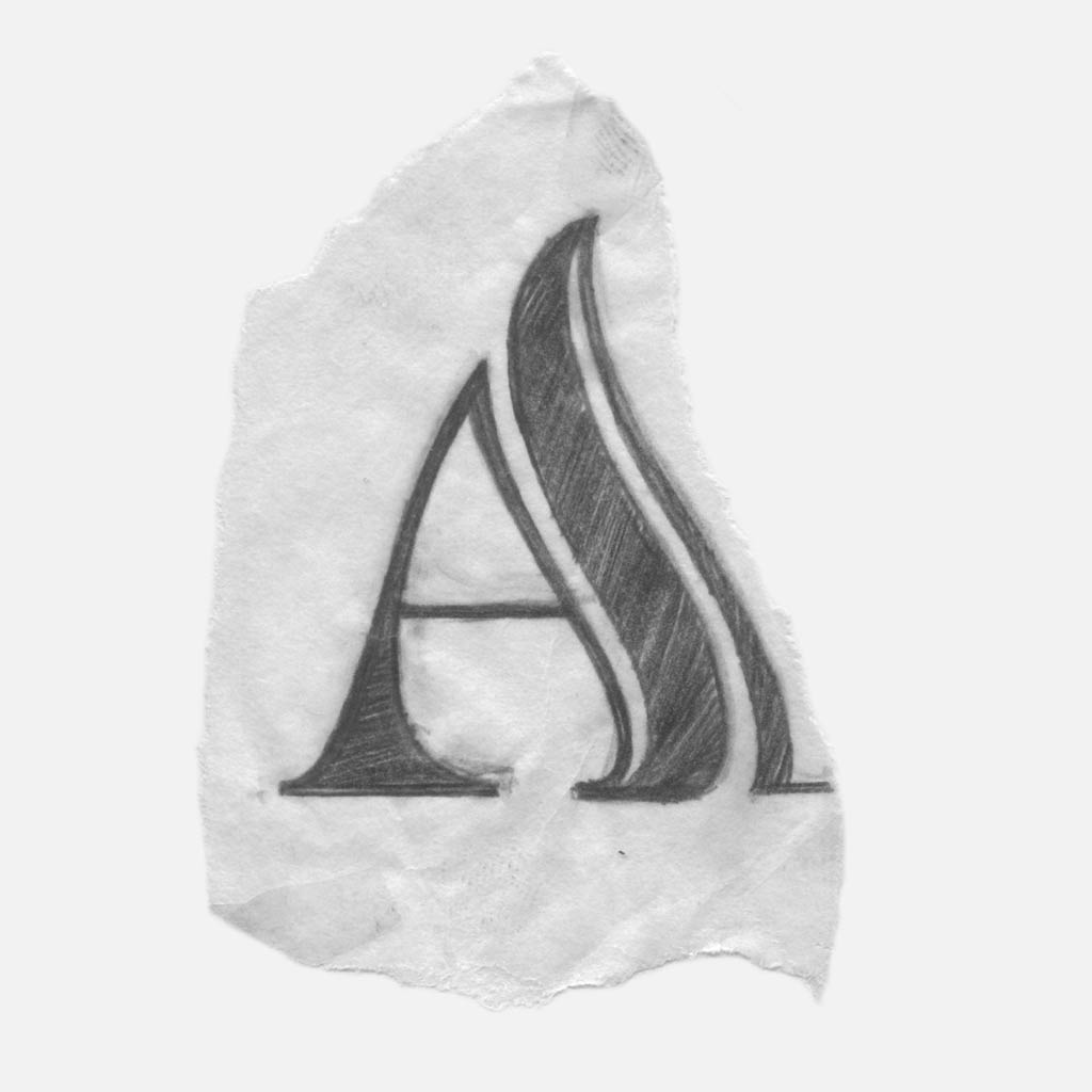
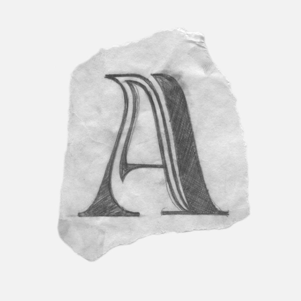
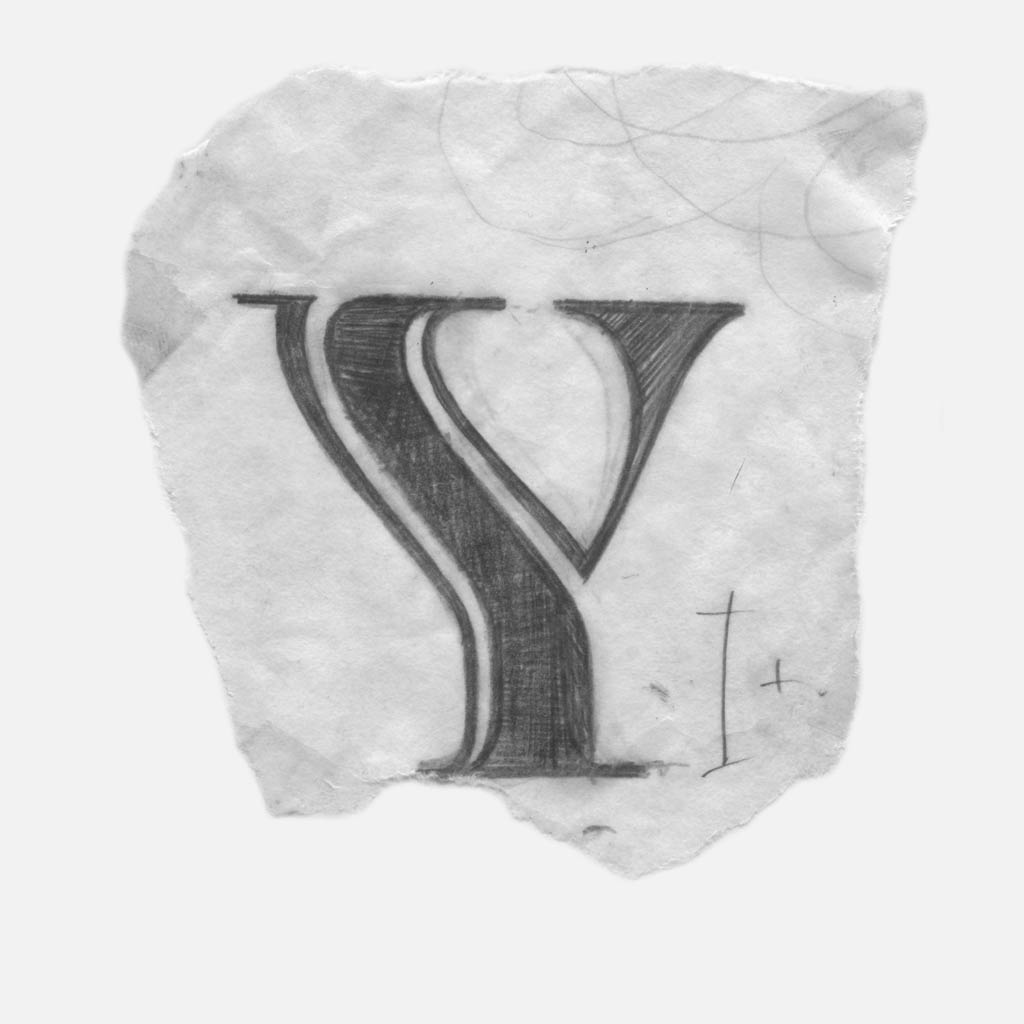
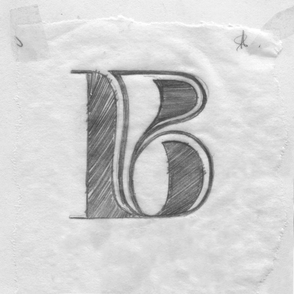
Solutions became more eccentric and the components started flowing together. Now, the rigid forms had curves, but they sacrificed their formal structure.
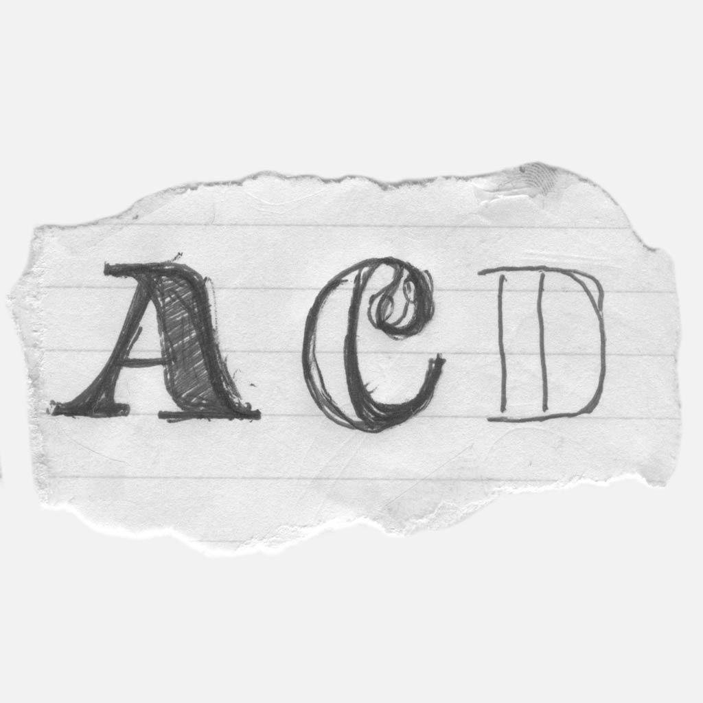
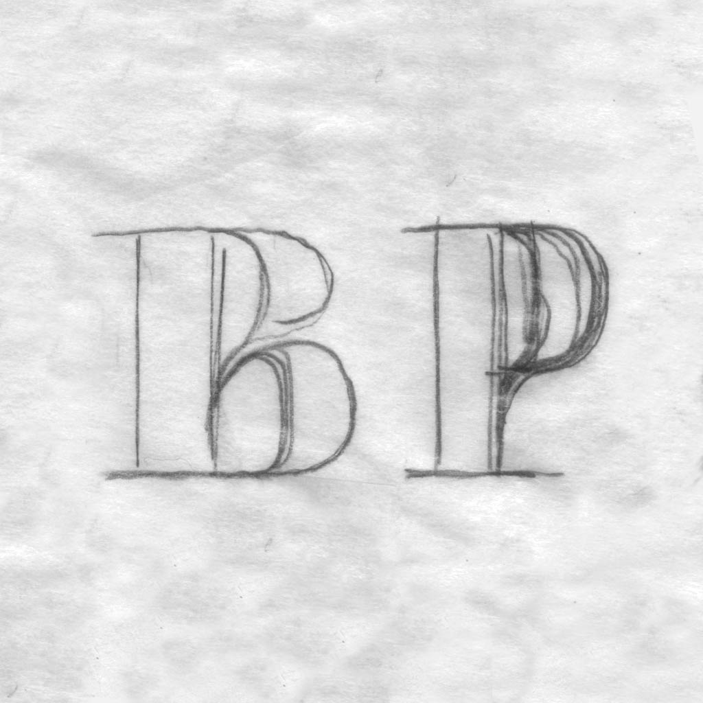
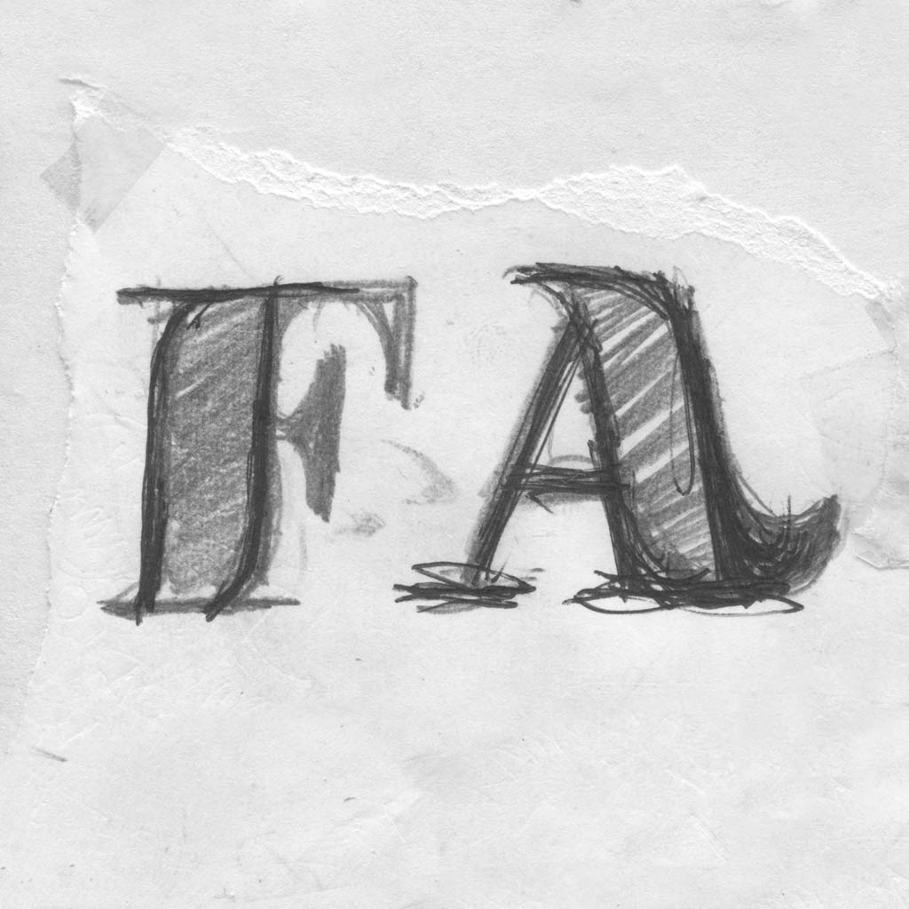
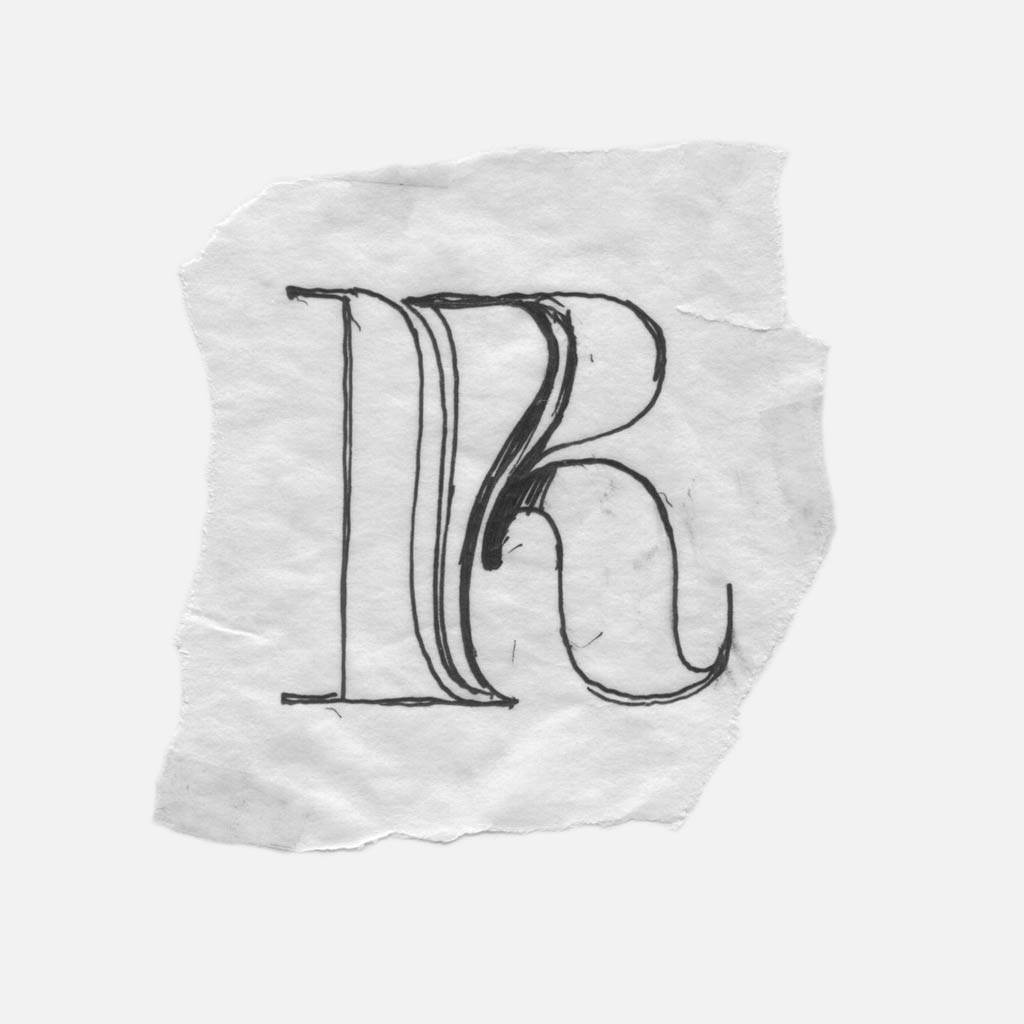
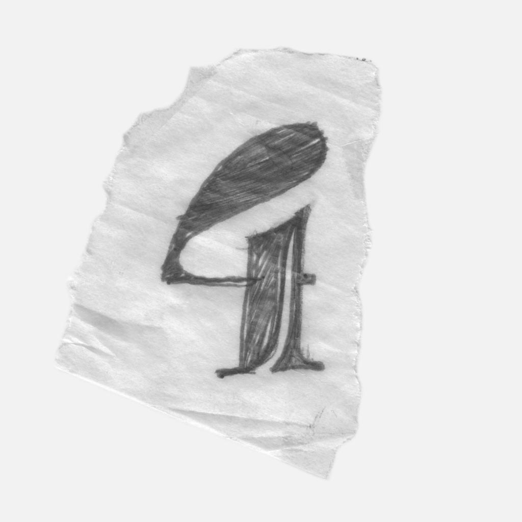
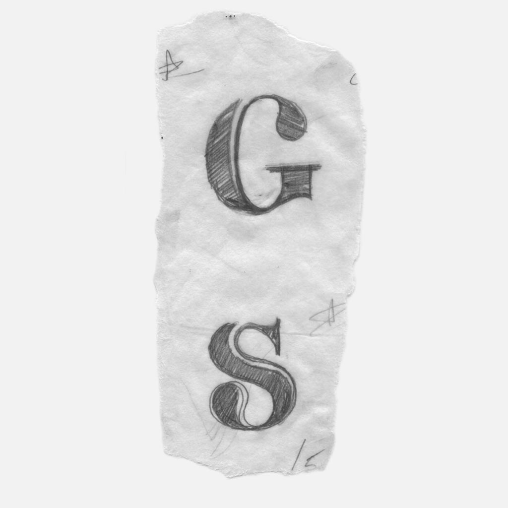
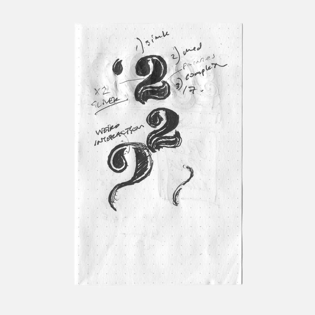
The P and R below show how the distortion looks awkward on the P, but attractive and balanced on the R. The distorted bowl of the R interacts with the leg, forming a negative space similar to the 2 and 7.
I decided that some glyphs would take advantage of the distortion, while others would retain a formal structure.
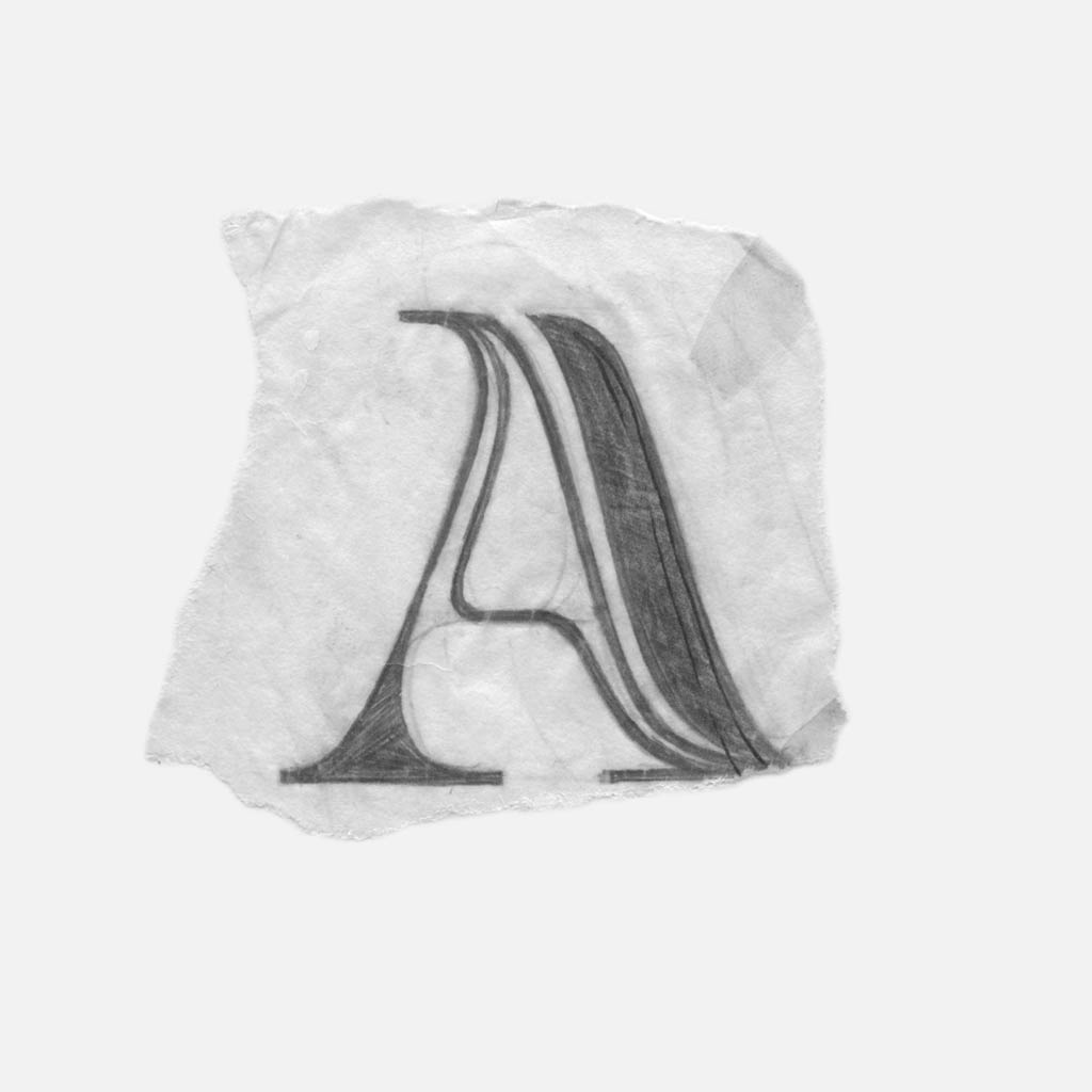
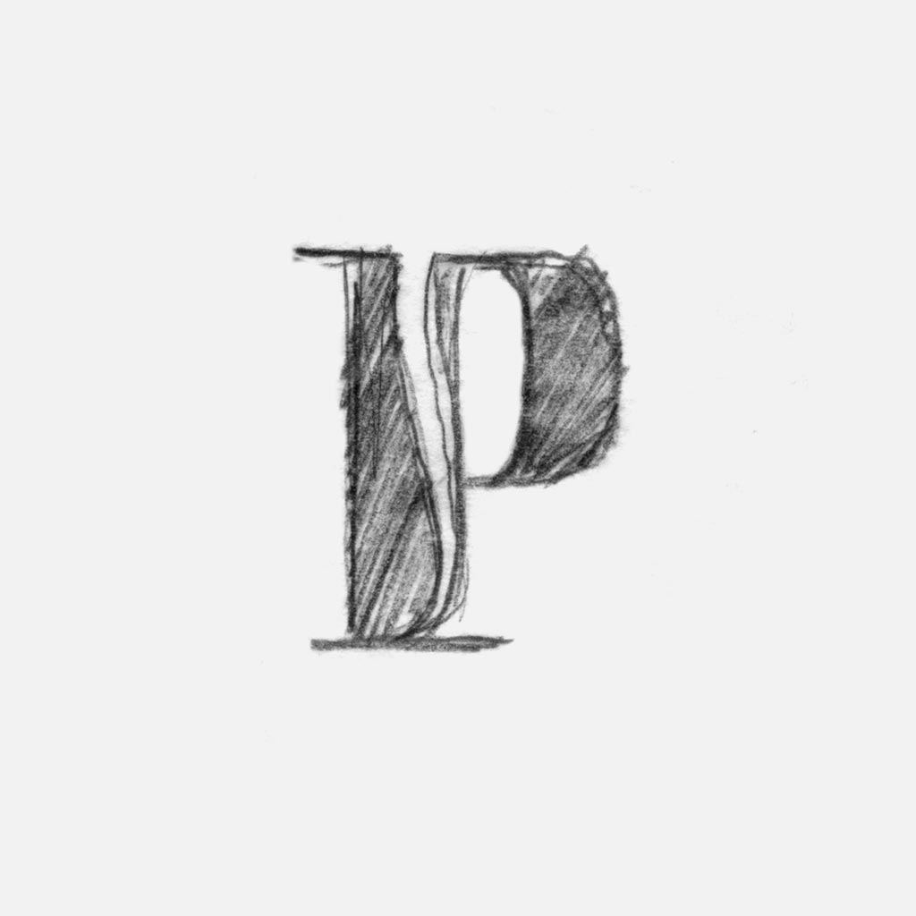
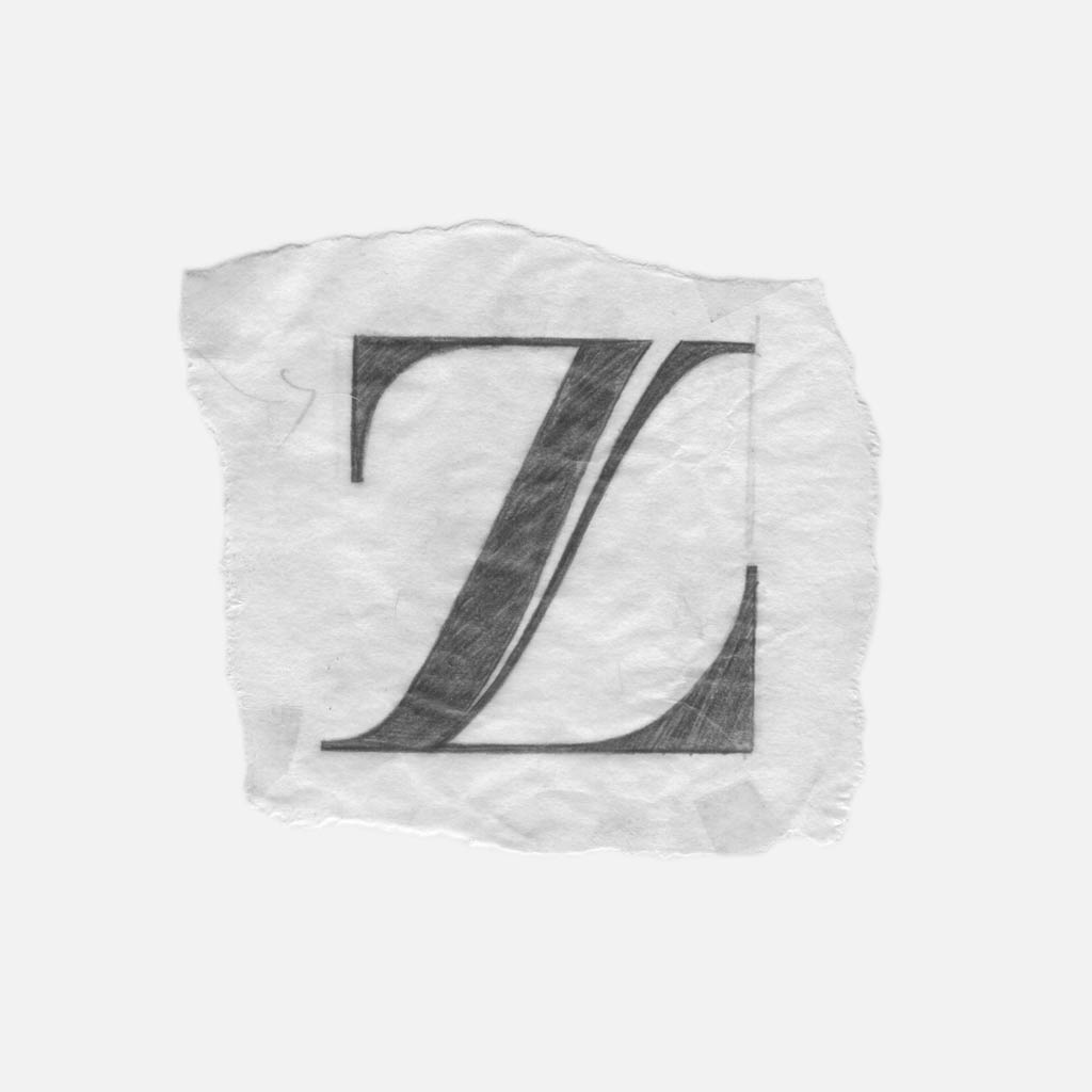
To become formal, the P had to lose its downward-curved bowl and I had to think of another way to include a curve within the letterform. This led to the curve within the stem (below), which mimics the 2/7 by becoming increasingly narrow as it moves further inwards.
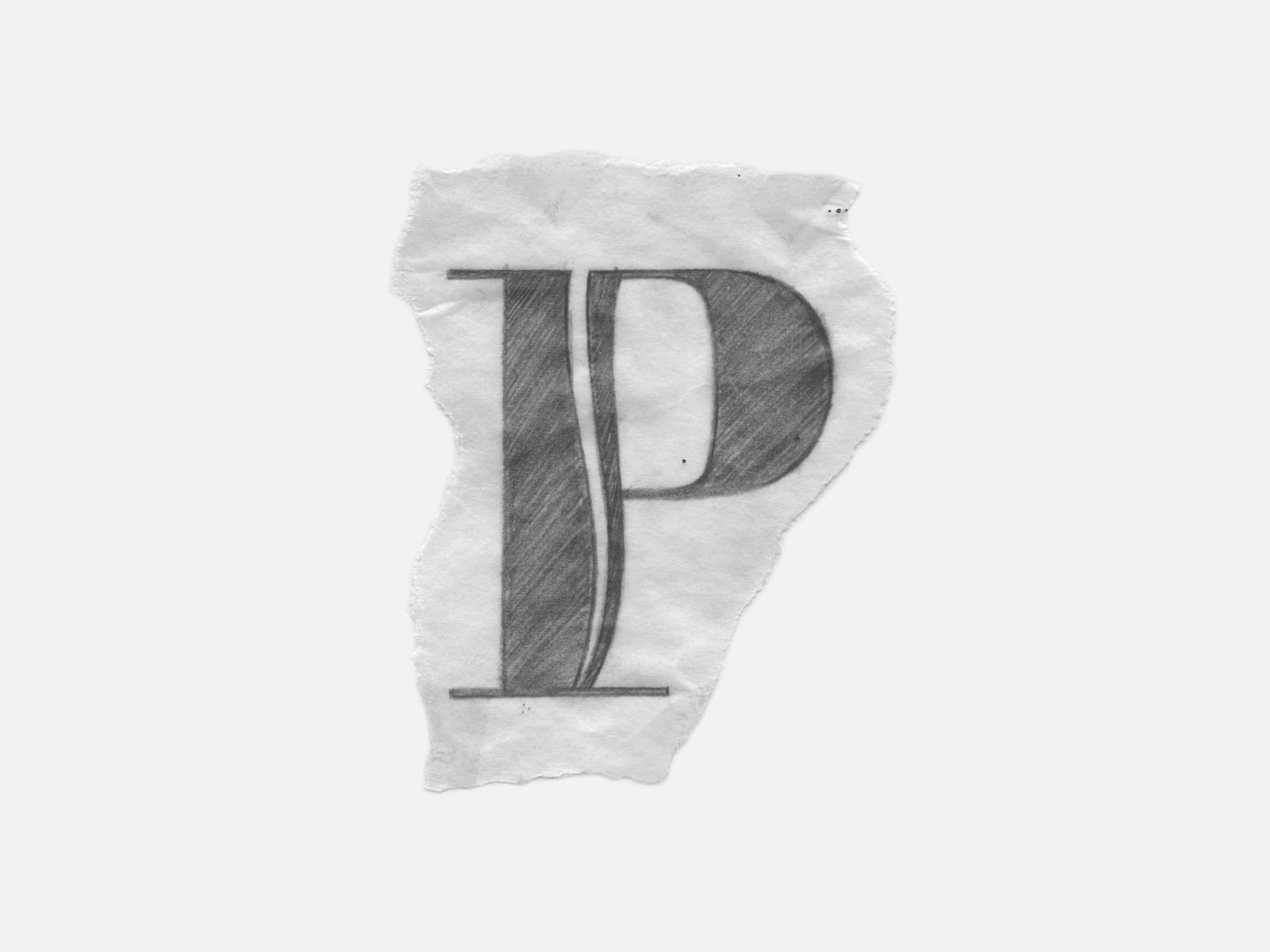
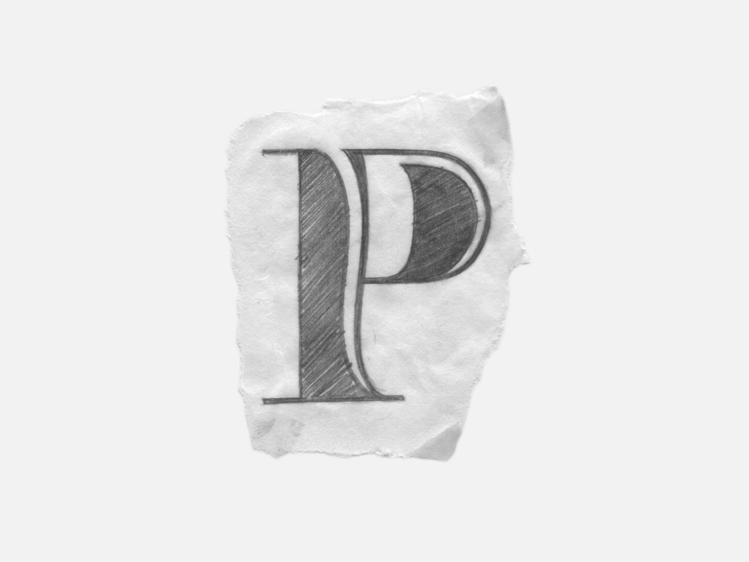
In the second P, a sliver was added to the right side to provide balance. This improvement established that all heavy areas would have a sliver.
Additionally, the sliver’s curve was inverted in the second P to provide forward momentum and allow the the stem to make a graceful – plant-like transition – into the bottom serif.
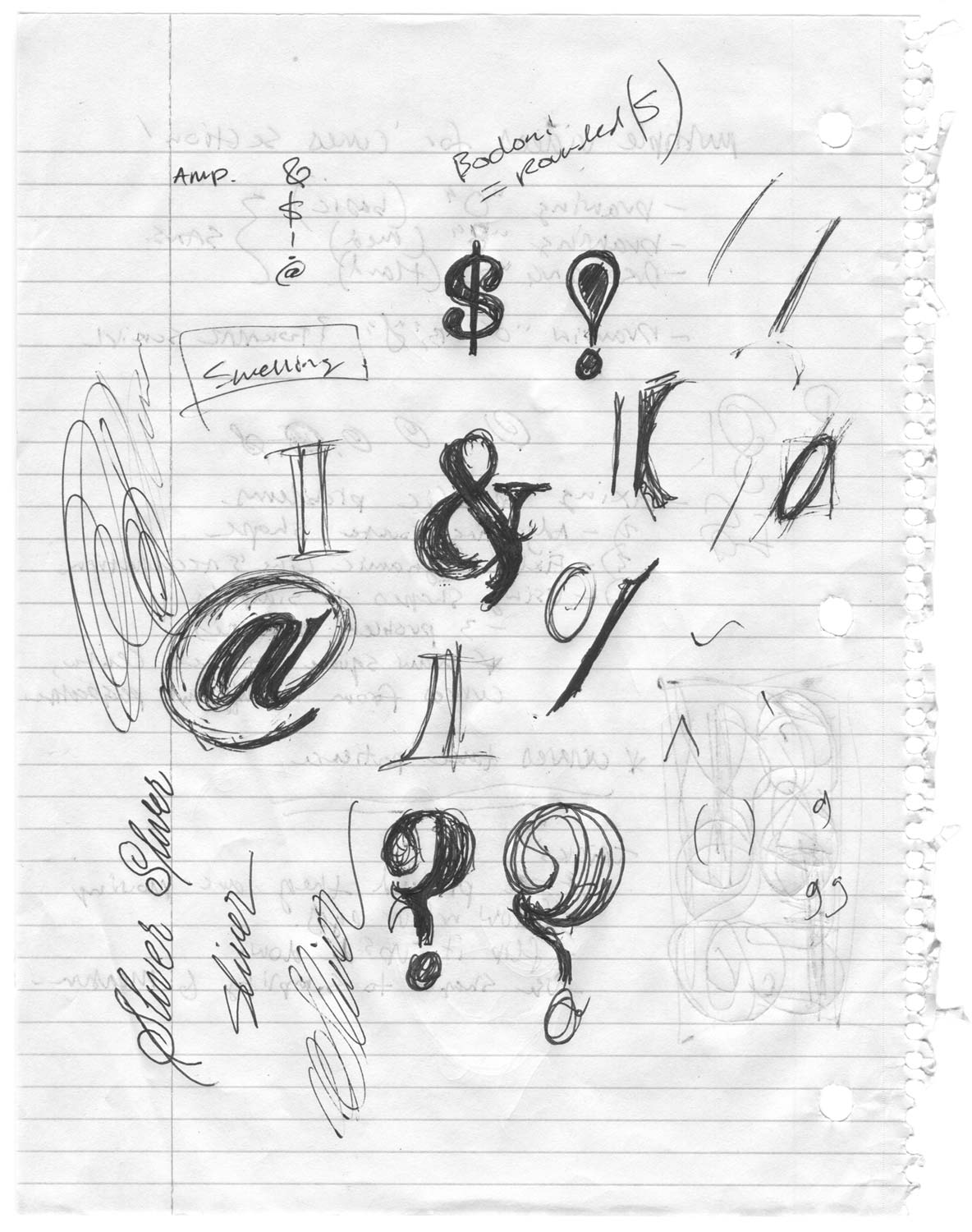
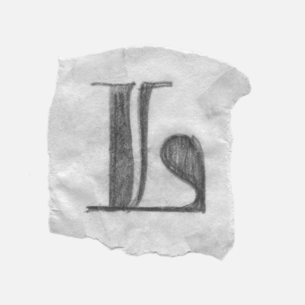
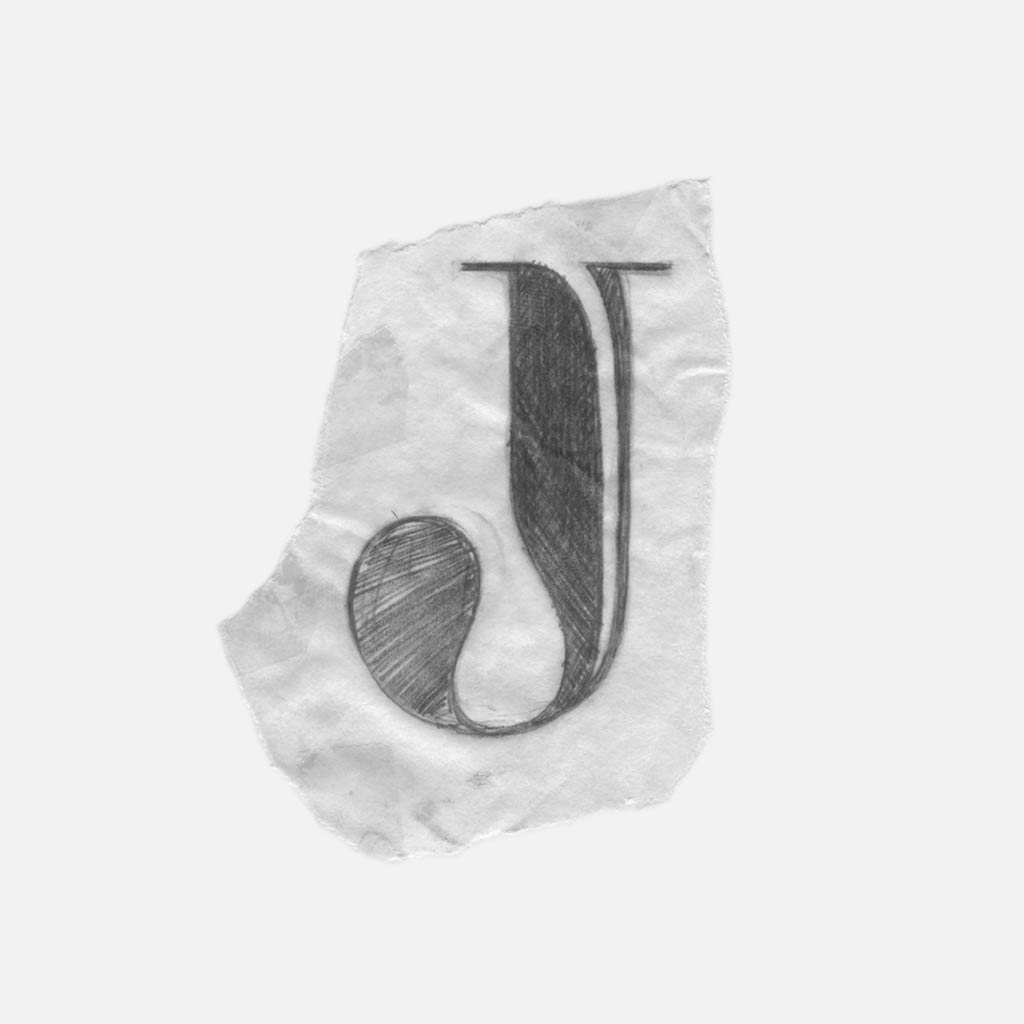
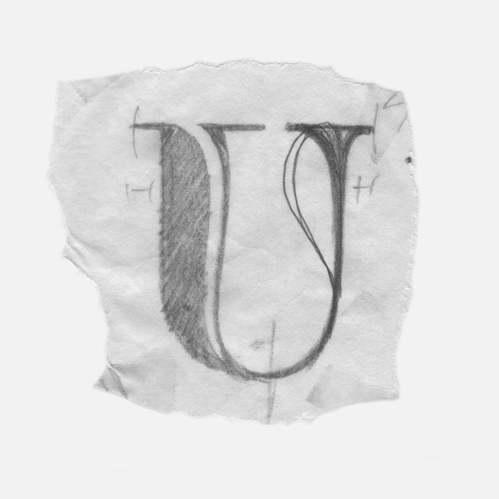
With the basic rules established, I started searching for the most natural way to incorporate slivers(s) into each glyph.
Part 2. Revised Illustrations
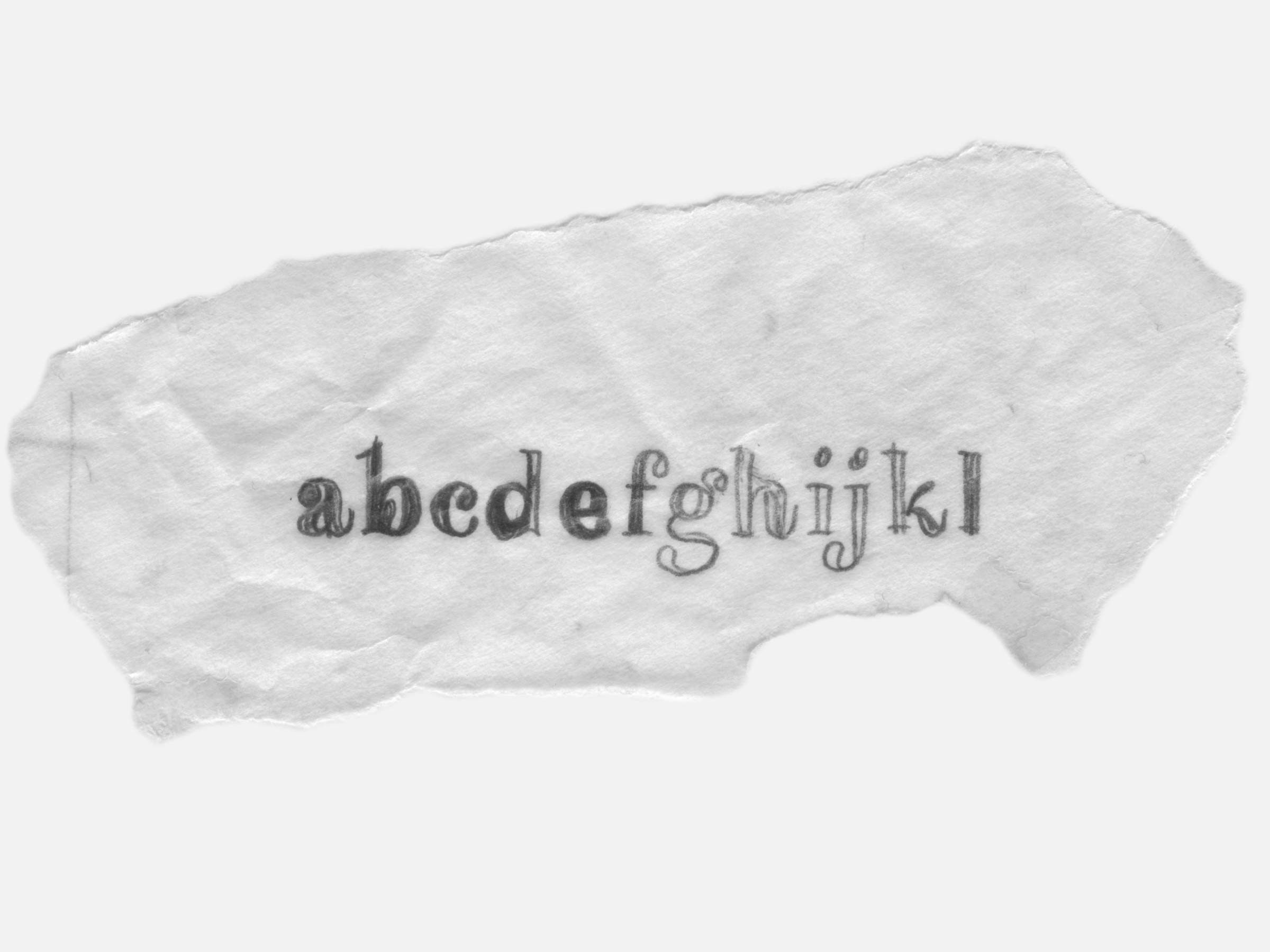
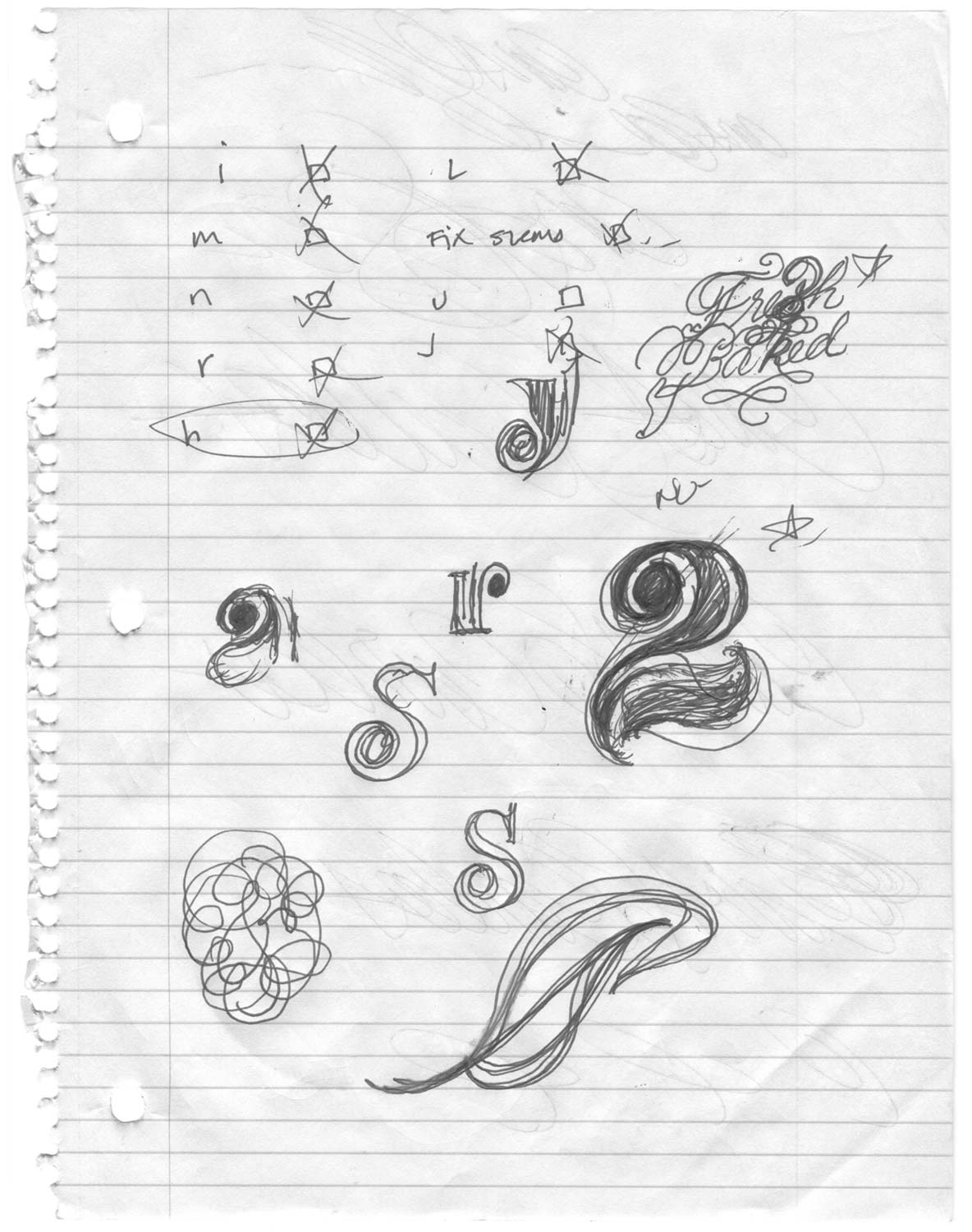
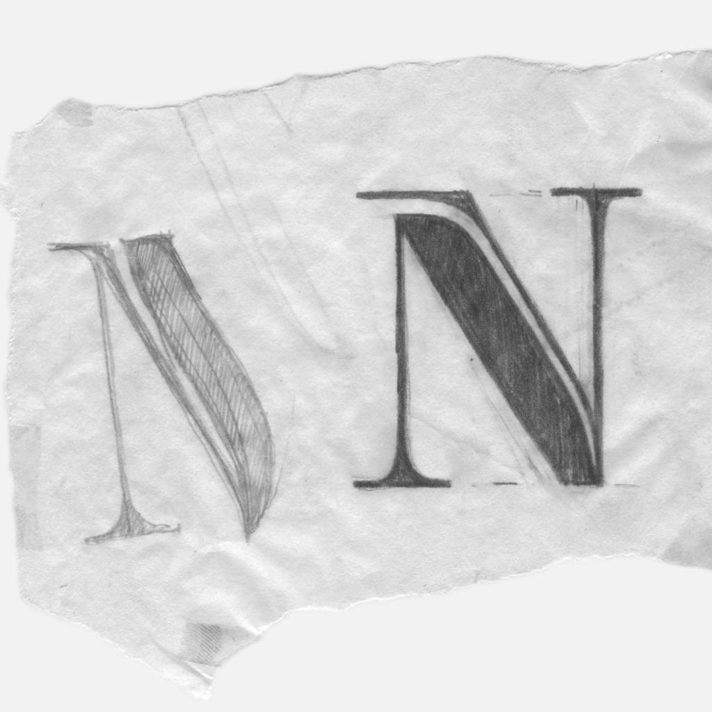
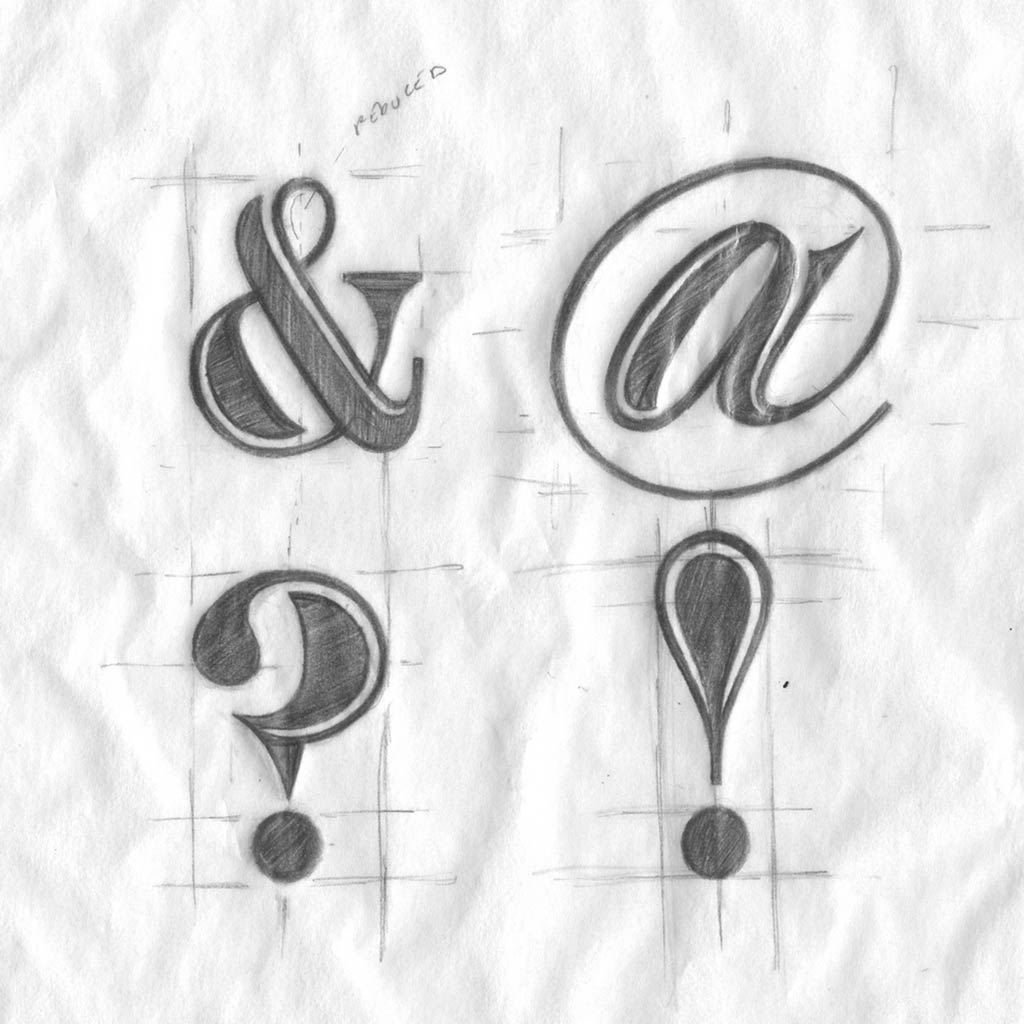
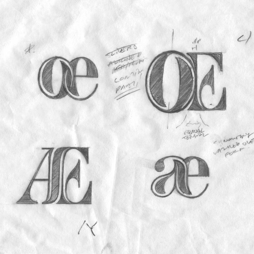
Failed attempts revealed the solutions that were working well. I applied the strong solutions to refined illustrations that defined the weight, sliver size, and proportions of the upper and lowercase letterforms.
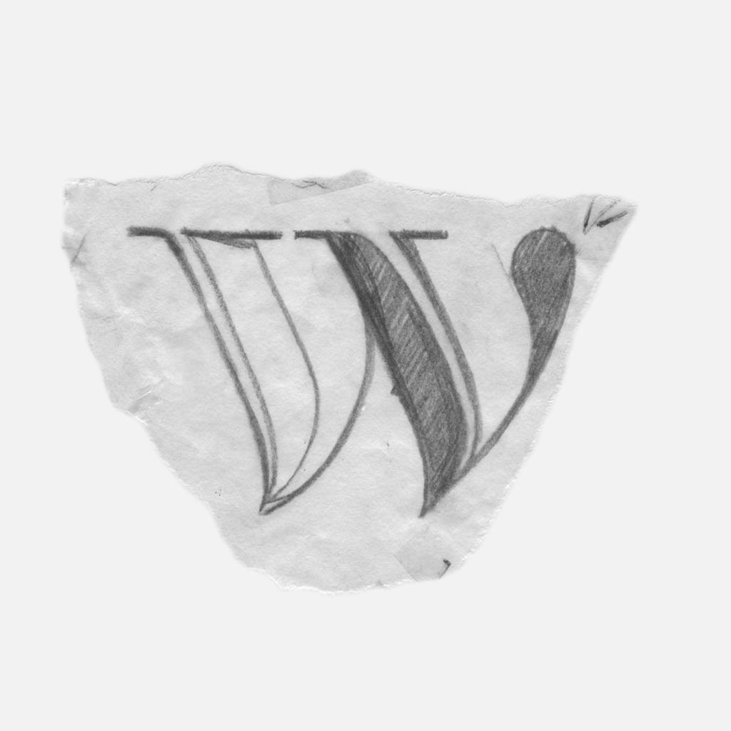
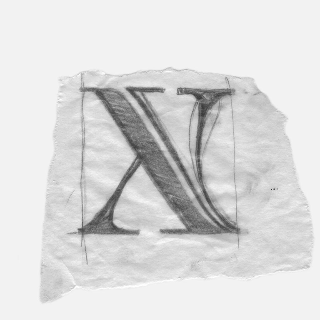
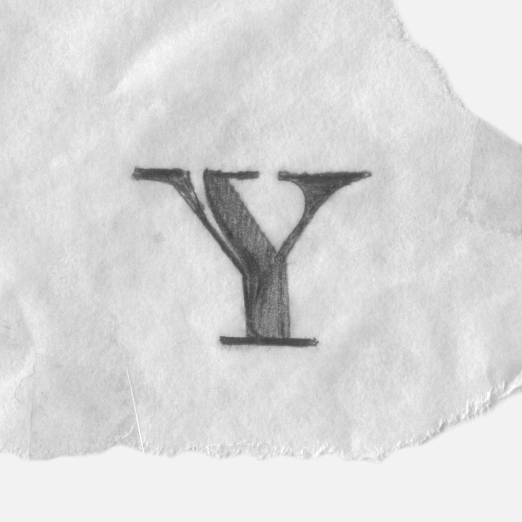
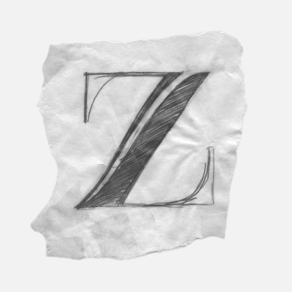
Part 3. Systematic Slivers
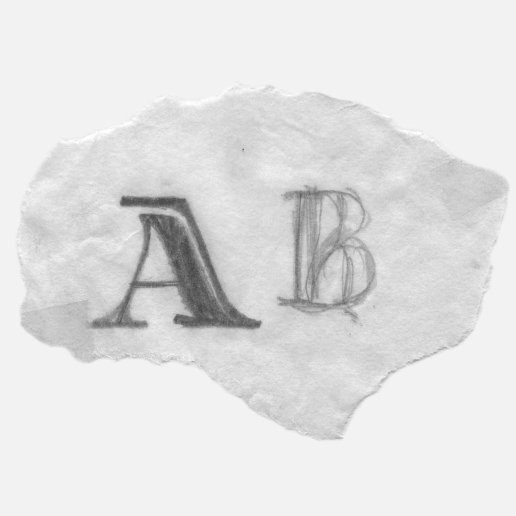
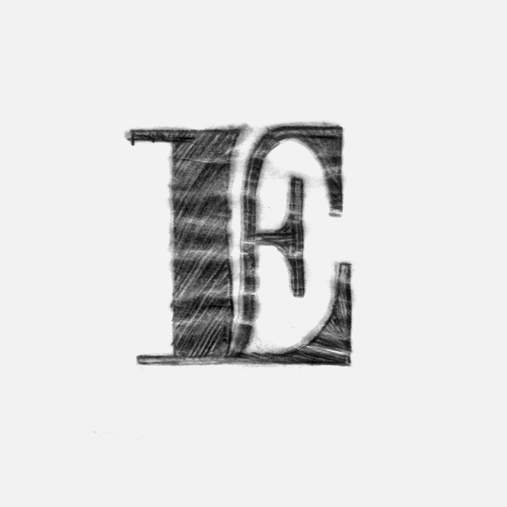
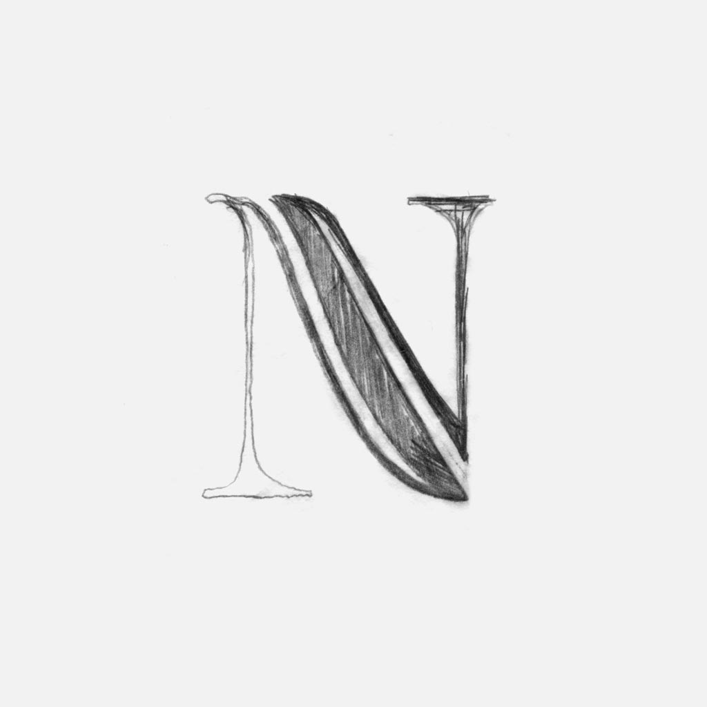
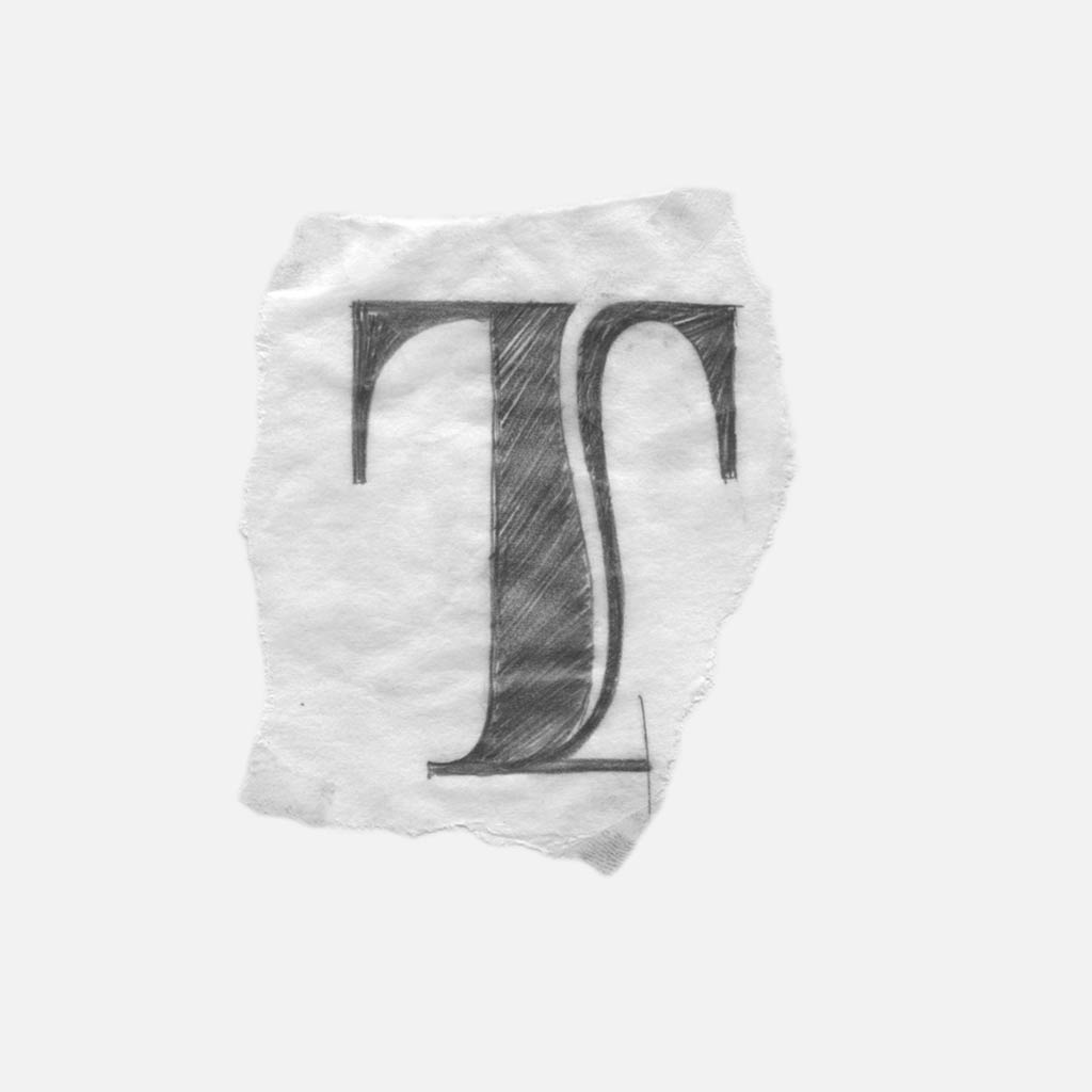
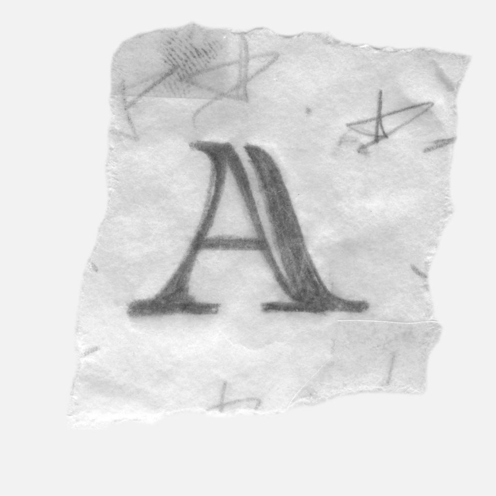
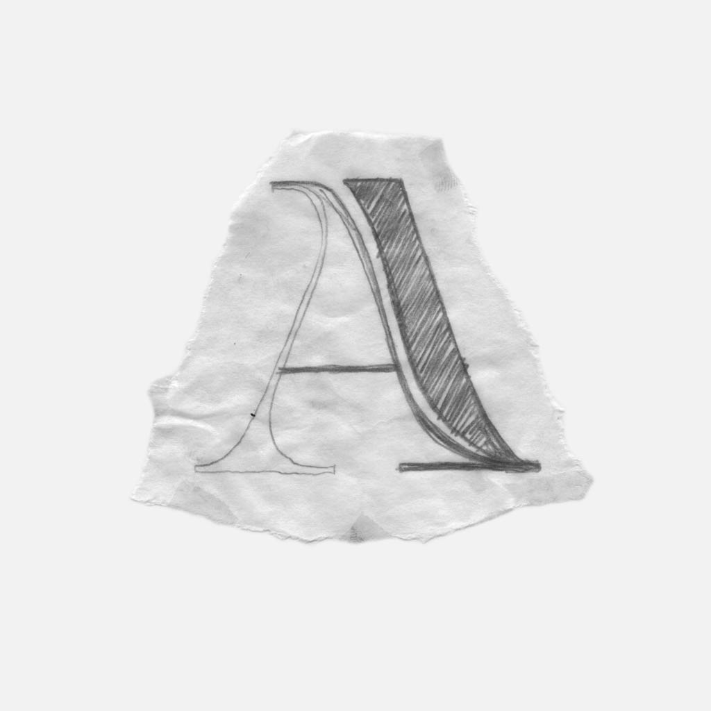
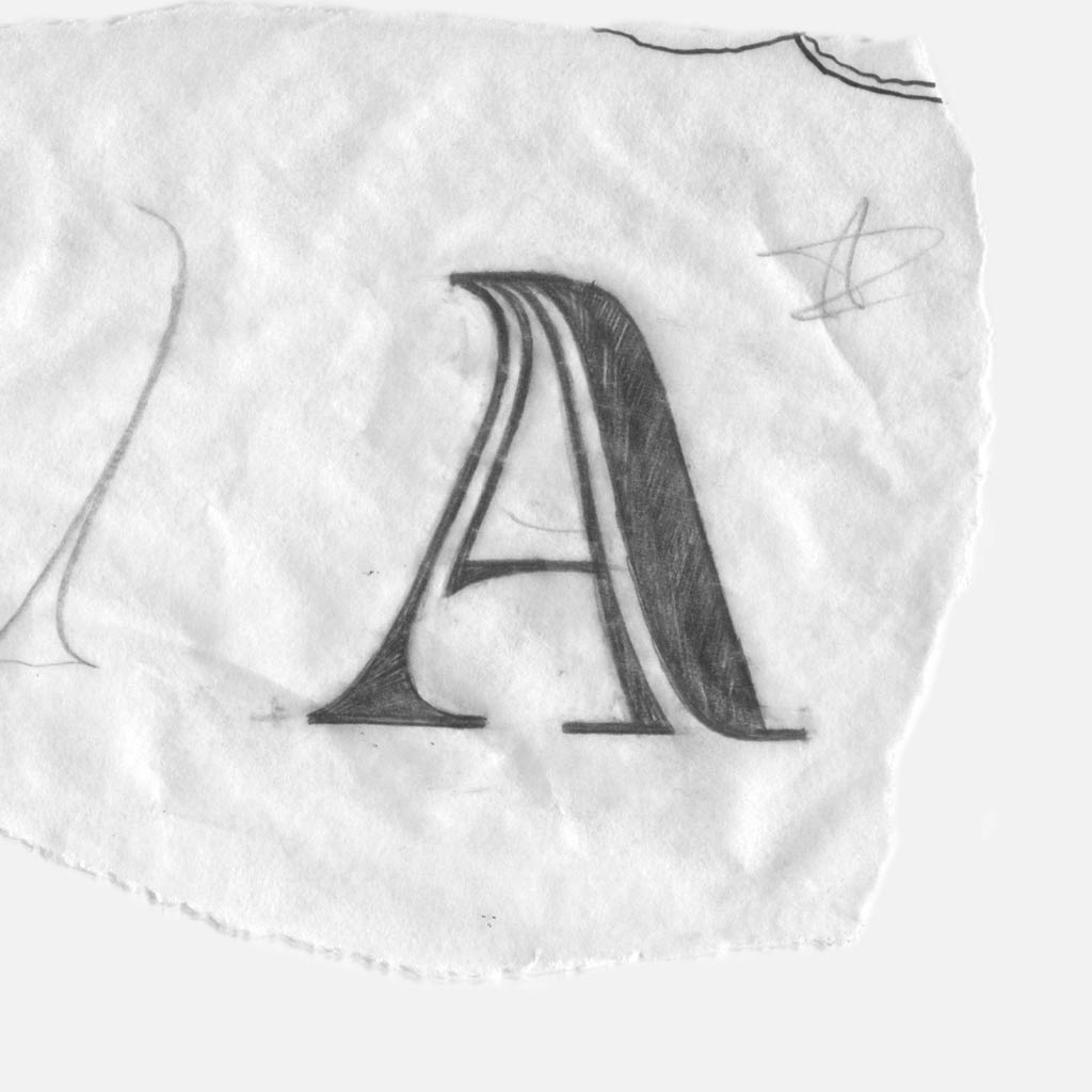
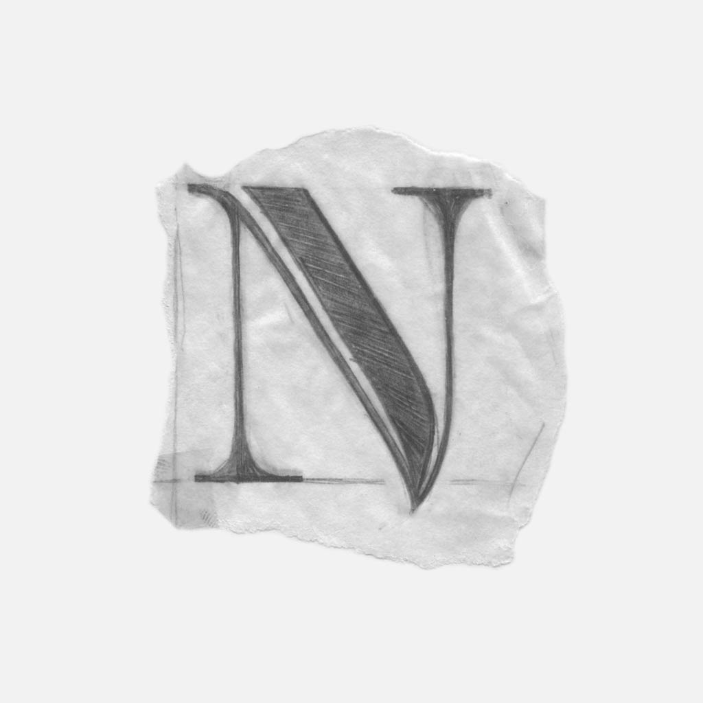
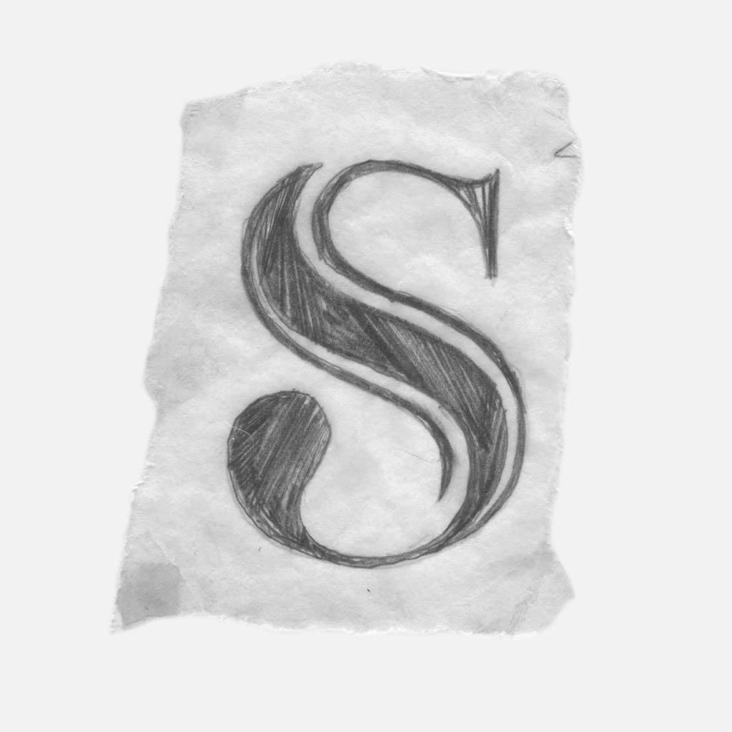
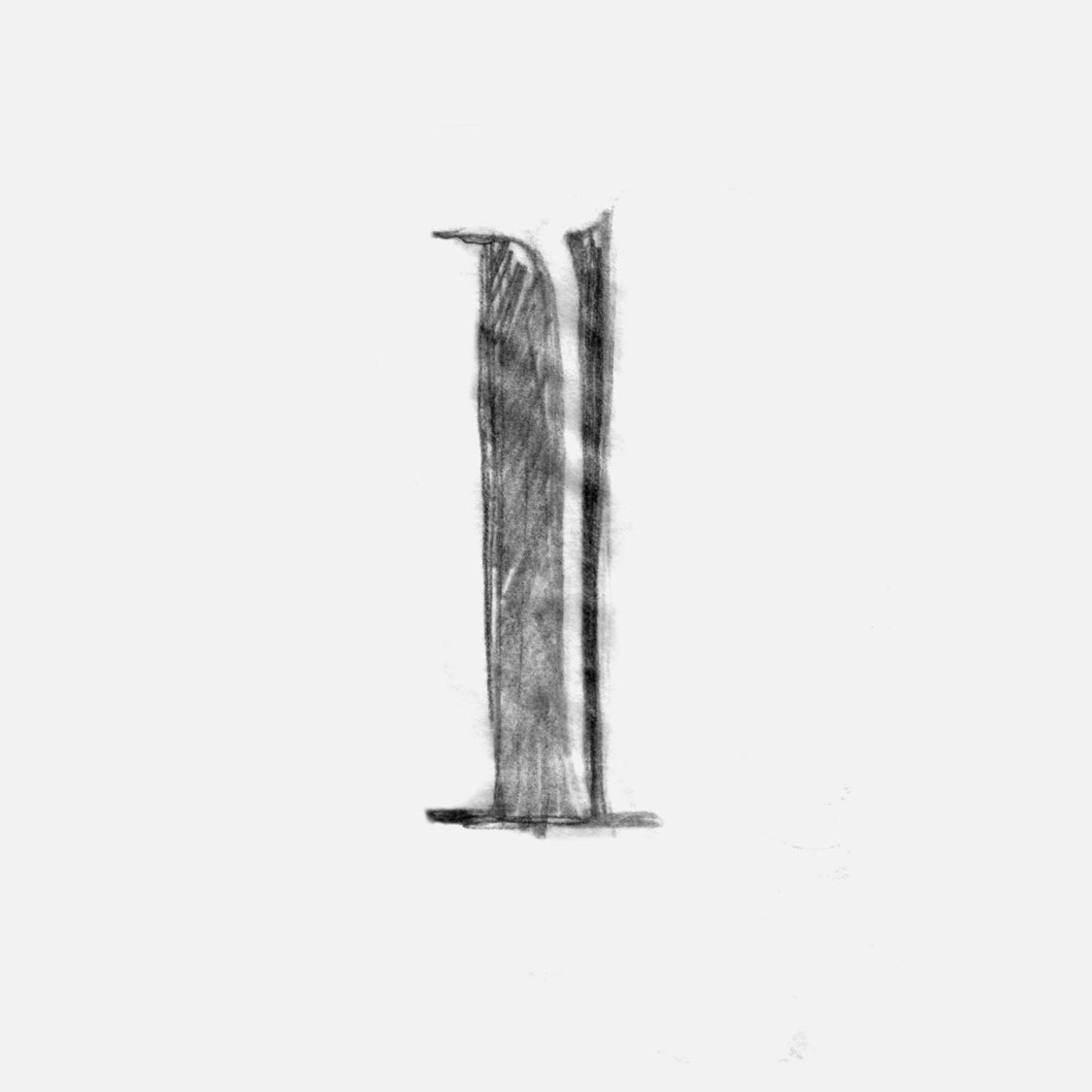
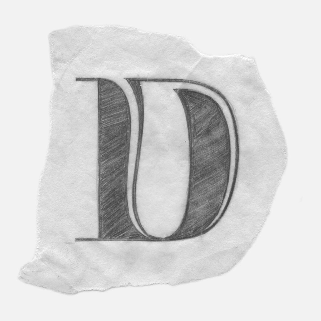
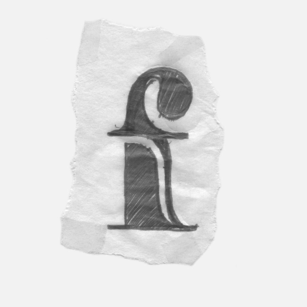
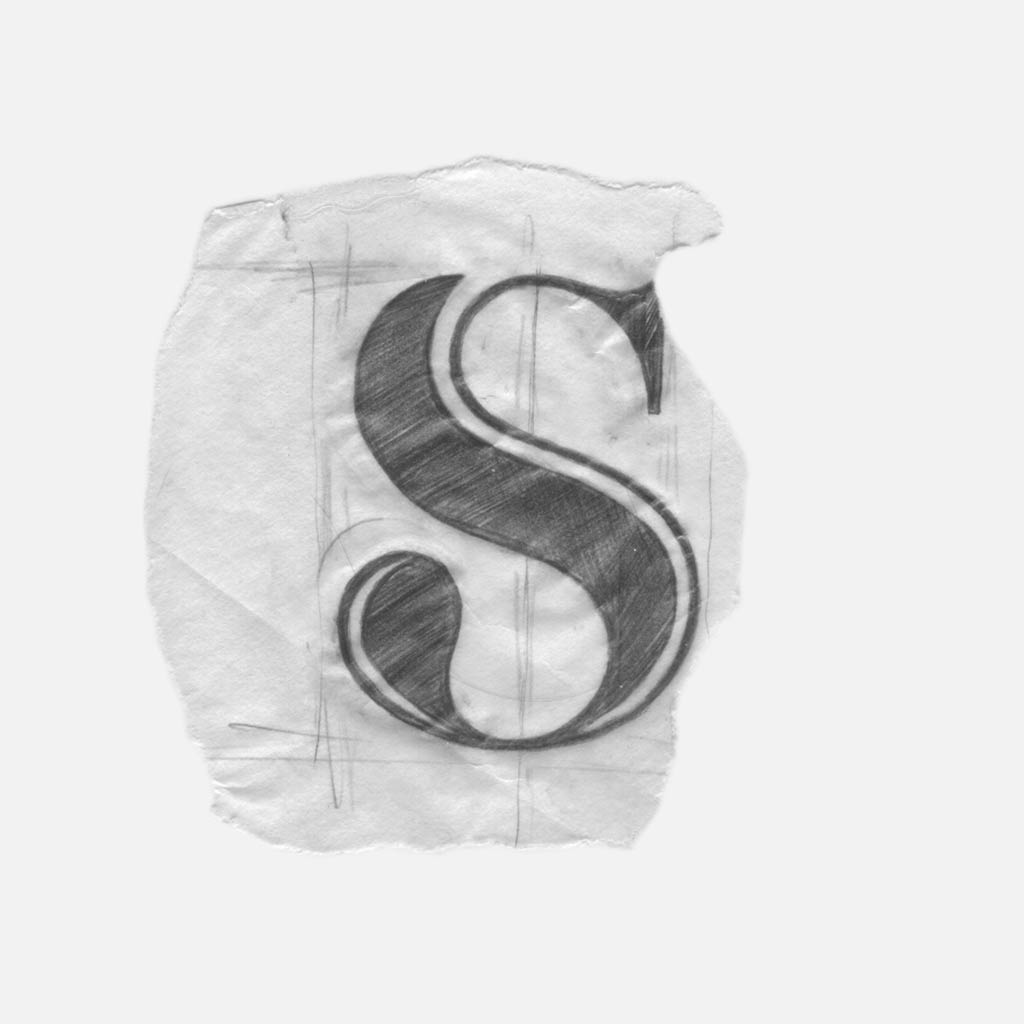
Simple rules define how the slivers are applied to a variety of simple forms. Rule one: the sliver rolls in from the upper-left, moves downwards, and ends by curving into the lowest serif. Like Didot and Bodoni, the exterior is made up of grand vertical lines, aside from the bottom-right transition.

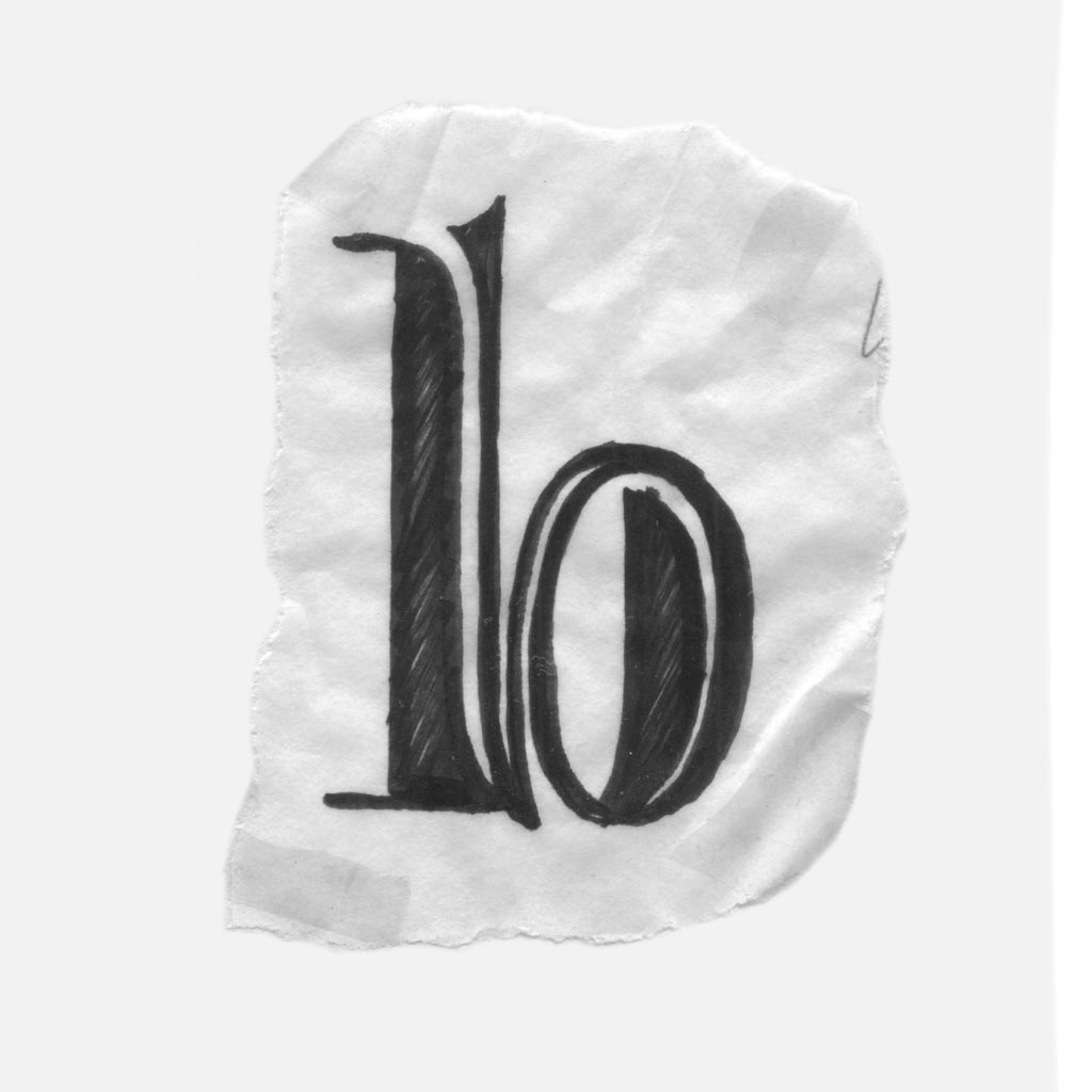
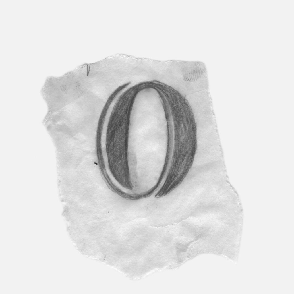
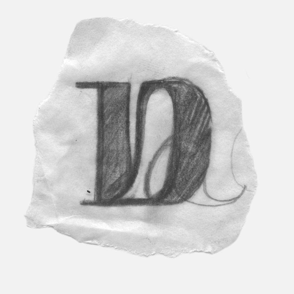
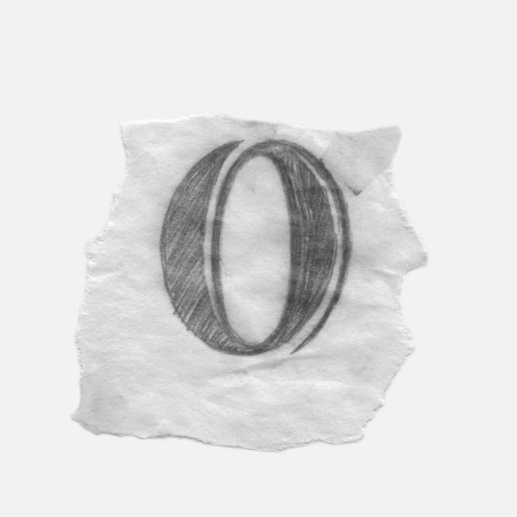
Rule two: two symmetrical pieces make up the O. On the left side, the sliver enters from the bottom and on the right, the sliver enters from the top. Both slivers enter the thick areas from within the counter, giving the form a solid exterior.

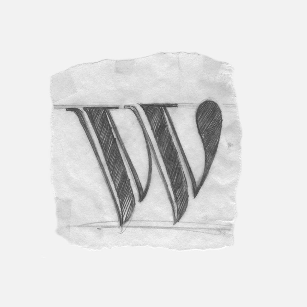
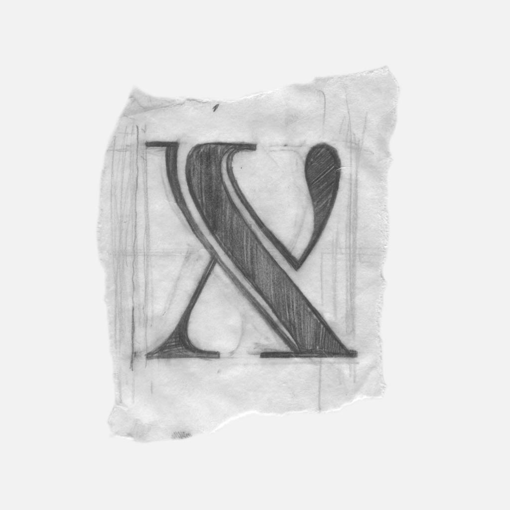
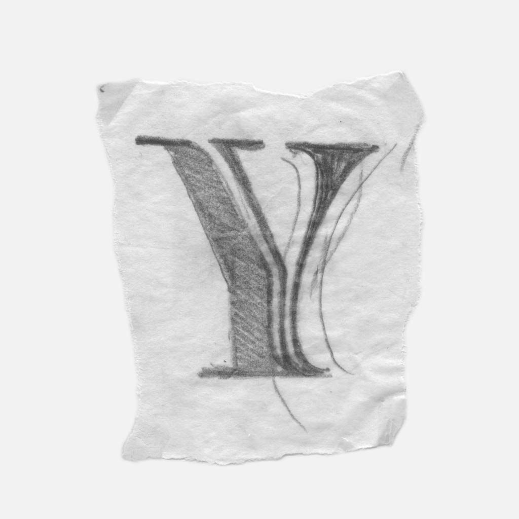
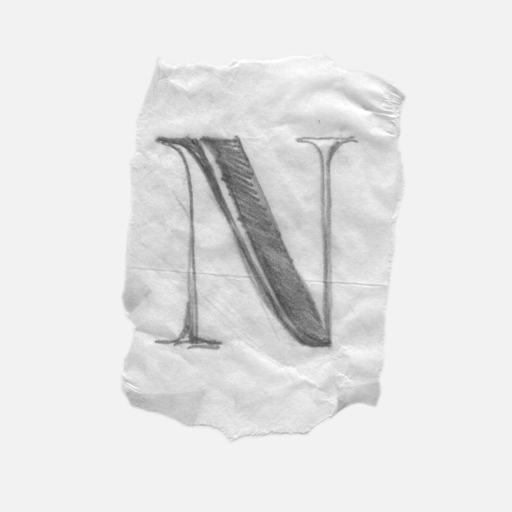
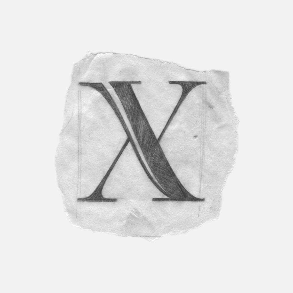
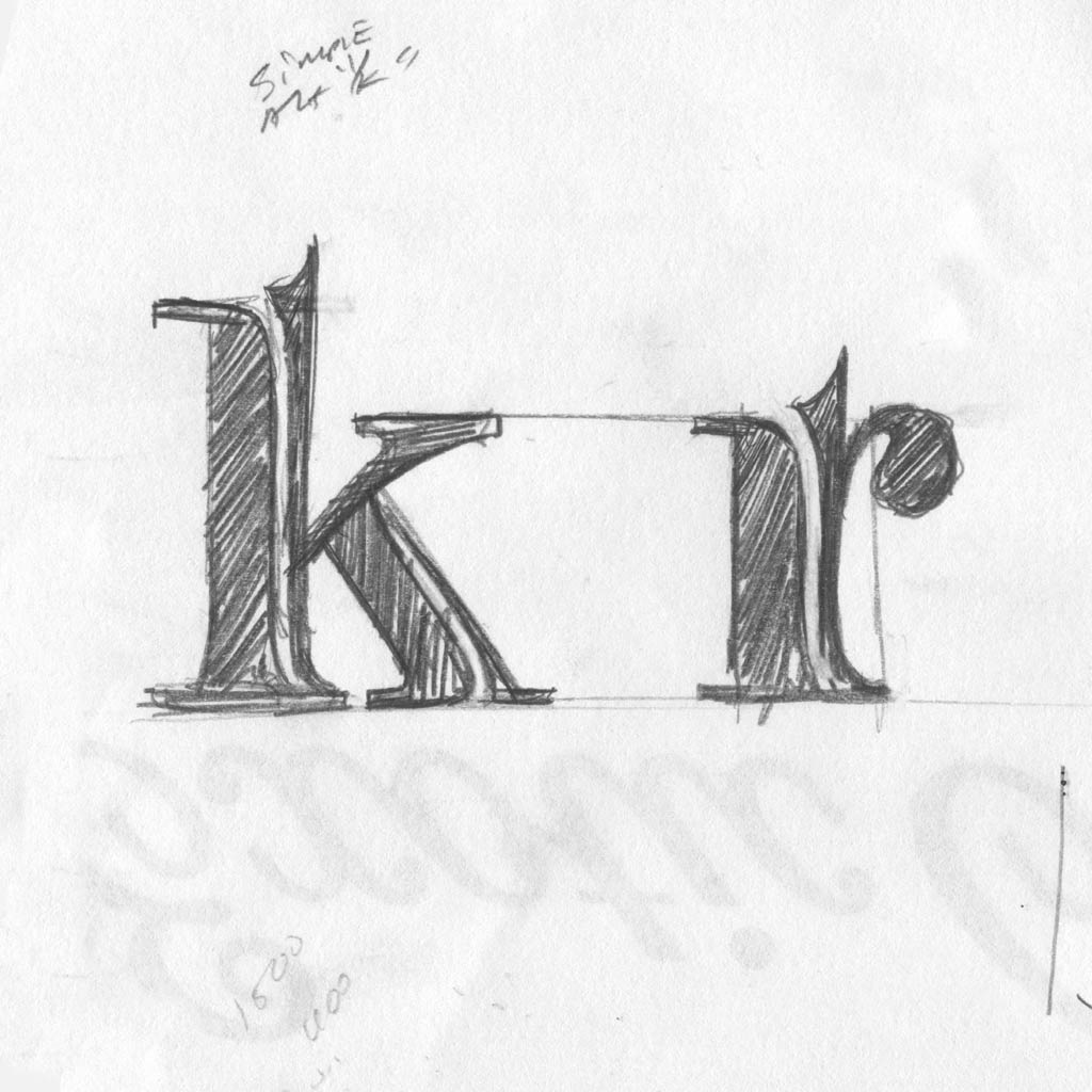
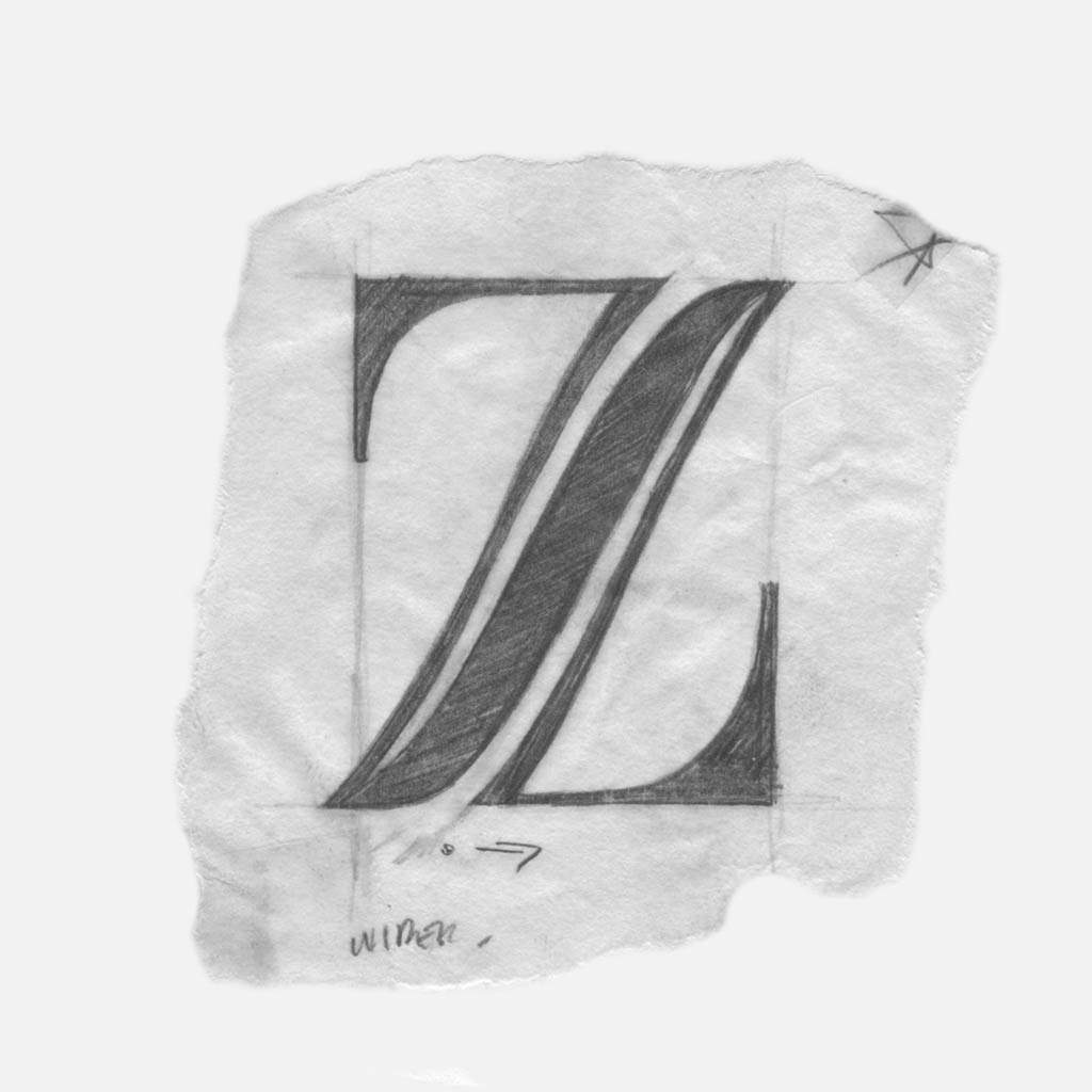
Rule three: for the purpose of balance, angled strokes incorporate two slivers. This is similar to O, but different because the slivers are not symmetrical.

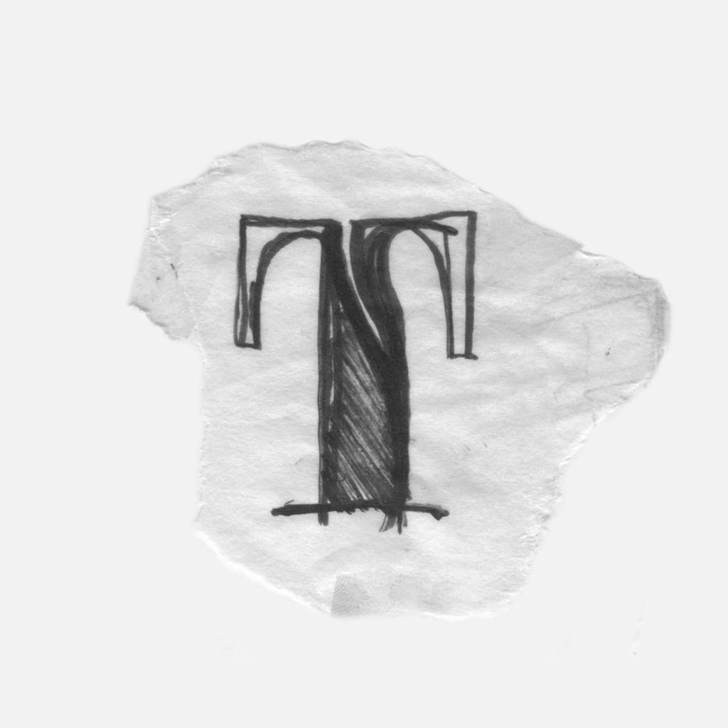
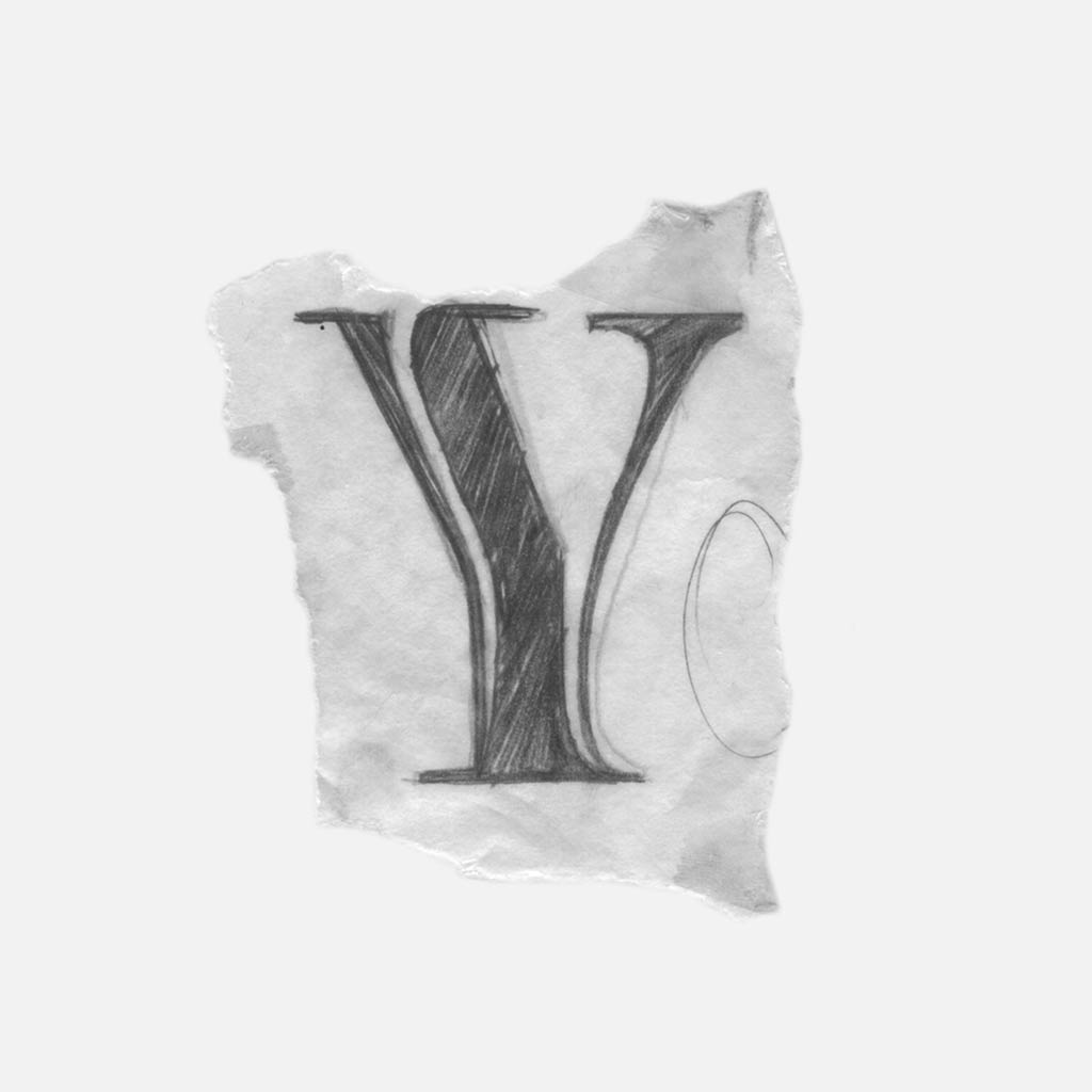
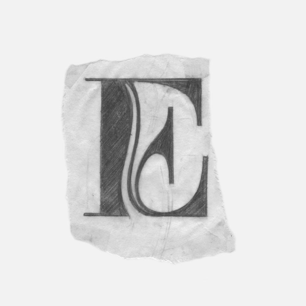
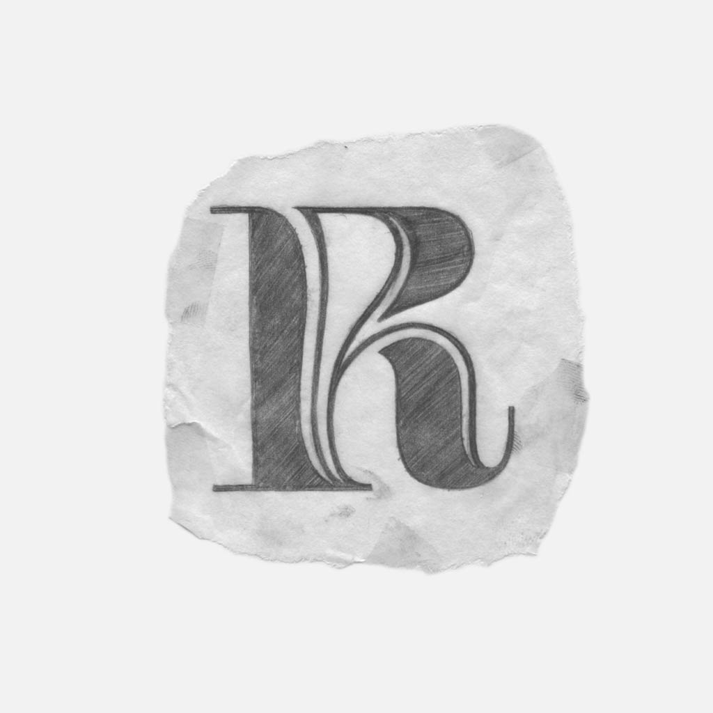
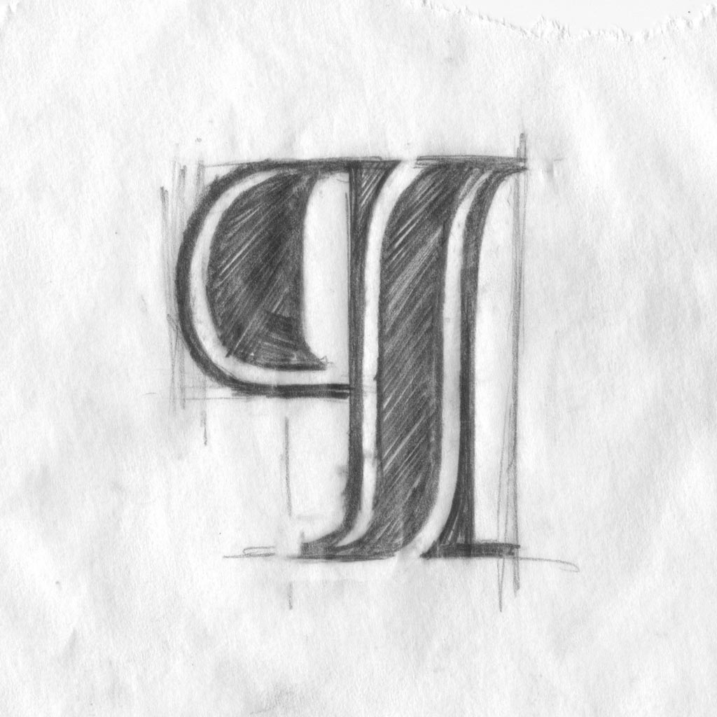
Rule four: when a shoulder connects directly to a stem, they feel awkward. To solve this problem, shoulders run downwards, parallel with the stem and join into an enlarged serif. This creates an extra sliver, additional vertical lines, and variety within the font.

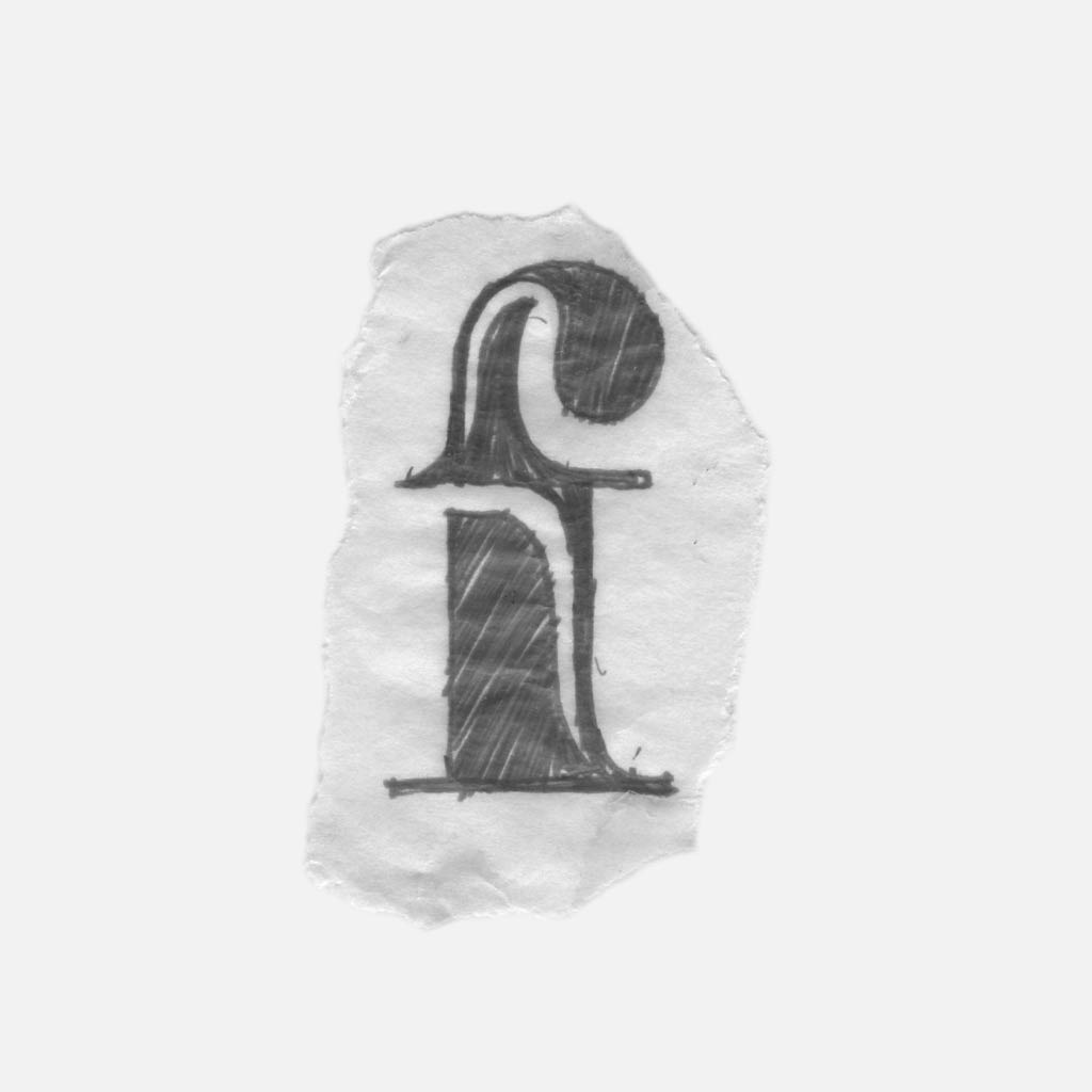
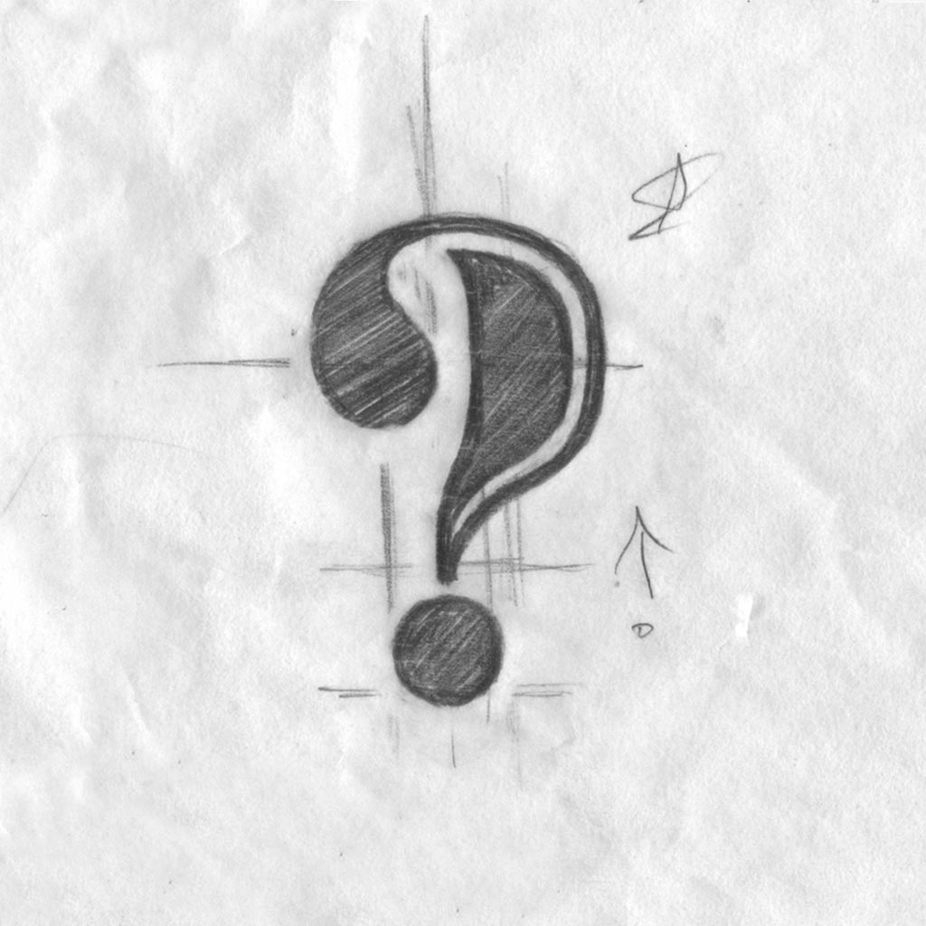
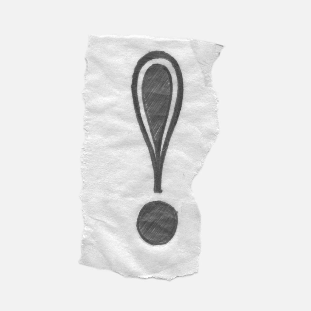
Rule five: when the terminals were given a sliver, the form felt overly complex. For this reason, slivers were not used within punctuation, serifs, or terminals. These simplistic forms provide balance and sophistication for the complex font.

Thanks for reading about the Sliver design process! If you’re interested in purchasing Sliver for a project, follow the link below.