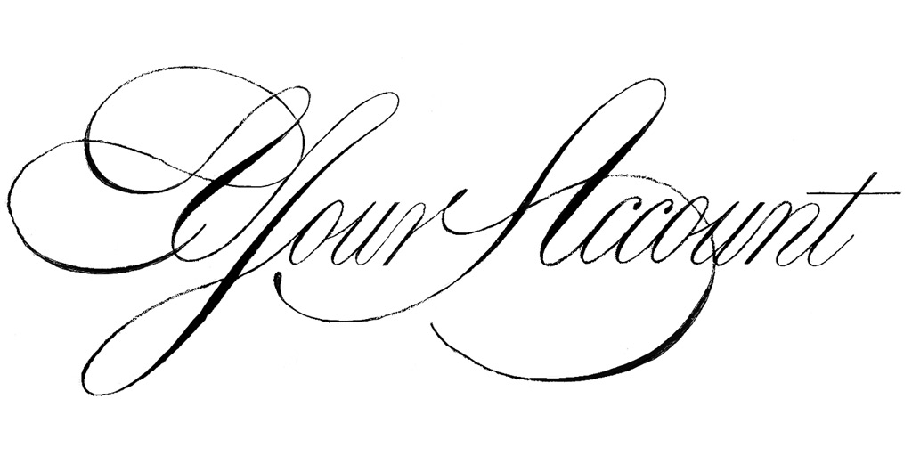
The design process for harmonious, a refined formal script with elegant curves and dynamic spacing reminiscent of 18th-century copperplate examples
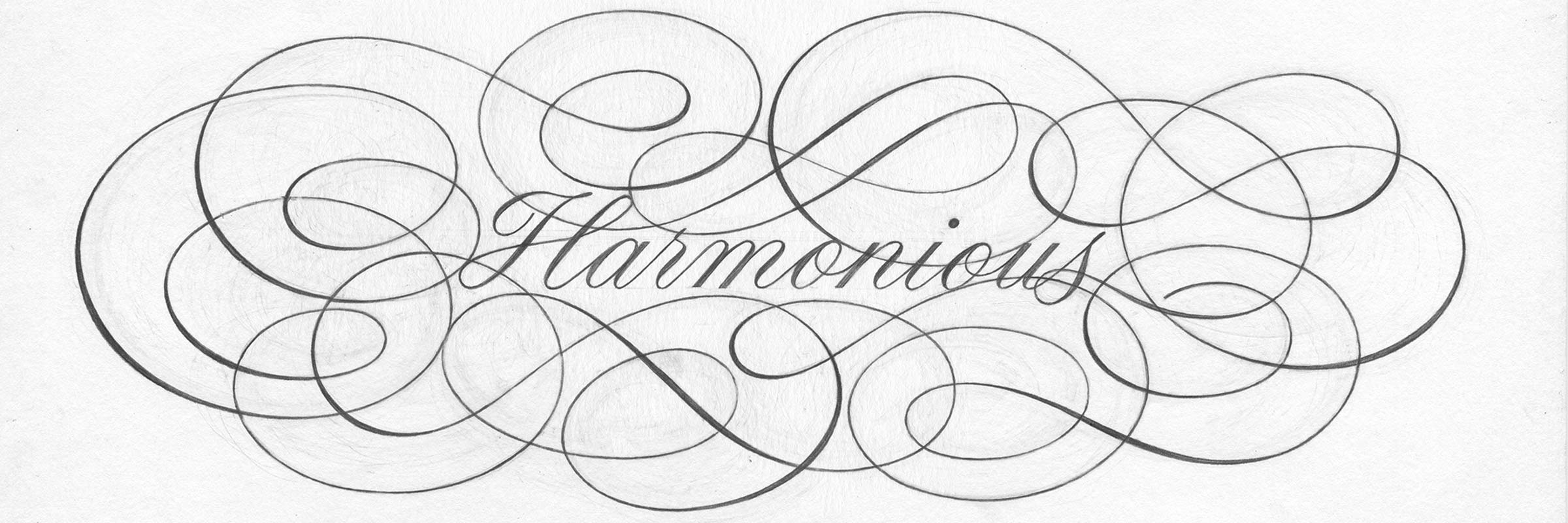
design process for harmonious, a refined formal script with elegant curves and dynamic spacing reminiscent of 18th century copperplate examples
The elegant curves that comprise formal scripts cleverly combine structure with grace and fluidity. As a kid, I remember staring in awe at the impossibly-perfect forms on the packaging of a calligraphy set given to me by my Grandma. That box – and her beautiful handwriting – sparked my obsession with typography and design.
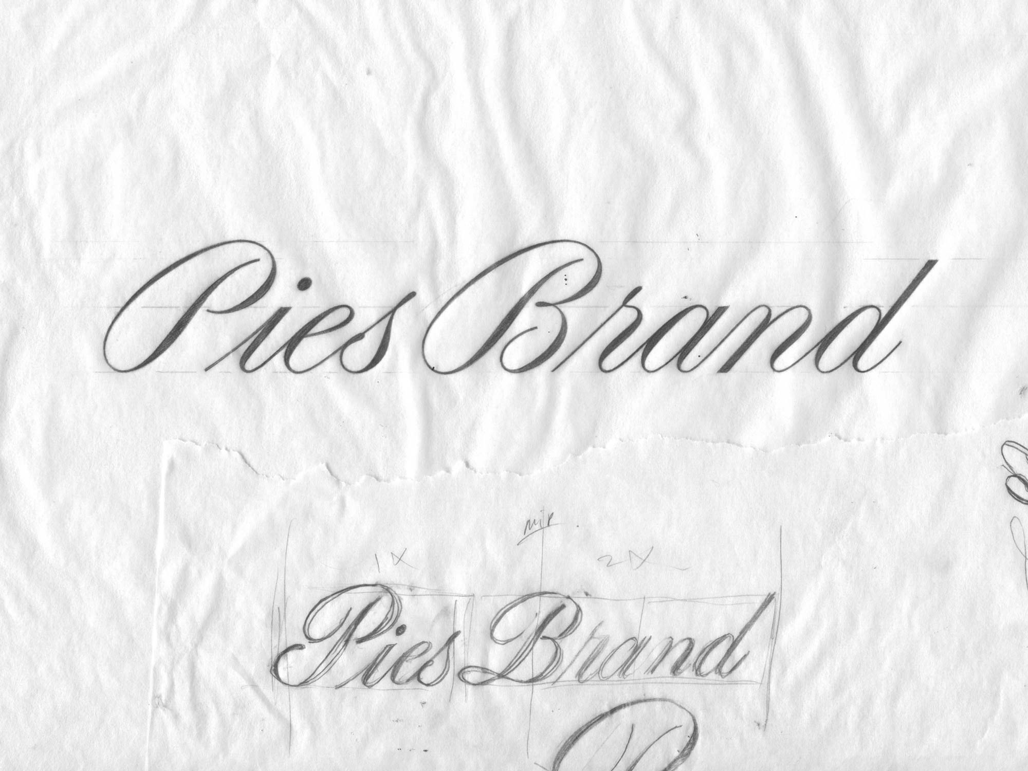
original illustration
Part 1. Illustrations
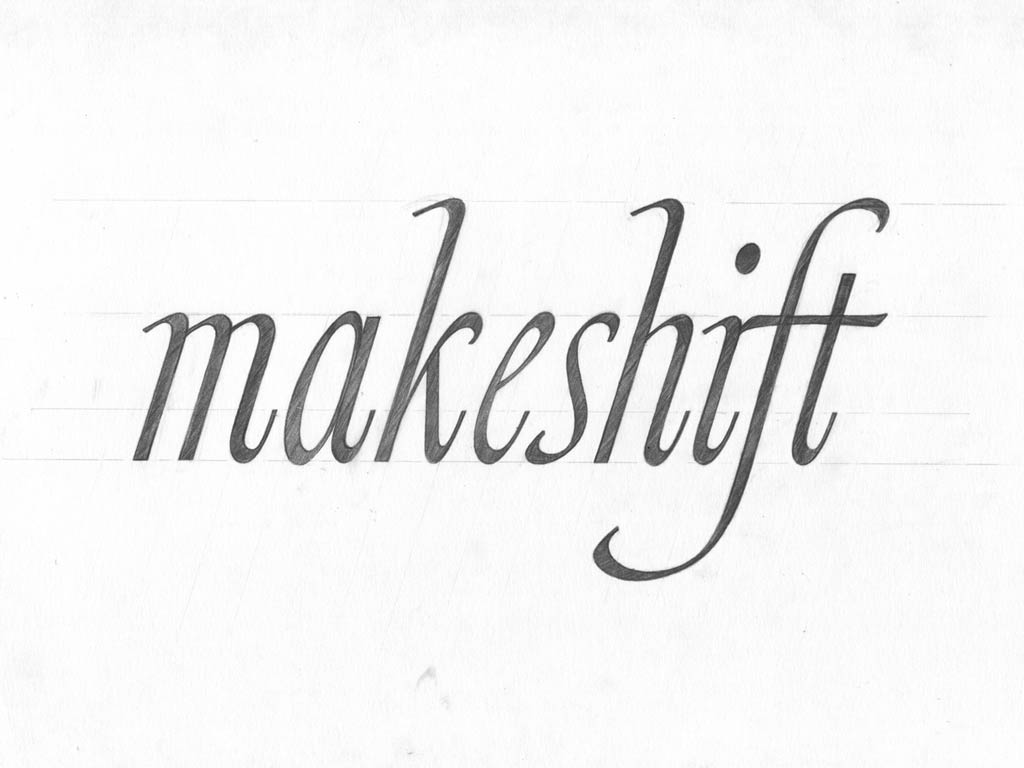
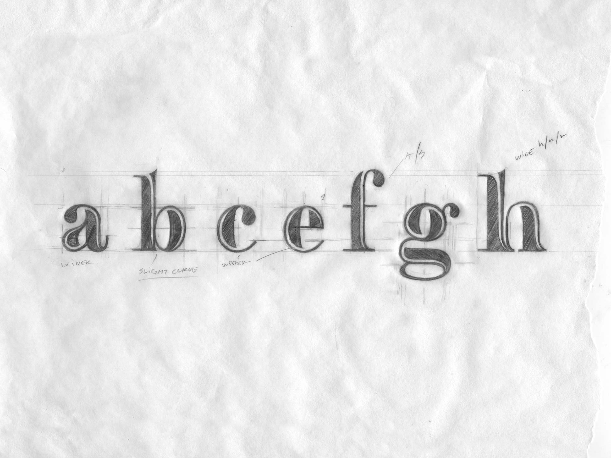
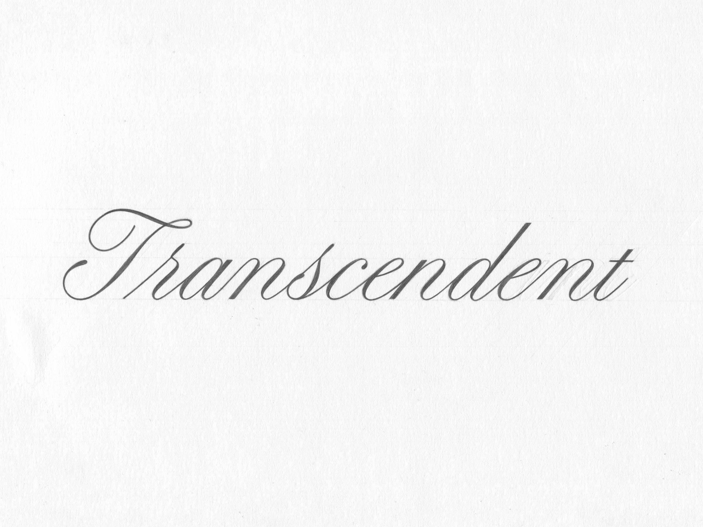
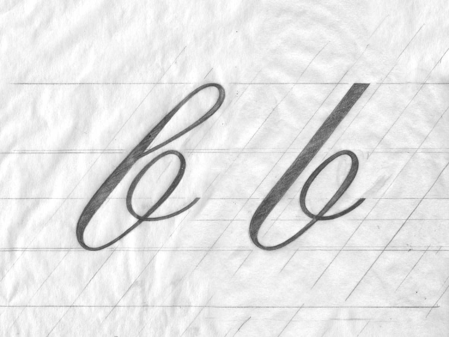
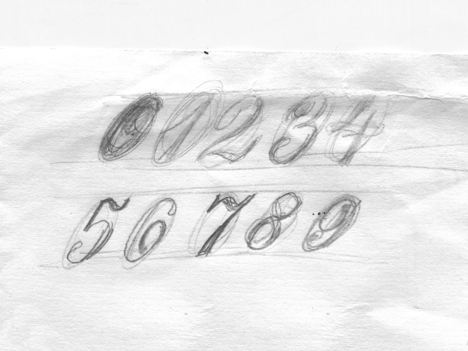
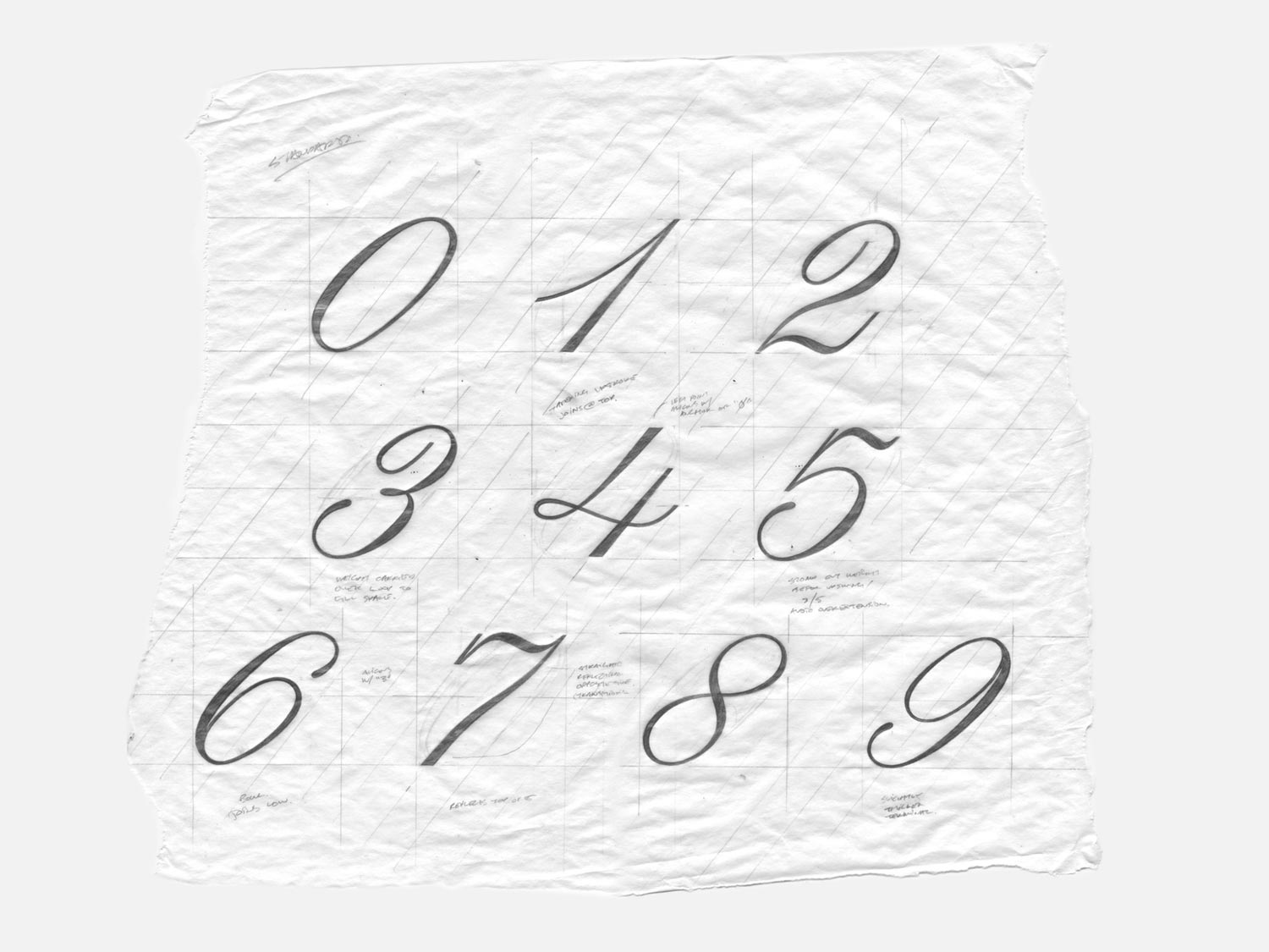
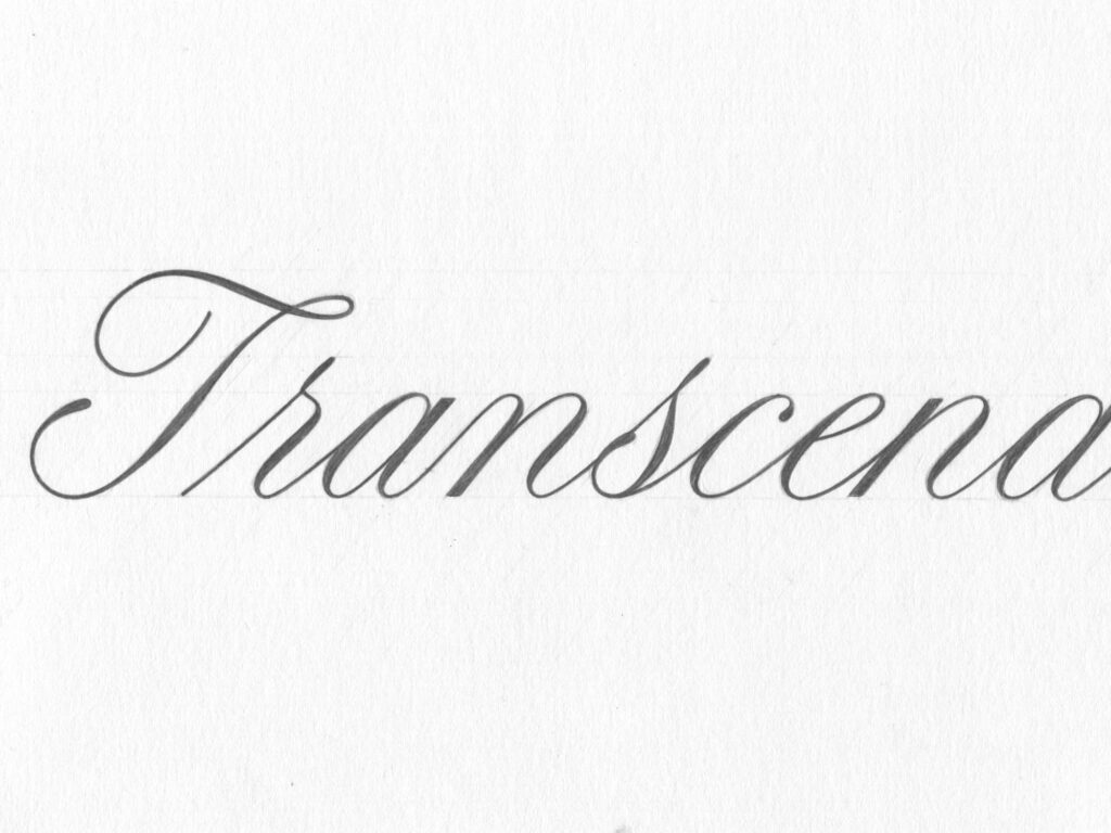
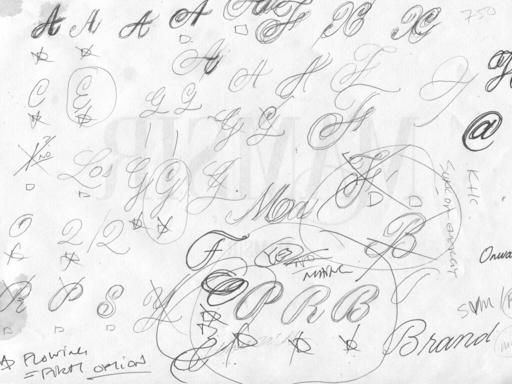
It’s hard for me to imagine something more enjoyable than sitting in front of a computer, next to my snoring dogs, tinkering with curves – I knew a formal script would require a lot of that – so designing a font based on 18th century copperplate seemed like a practical project idea. I got started by hand lettering each form’s structure and then combined them into words to help visualize spacing.
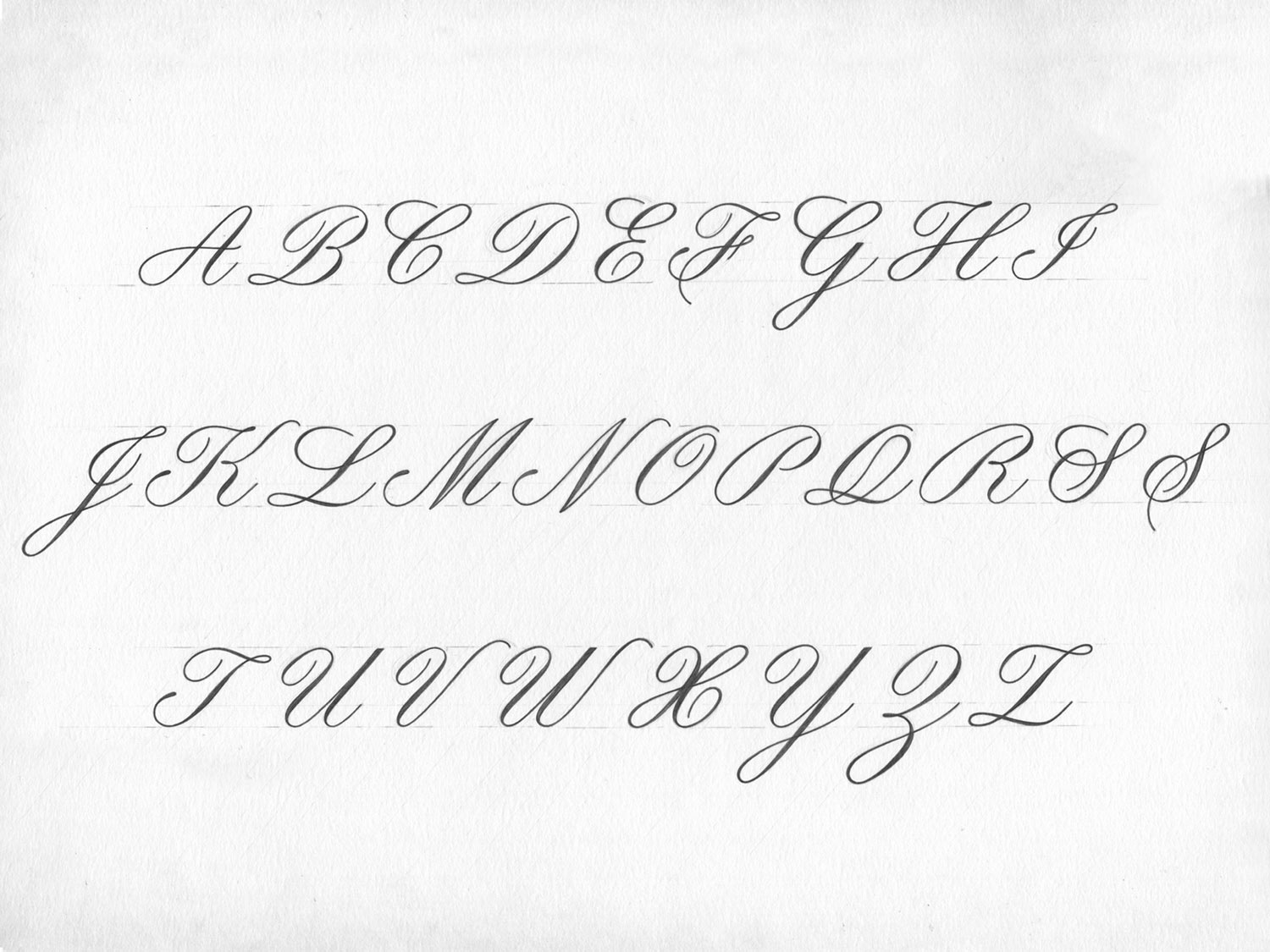
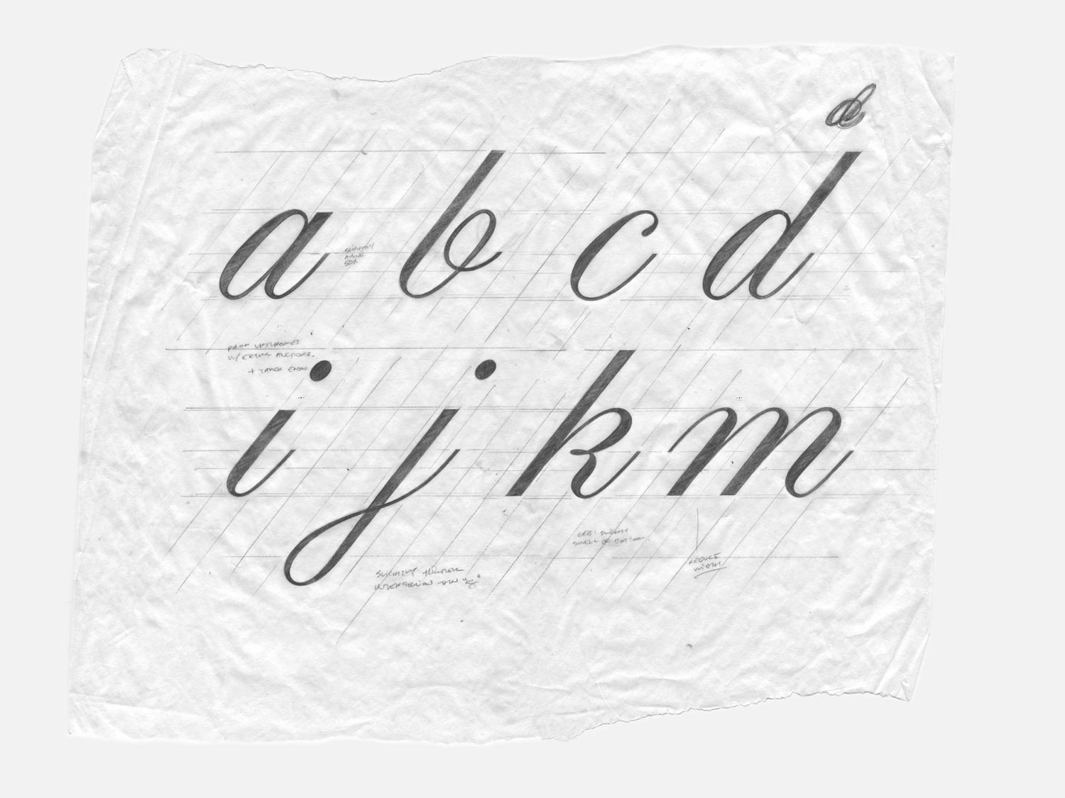
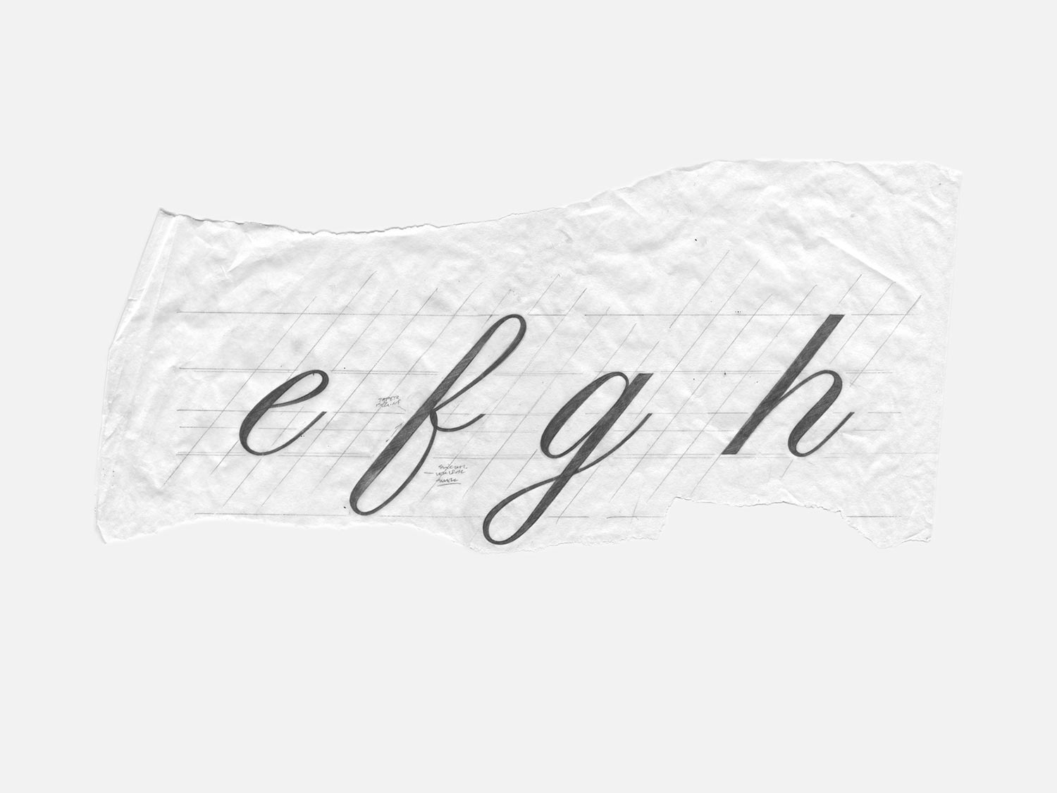
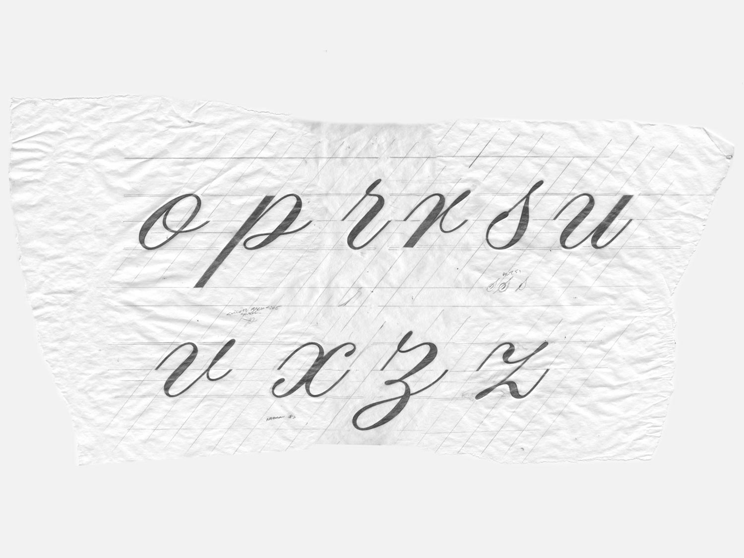

Copperplate makes use of twelve principal strokes; six lowercase and six uppercase, giving the style a structured appearance. Within the lowercase, a variety of connections occur.
Letterforms connect with either an upstroke; that directly connects to the following form (ab above), or with an ogee curve (lm above), where an upstroke connects to a hairline entry stroke, which can be thought of as an indirect connection.
When writing, ogee curves are tightened up, so that the space does not appear noticeably larger than the more common, direct connections. Harmonious mimics this calligraphic writing technique by automatically reducing the width of lowercase letters that make up an ogee connection. This feature makes the font’s spacing uniform and rhythmic, despite the assorted connection types.

Part 2. Characteristics
The font delicately balances traditional characteristics from writing’s golden age, which is considered by many to be the 18th century, with contemporary ideas that improve legibility and balance.
- Dynamic forms – Whenever possible, dynamic forms take priority over more traditional options. The three uppercase Bs are a good example (below), where the most fluid is the default and the two, more traditional forms, are its alternates.
- Elongated teardrop-shaped terminals – Terminals dramatically spring off horizontal boundaries (x-height, cap-height, and baseline). This makes the forms more dynamic and helps create even coloring.
- Uniform proportions – The predictability created by the close-to-uniform width of the uppercase and numbers makes for enjoyable reading.
1. Slope
Compared to the standard 54-degree slope of copperplate, Harmonious is slightly quicker and gets a dynamic boost from its 51-degree slope.
2. Alternates
A large selection of alternates makes the font versatile and adaptable to a broad range of uses. The alternates allow for bold and subtle modifications to single words and large bodies of text. A full list of features is included in part three.
3. Spacing
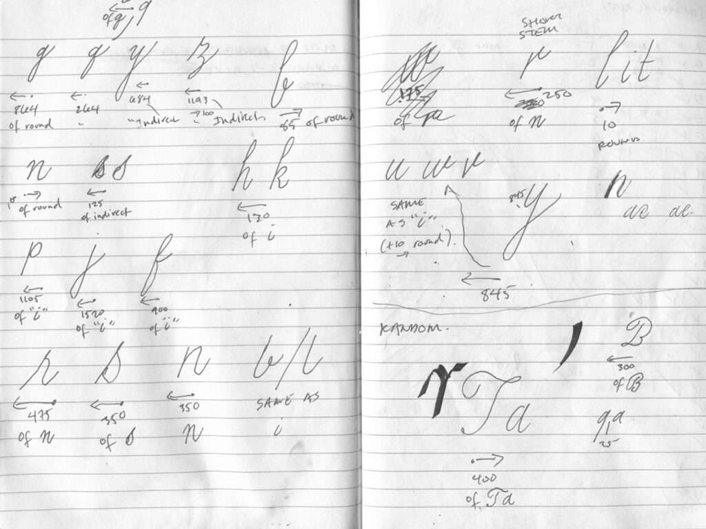
The image above shows how subtle modifications are made to the upstroke and entry-stoke of the contextual alternates used for spacing adjustments. The adjustments help squish together, to varying degrees, cumbersome pairing combinations.
upstroke
indirect entry-stroke
The upstroke category (example above) encompasses any form with an upstroke. The indirect entry-stroke category includes all forms that connect to a preceding letter with a hairline upstroke that begins at the mid-point between the baseline and x-height. As you can see above, there is an overlap between the two categories because the indirect entry-stroke n u also has an upstroke.
The special-spacing-alternates are divided into four groups: 1. tight upstroke 2. tight indirect with regular upstroke 3. regular indirect with tight upstroke 4. tight indirect and tight upstroke.
To reslove spacing issues, Harmonious below uses an a with a tight upstroke, an r with a tight indirect and tight upstroke and an m with a tight indirect and regular upstroke. The rest of the lowercase forms have a regular upstroke. If no spacing alternates were used, arm would be more expansive than the lowercase that follows it. Shortening arm, causes it to blend in. Good type design requires short arms, just kidding.
harmonious regular – active features: calt
Three rules dictate when a lowercase form is replaced:
- Use regular length upstroke when it precedes a stem, round, or empty space.
- When upstroke precedes an indirect connection, replace both; upstroke with a tight upstroke and the indirect with a tight indirect.
- When a letterform with an indirect and upstroke falls between an upstroke and indirect, replace it with a tight indirect and upstroke + replace the surrounding form on the left with a tight upstroke and the form on the right with a tight indirect.
These rules provide the foundation for OpenType classes, features, and substitutions that automatically adjust areas where spacing would otherwise be too large, giving the font a rhythmic, custom feel.
Part 3. Features
Harmonious defaults to a natural writing style that can be simplified, hovering on the image (above) shows how flat lowercase alternates can take the place of the more complex, standard indirect entry strokes.
All lowercase forms with indirect connections include a flat alternate, which can be manually selected, or activated with stylistic sets. The flat alternates are intentionally divided into separate stylistic sets for maximum ‘complexity control’.
Below is a complete list of the font’s OpenType features:
CALT
Automatically resolves spacing and unappealing relationships.
SS01
Traditional A, B, F, O, P, Q, R, S and T.
SS02
Upstroke C, E, G, X and Z.
SS03
Simple alternate C, E, G and O.
SS04
Alternate B.
SS05
Alternate F.
SS06
Traditional alternate F.
SS07
Alternate S.
SS08
Flat ascenders; b, f, h, k, and l.
SS09
Upstroke r and s at break points to mimic calligraphic writing.
SS10
Flat alternate m, n and r.
SS11
Flat alternate u.
SS12
Flat alternate v and w.
SS13
Flat alternate y.
SS14
Traditional alternate p.
SS15
Alternate r.
SS16
Alternate x
SS17
Alternate z.
SS18
Alternate &.
AALT
Manually select forms and access the o, p and s without an upstroke.

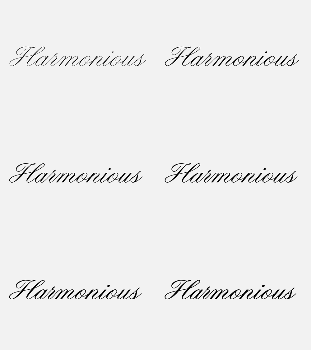
Variable Weight Axis
Variable font included with family license.
This project was an attempt to capture the timeless elegance of past examples and merge the copperplate style with features that help further its beauty with practical functionality. More than anything, it was an excuse to spend time working in a style that I love.
If you’re interested in learning more about script lettering, I’d recommend: Script Lettering For Artists by Tommy Thompson, which explains how to construct each form and The Universal Penman Engraved by George Bickham, a beautiful collection of the very best copperplate specimen.
Thanks for reading and your support! Please consider subscribing to my mailing list below or sharing this post (left) if you found it helpful.
