presentation one
Client: Zag Man LLC
Below is the first presentation showcasing formal script logotype options. My main goal in this round, was to explore structure and complexity. This will allow us to narrow in on your favorite characteristics in the next batch of revised illustrations.
Below are rough options that explore character options and slight variations in style.


I stumbled on this “Z” (above) made up of three separate strokes. I love the way you combine subject matter in your work and I thought this was a cool way to mirror that skill through typography – separate pieces forming the whole.
From the sketchbook, I pulled the stronger directions onto tracing paper so they could be explored in more detail and refined.


Below are touched-up digital images showing the directions we could take.
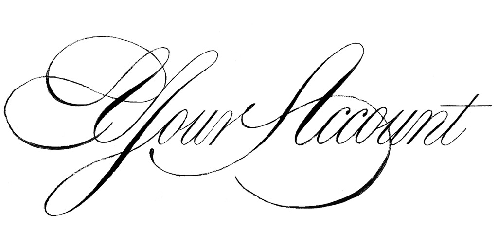
1. Simple – This one is a simple formal script, with a few subtle, elegant details that give it a custom feel. The first stroke of the M descends below the basline to align with the Z, and the swash next to the top left of the M, mimics the top portion of the Z.

2. Overlap – An alternate M is used in these versions, which allow it to gracefully intersect the g in Zag.

3. Ligature – The g in these three examples, is elaborate, and extends to connect to the M in Man – joining both words together.

4. Semi-complex – An elaborate M interacts with the other letterforms.

5. Complex – Extra, disconnected flourishes, create more complexity.

6. Extra Complex – Even more flourishes are added to create a container around the logotype and maximum complexity/curviness.

Let me know your thoughts on which direction(s) you like best.
Additional Considerations:
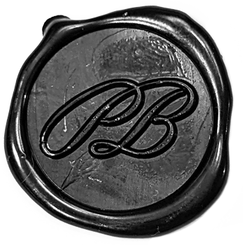
![]() 1. Monogram – We could create a monogram that reflects the logotype’s style. These are useful for small size uses and instances where you don’t need a full logotype. Let me know if your interested and I’ll work on revised versions in the next round of sketches.
1. Monogram – We could create a monogram that reflects the logotype’s style. These are useful for small size uses and instances where you don’t need a full logotype. Let me know if your interested and I’ll work on revised versions in the next round of sketches.
2. System – If you’re interested in the ‘extra-complex’ direction (6), I think we should also design a simple version to go with it. The simple version could be used in instances where the complex version isn’t appropriate or necessary. This would give us three designs in total; monogram, simple logotype, and complex logotype (below).

3. “Zag Man” or “Zag Man LLC” – Lastly, we need to decide if we’re going to include “LLC” in the logotype. For artist logos, I think it’s more common to leave out “LLC”, but it could be done in a way that makes sense. For example, if we end up going with the three designs (above image), we could include “LLC” in the complex composition and leave it out of the simple logotype. This would let the simple logotype be a signature, while the composition would be more of an ad for your business. That would work well and feel natural.
If we end up going with two designs – an icon and simple logotype – I would recommend leaving out LLC, so that the logotype feel like a signature instead of an ad. But ultimately, it comes down to your preference.
Thanks for reading —! I’m excited to hear your thoughts!
All the best and talk soon,
Stephen