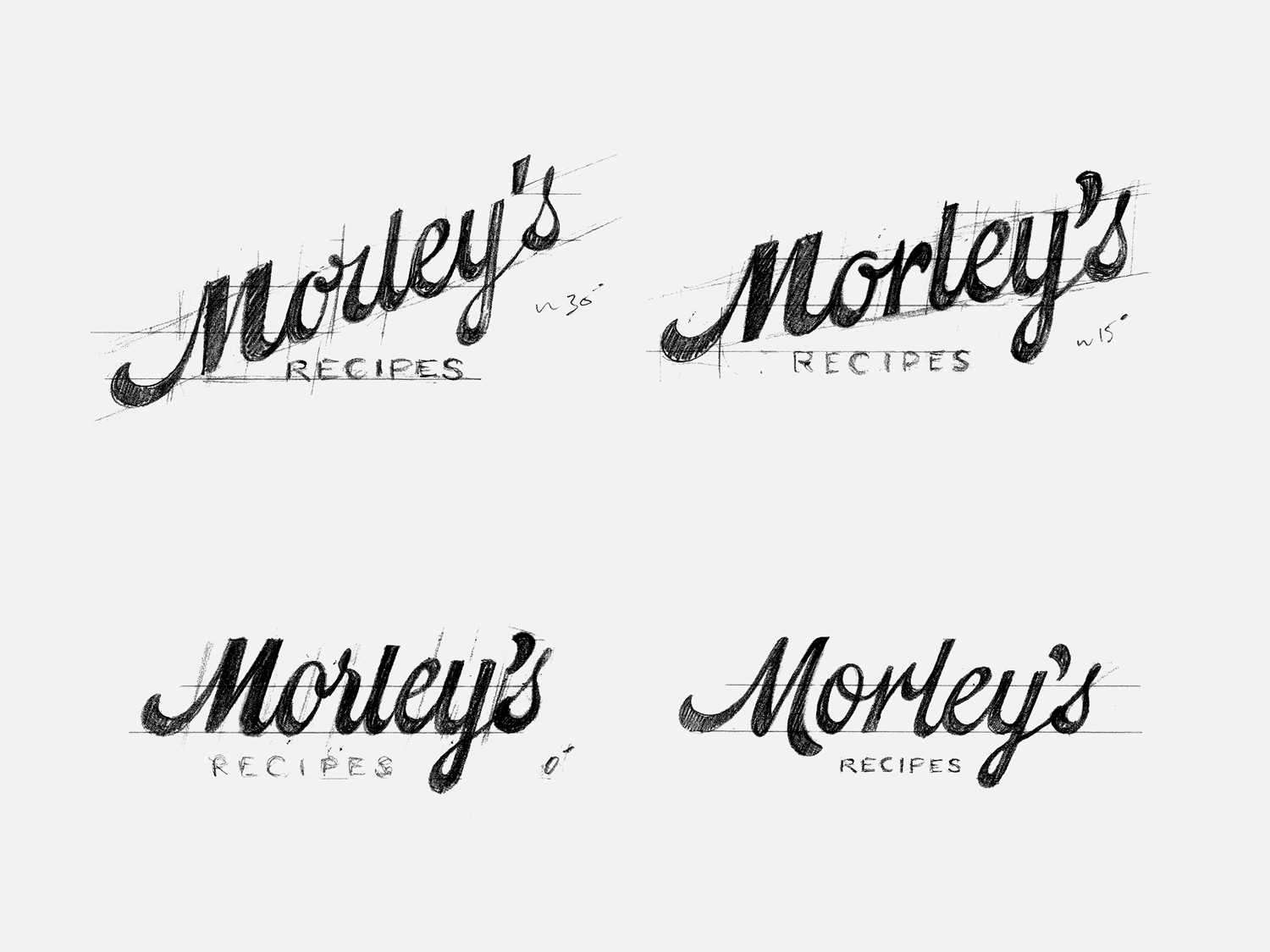
presentation one – rough directions
Client: Morley’s – Australia
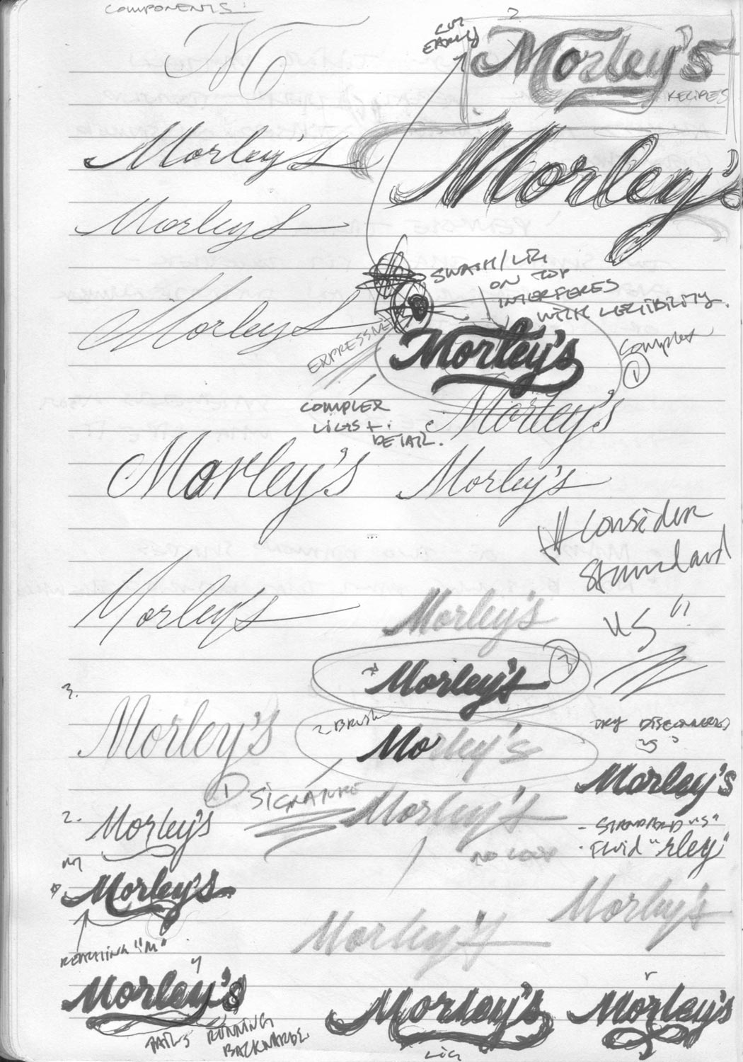
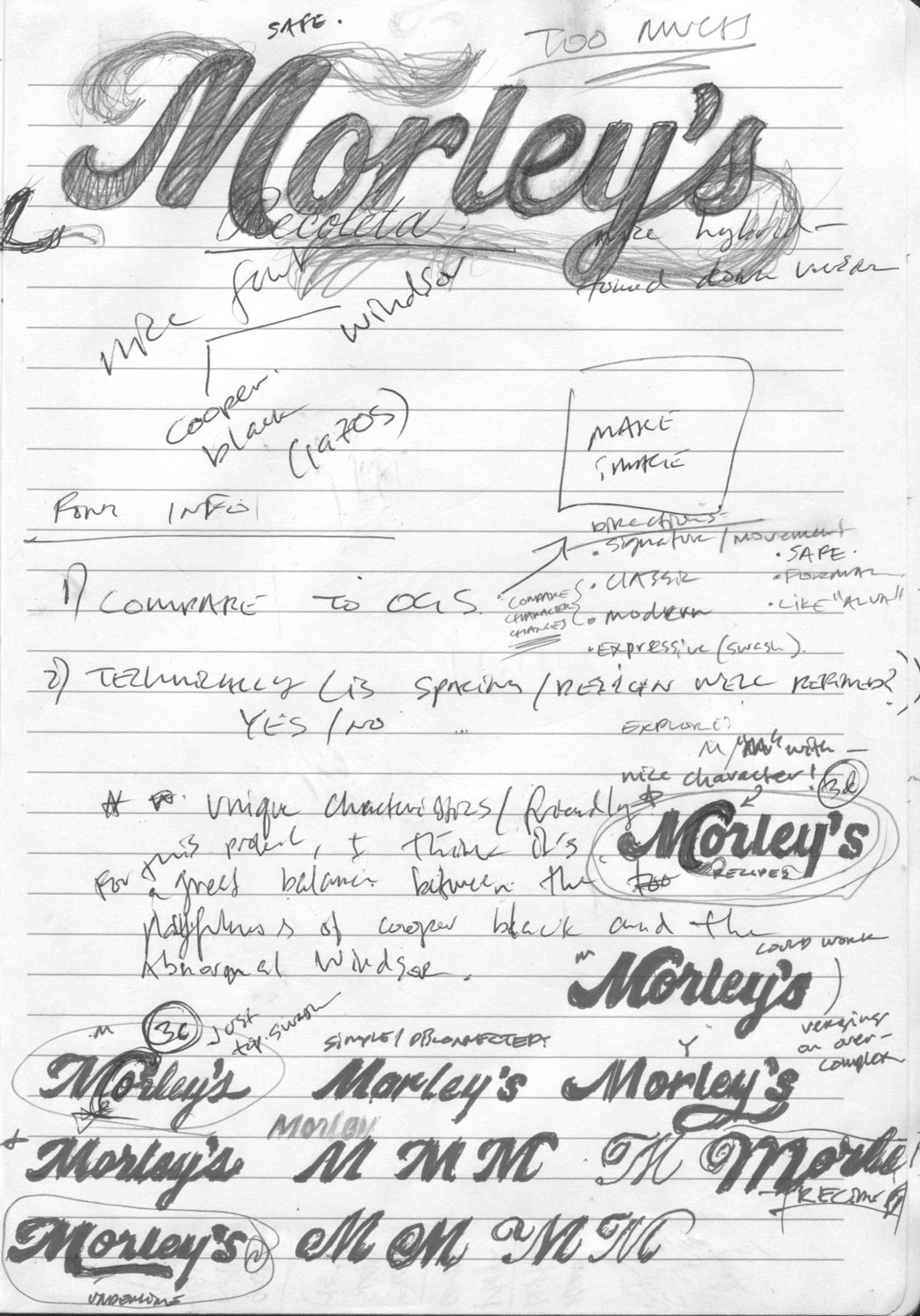
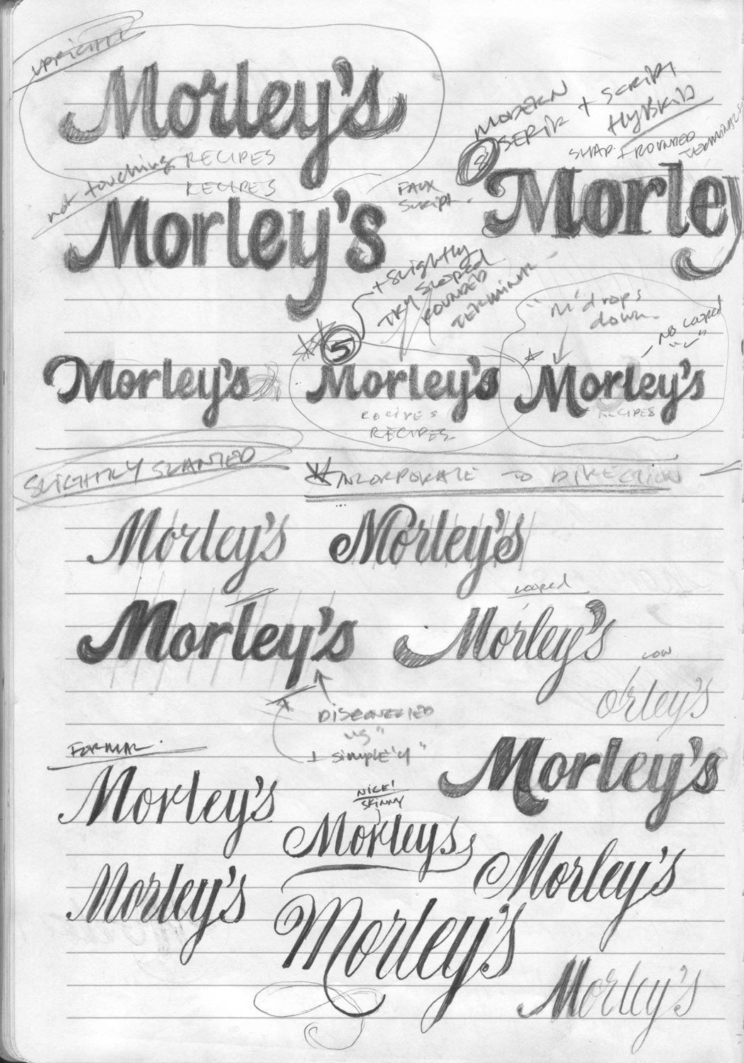
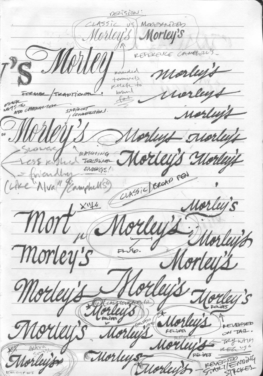
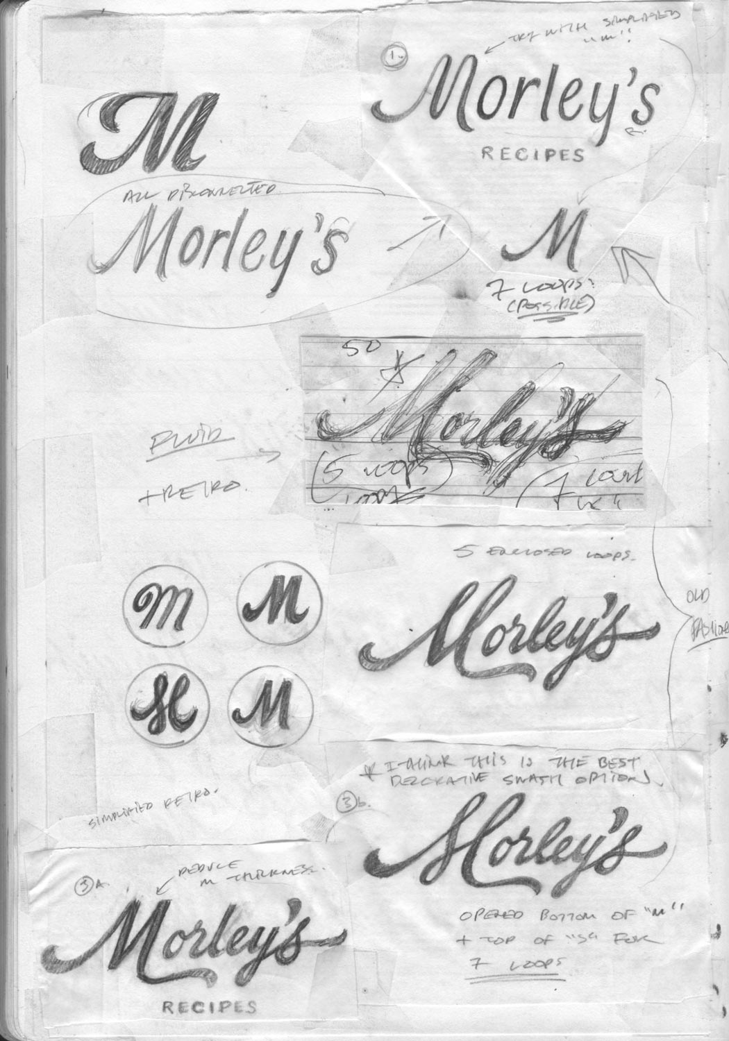
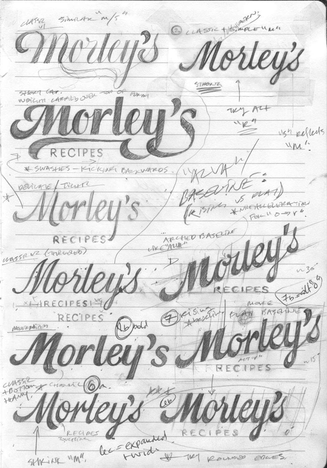
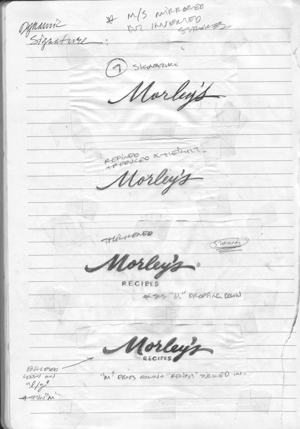
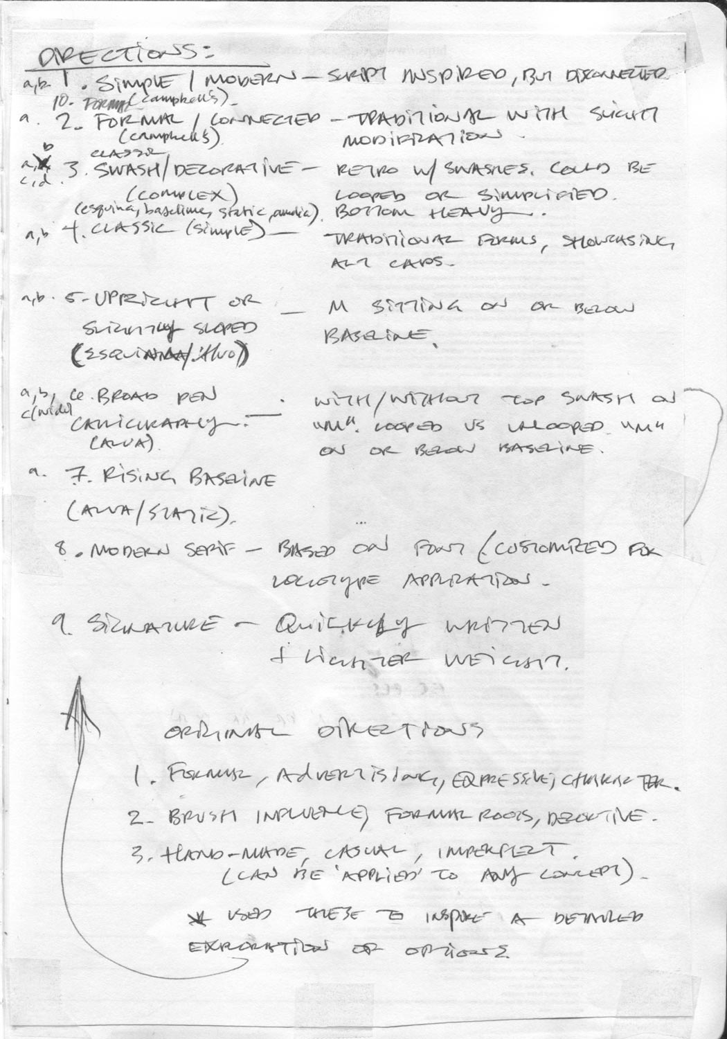
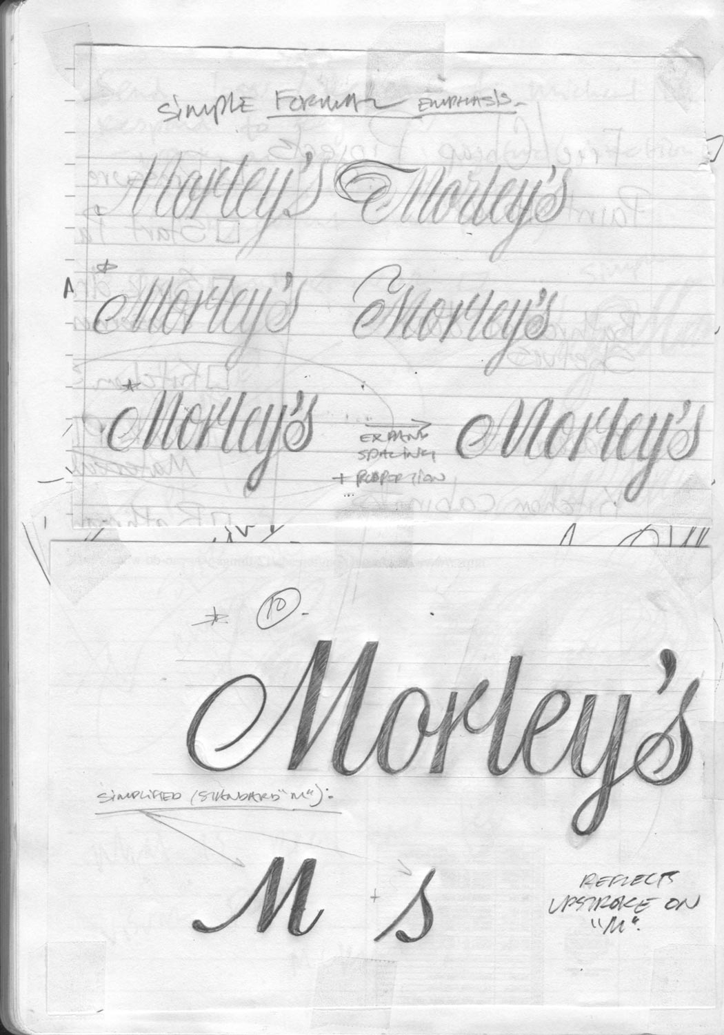
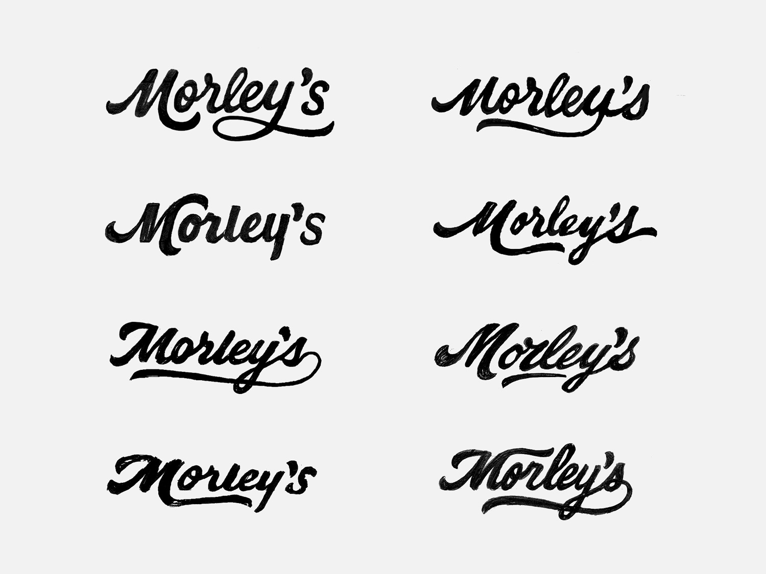
The art direction for the project contained all script examples, which I divided into three categories: formal/classic, brush-influenced, and handmade – the logos associated with each category can be seen in the bottom left image, left side. With hand lettering and calligraphy techniques, I explored styles, letterform options, spacing, composition structure, and weight.
Presentation One
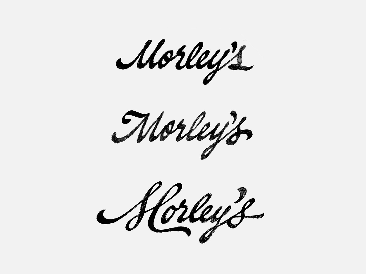
Below are rough scans, touched-up digital images, and finally, the directions I think are strongest. After you’ve reviewed the presentation, let me know which characteristics or directions you’re interested in exploring further in the next round.
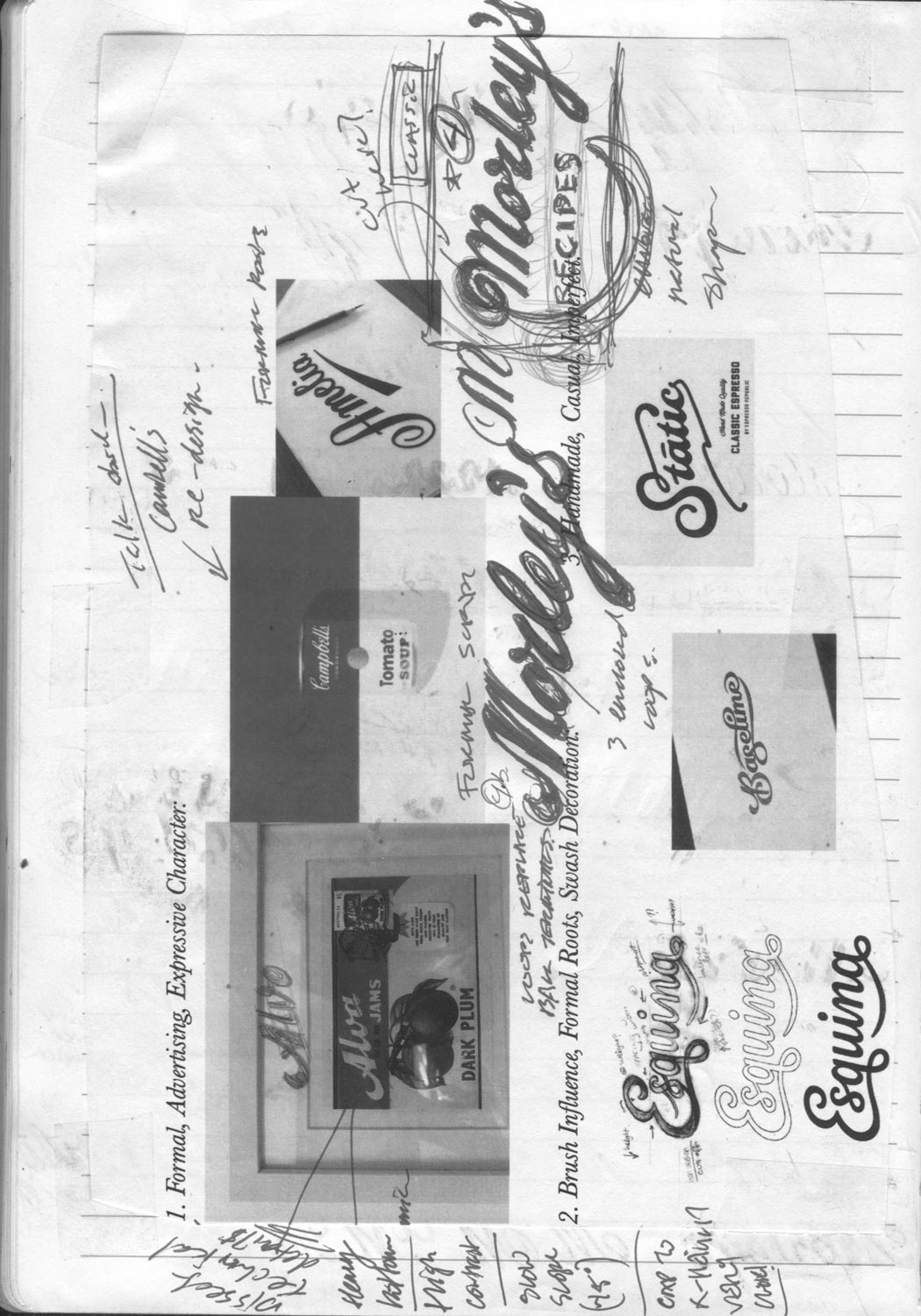
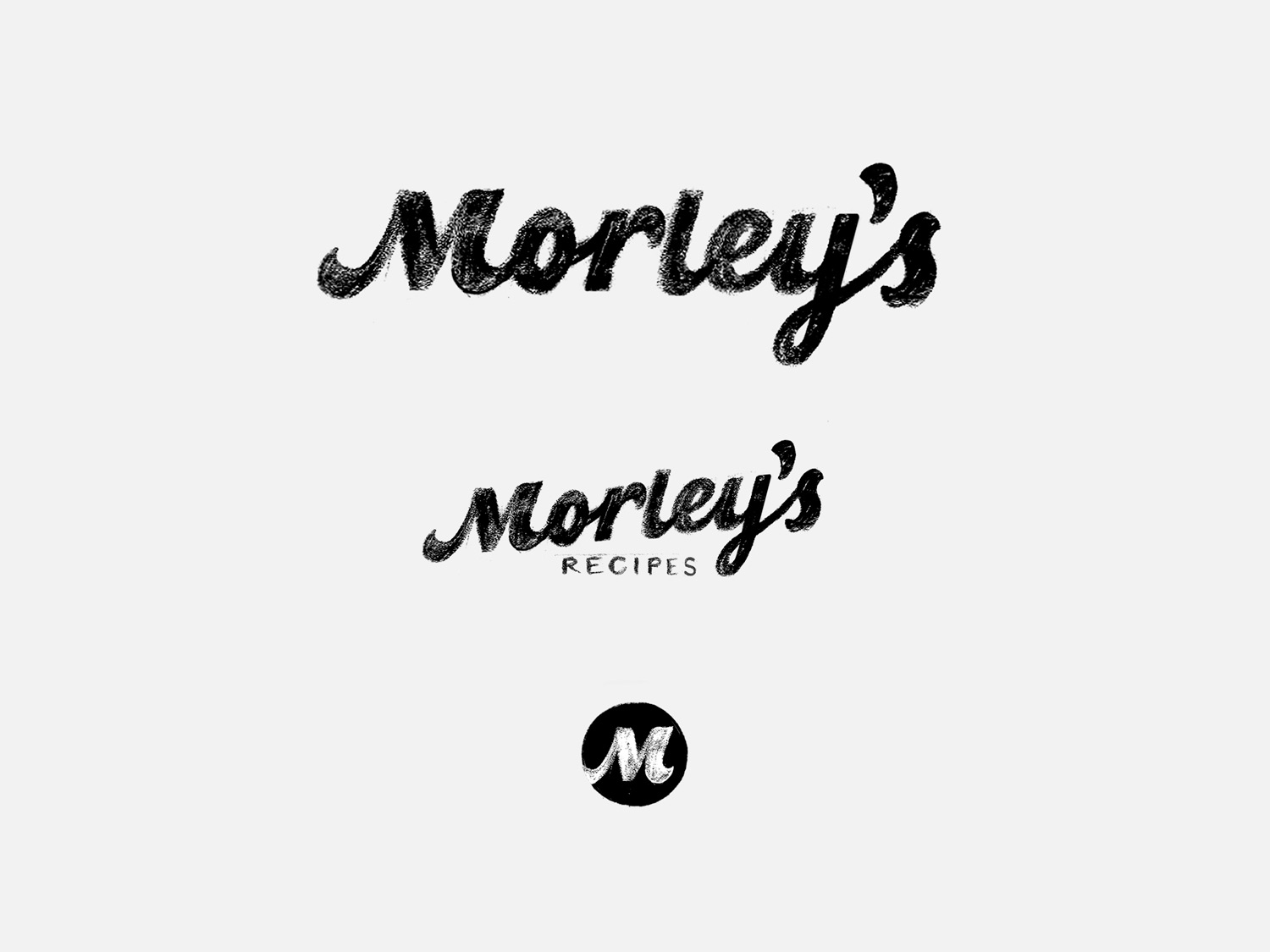
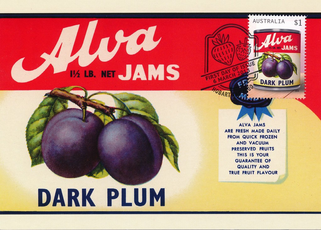 I sense how special Alva is in comparison to the other examples. It’s expressive, well-crafted, and does an amazing job of conveying the sense of love and care that Morley’s embodies. Many of the technical details present in Alva the logotype are reflected by the other logotype images referenced in the initial art direction: mild slope, bold forms, friendly tone, and dynamic forms.
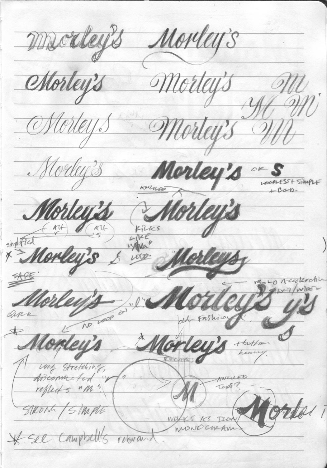
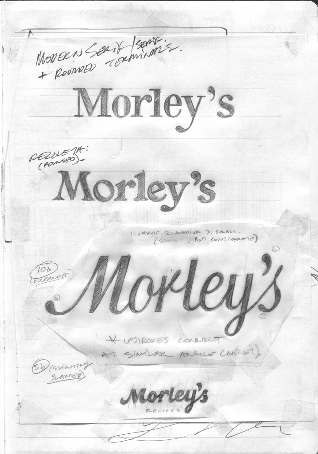
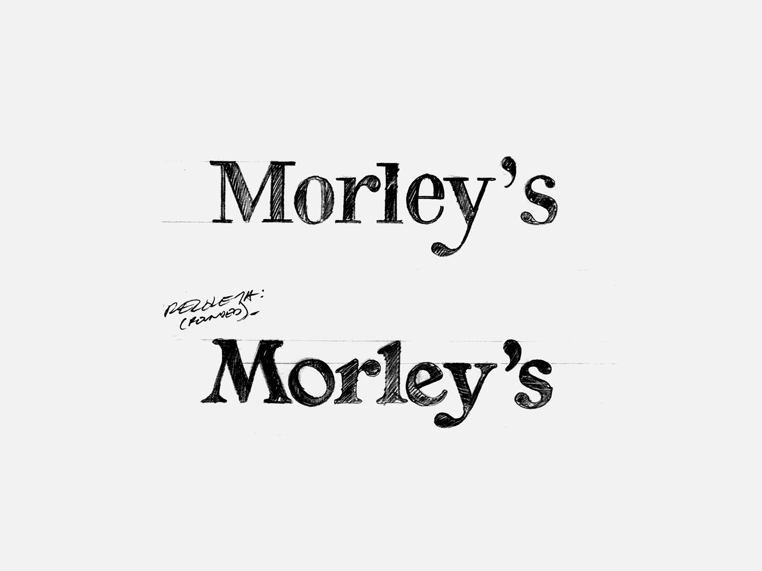
Below are touched-up digital images, pulled from the sketches above. The first three directions deliberately depart from the art direction to showcase our complete spectrum of options.
1. Serif – Simple, custom serif forms. Top: modern serif. Bottom: based on Recoleta.
2. Disconnected – Italic forms with no script connections. Top: Recipes tucks up into logotype. Bottom: Recipes sits below logotype, just under the descender of the y.
A relevant, recent redesign to consider is Campbell’s. They updated their script logotype by removing all of its connecting strokes and simplifying some of the more ‘difficult to read’ script letterforms. Part of the reasoning for this is that many people today have a hard time reading/writing script. I think this modernization technique detracts from the charm and character, but despite that, I wanted to include it as an option.
Below, I’ve shown how the formal script structure can be represented by modernized, simple, disconnected letterforms that retain a script influence.
3. Formal – Traditional formal script variations – with connecting strokes. Both of these options use an r that is more recognizable than the standard formal script r (as seen in the top option from the image above).
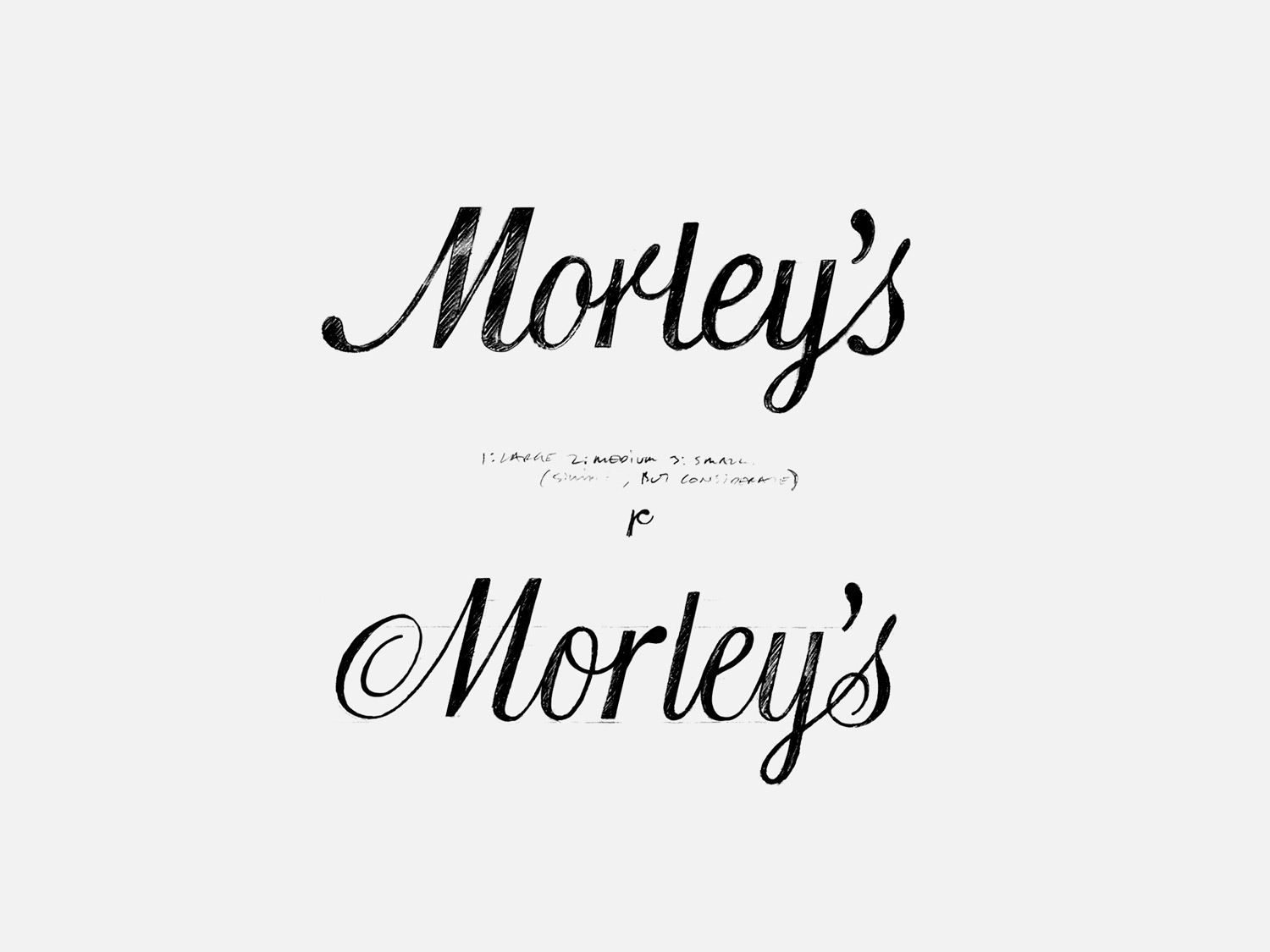
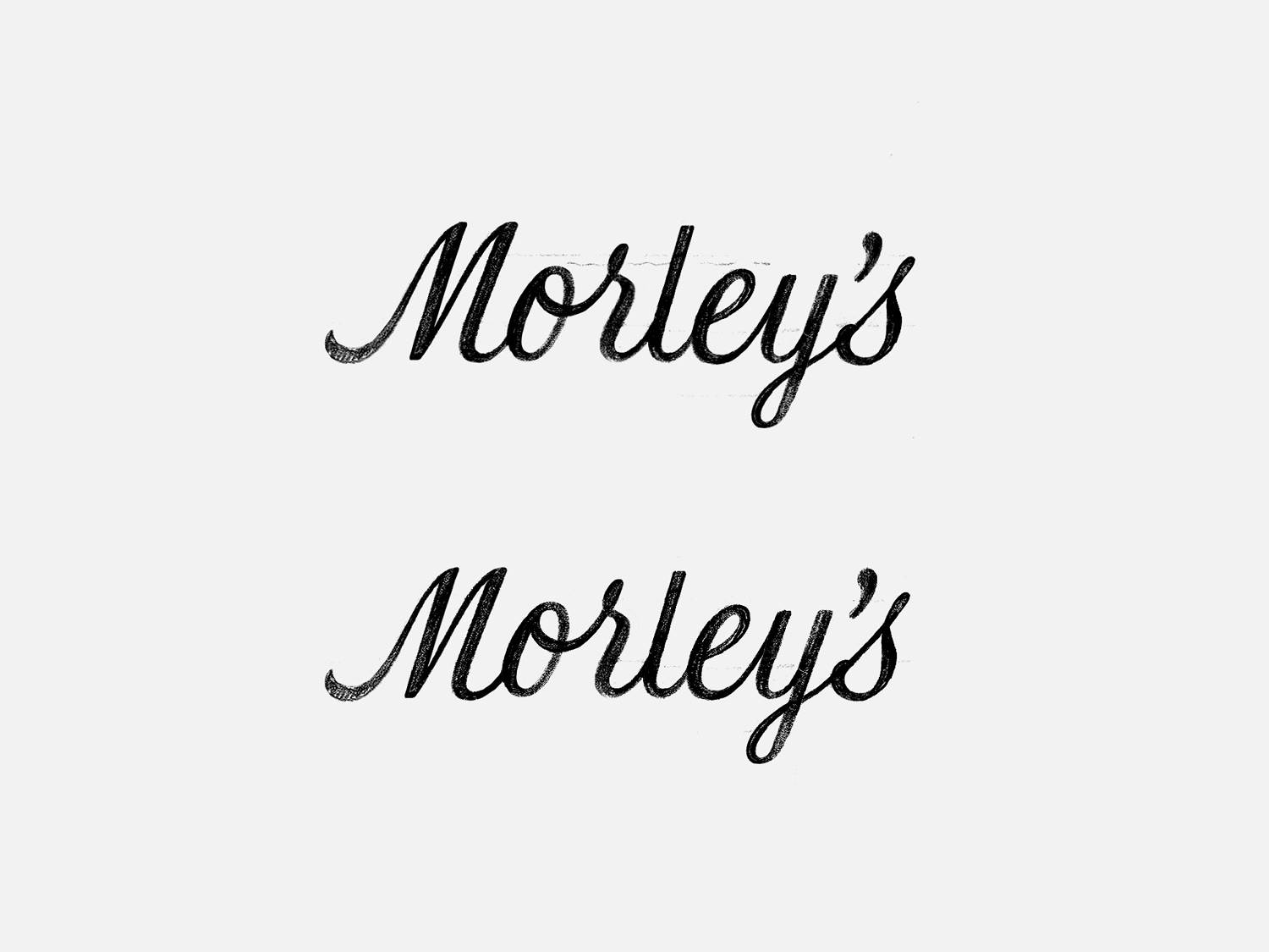
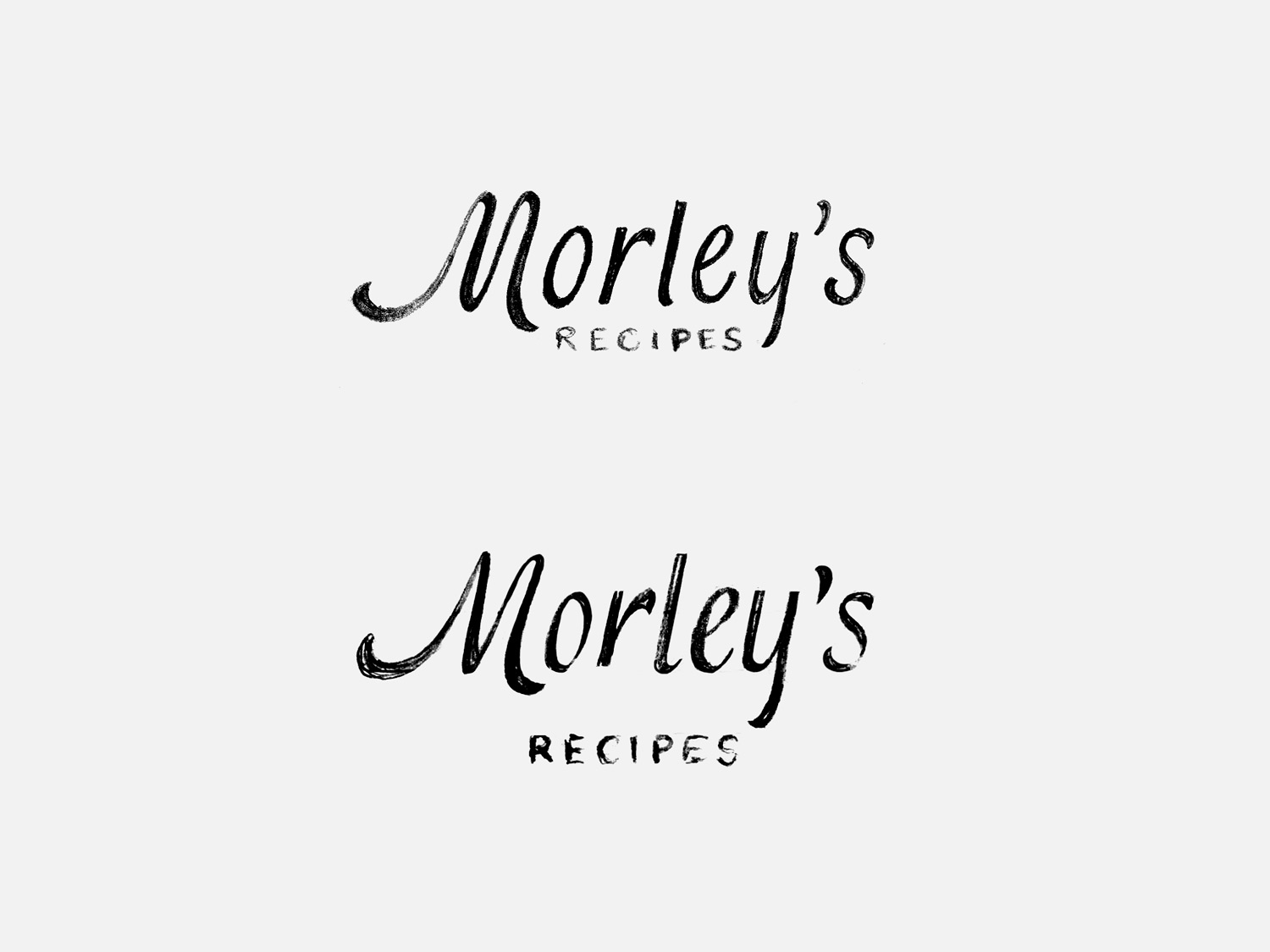
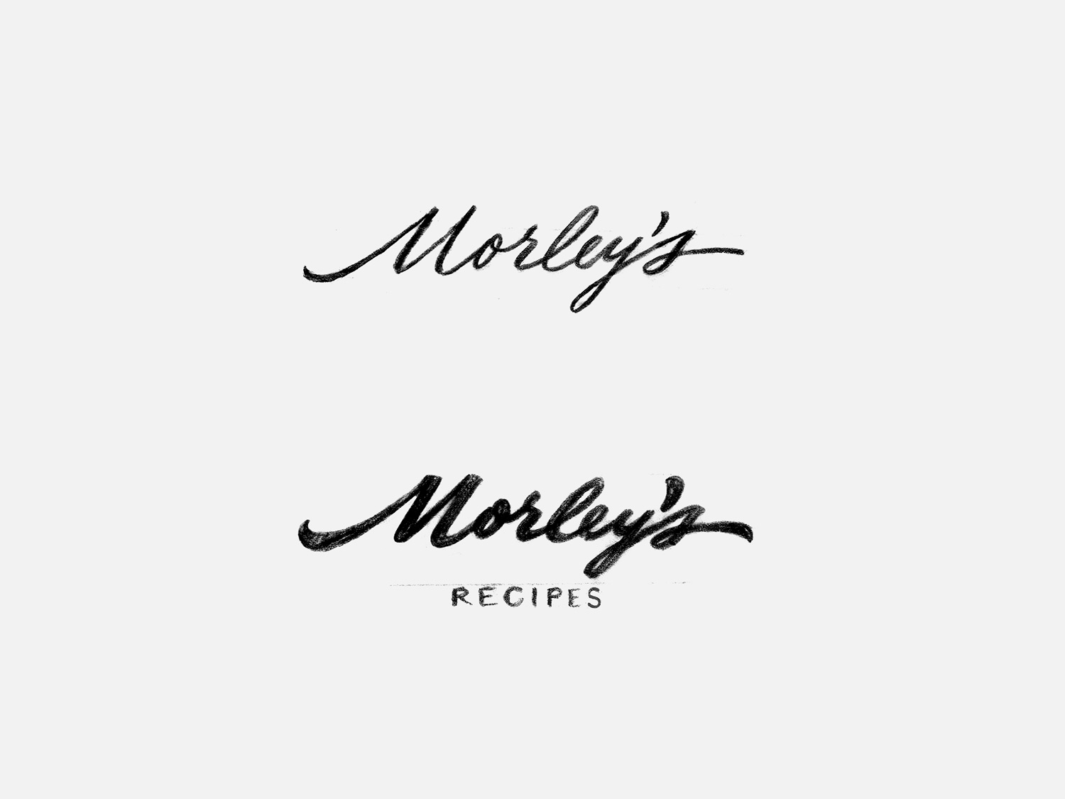
5. Classic Broad Pen – This direction is inspired by the broad pen script, weight, wide proportions, and the bold and dramatic entry stroke found in the Alva logotype. The wide M and disconnected r, balance the composition by splitting the logotype in two: Mor and lef’s. The final stroke of r mimics the M‘s entry stroke. The image below also highlights a possible design system the logo could exist within. Top: flat baseline. Middle: rising baseline (to create space for Recipes tagline). Bottom: Monogram in container.
A modern logo that makes use of the broad pen calligraphy is Walgreens.
Below, I’m experimenting with the number of swashes and loops to control complexity. Top: no swashes, loops on l and y. Middle: swashes on M and s, loops on l, y and s. Bottom: Elaborate M and s contain the maximum amount of loops and feature swashes.
6. Decorative – These experiment with adding in extra detail through swashes and disconnected forms. I think we could make the decorative direction work, but, the decoration will directly impact and limit the utility of the design. For that reason, I prefer the more simple directions over this one.
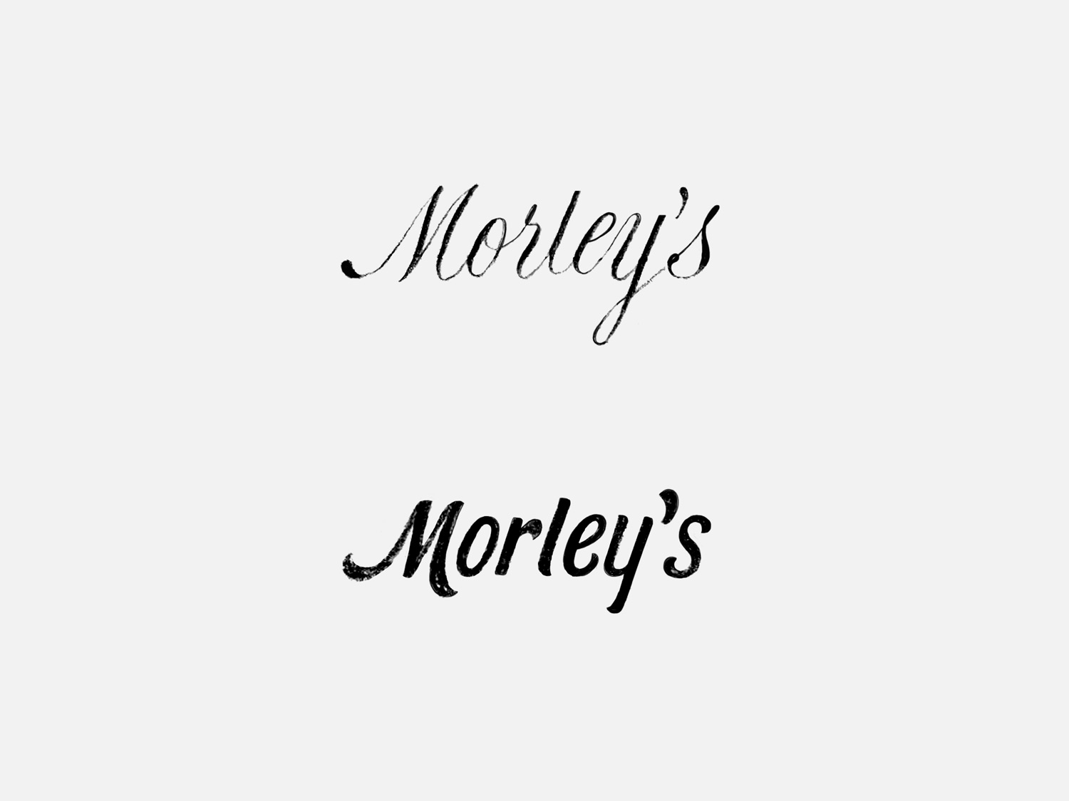
7. Signature – Last, but not least, is a casual signature. This design is nicely balanced and the dynamic nature relates to the strokes found in the Alva logotype. Top: lightweight. Bottom: bolder.
From this round, I think these directions are the strongest and have the most potential:
4 – brush influence
5 – classic broad pen
7 – signature
Directions four and five are strong solutions to the art direction: four is a slow-moving, friendly brush script (similar to Esquina, Baselime, and Static) and five is a bold formal script with character (similar to Alva and Campbell’s). Direction eight falls a bit outside the style parameters of the art direction but uniquely achieves the character through its rhythmic and dynamic lines.
I look forward to hearing your thoughts. Send them over whenever you’re ready and we’ll figure out the best way to move forward.