presentation two – refined directions
Client: Morley’s – Australia
After the first presentation, the broad pen (direction 5) was our favorite. To conduct a complete exploration of the broad-pen style, we compared the vertically compressed, contemporary example – from the previous round – to more classic options with a higher degree of formal and calligraphic influence.
Presentation Two
Below I’ve explored broad pen script directions based on direction 5 from the previous round. The exploration is limited to flat baseline compositions for efficiency. Once we decide on a stylistic direction, I’ll create the additional composition and monogram.
1. Vertically Compressed – Below (top) is option 5 from the last round, which combines calligraphic influence with some rule-breaking. The bottom logotype shows an altered variation that completely obeys pen logic, which only required altering the o and the e.

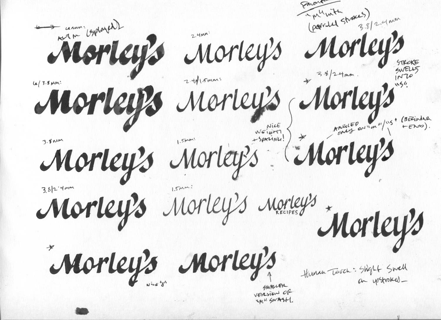
Since we’re basing the design on a broad pen script, the obvious next step was to write script with a broad pen. I explored weight options by using different nibs and writing at a consistent size.

2. Calligraphic – This first option is simple and maintains almost all of its natural calligraphic character – most noticeable in its angled stems. The only modifications are a flattened stroke on the M and stem of the r where they contact the baseline. This minimal alteration helps with readability, while maintaining a sort of ‘bare bones’ look.

These next four directions explore weight – with spacing that gets tighter as weight increases – and are more refined. All of the angled tips have been flattened and two nib sizes were used to create more delicate forms. The top stroke of the o/e and bottom stroke on the y use a smaller nib to avoid unnecessary heaviness. Also, swelling/dynamic upstrokes connect the o/r and the y/s – This was an attractive detail I stumbled on during the calligraphic exploration.
3a. Refined Calligraphy – Light

3b. Refined Calligraphy – Regular

3c. Refined Calligraphy – Bold *favorite weight

3d. Refined Calligraphy – Extra-bold

Next, using the structure of the broad pen script, I created a formal script variation. The flexible nib used for formal script removes the heavy weight at the bottom of the forms, creating a more graceful appearance.

The two weight options below are the same, aside from their o and r.
4. Formal – Regular

4b. Formal – Bold

From this round I think these two options are the strongest – The first (3c) is classic and elegant, while the second (1) is contemporary, fun, and friendly:
direction 3c – classic broad pen with refinements and subtle, elegant details
Pros:
- Proportions feel custom to the word

direction 1 – vertically compressed broad pen with some rule-breaking (5 from previous presentation)
Pros:
- Friendly (rounded corners), unorthodox M, fun/cute
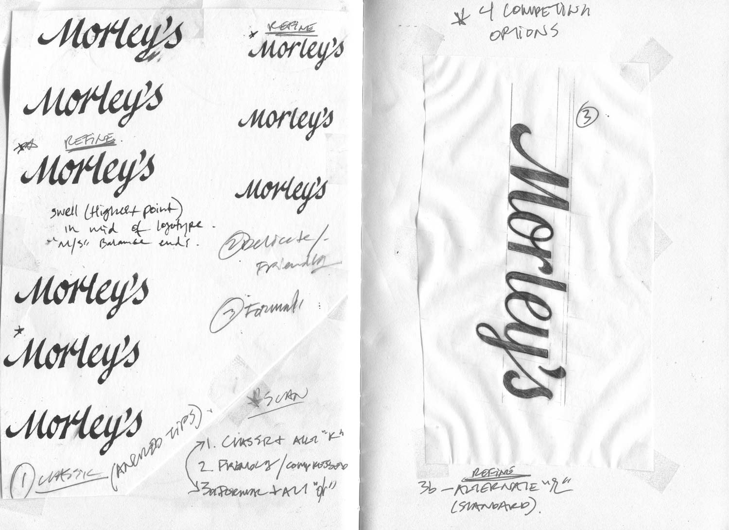
I’ve been alternating between feeling like the partially splayed M (from direction 1) works and that it’s clumsy. However, after a couple of bad dreams, I’ve decided that it looks good.
Below is a comparison of M options for direction 1: the top uses a partially splayed M (angled second stroke) and the bottom uses an M with parallel strokes that follow the slope of the lettering.

Finally, in an effort to merge the best of both directions, I created a hybrid that combines the classic look of 3c with the friendly, contemporary features of 1.
5. Hybrid – All of the corners have been rounded for a more friendly tone. Thin stroke weight has been increased for better legibility at small sizes. Descender on y has been shortened to vertically compress the logotype and make it more versatile.

Both directions would make a great logotype for Morley’s. If I were forced to choose one, I’d pick the 3c/5 pathway because it’s the most in line with the art direction and I love the subtle technical details that make the logotype feel considerate.
Let me know your thoughts whenever you’re ready and we’ll move on to digital traces.