Logotype & Branding
Clients: Greg & Lisa Mistell
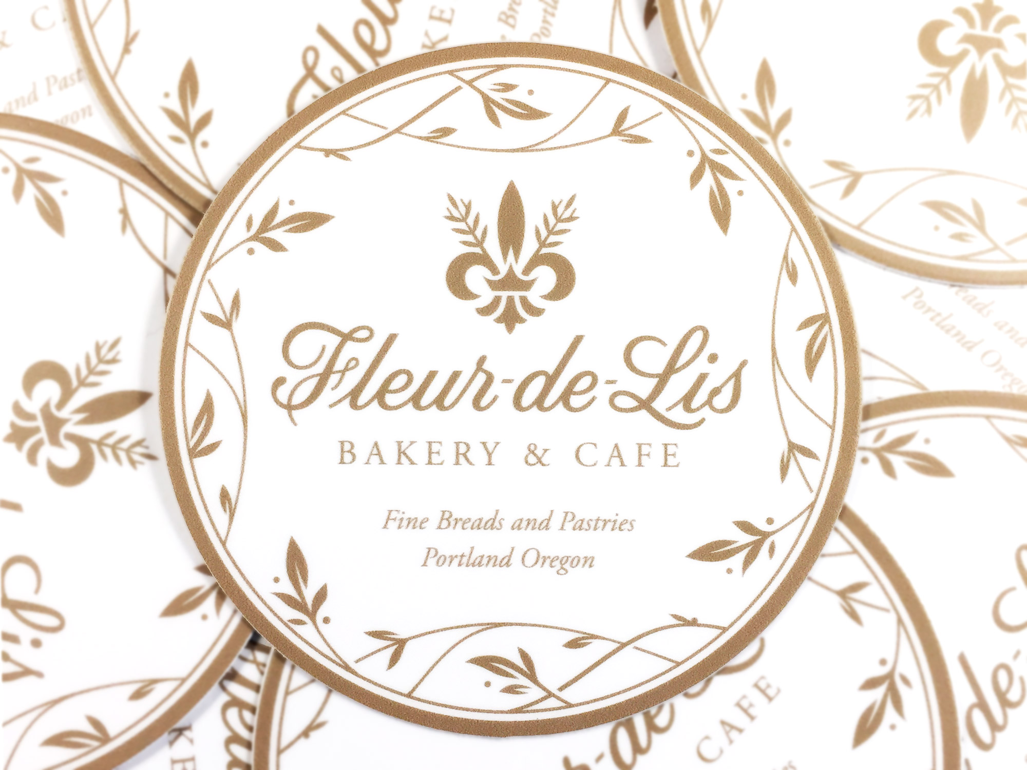
Greg Mistell is the expert baker and owner of Fleur-de-Lis, a French bakery specializing in artisan French breads and pastries. The bakery is a special part of the community of the Northeast Portland Community.
The original logo is set in University Roman, a quirky, romantic font designed by Mike Daines at Letraset Type Studio in 1983. University Roman combines the sturdiness of Roman proportions with elaborate swashes and abnormalities. The fun tone of the old logo did not communicate what Greg and Lisa wanted; that it’s a French Bakery honoring tradition, craft, and quality with fine breads and pastries.
Fig 1. Photo - Rough illustrations
Design Process
1. Rough Illustrations
After presenting strategic directions that were considerate of the bakery’s local competition, we decided on an Art Nouveau inspired, French script - a style that is ignored by other French bakeries in the area.
Fig 2. Scan - Rough illustrations
Fig 4. Scan - Rough illustrations
Fig 6. Scan - Rough illustrations
Fig 3. Scan - Rough illustrations
Fig 5. Scan - Roughillustrations
Fig 7. Scan - Rough illustrations
…
Fig 8. Photo - Revised Illustrations
Design Process
2. Revised Illustrations
I created three revised illustrations, all inspired by the dramatic, flowing curves of French scripts. All three of the illustrations were vectorized so that the options could be accurately compared.
Option A is an almost a monoline script, inspired by French neon signage. It has an elaborate capital F and flowing lowercase letters.
Fig 9. Option A - Revised illustration
Fig 10. Option A - Digital trace
Option B. is bold and dynamic, with angled tips and quick transitions from thick to to thin.
Fig 11. Option B - Revised illustration
Fig 12. Option B - Digital trace
Option C is a formal script, with capital letters that gracefully drop below the baseline.

Fig 13. Option C - Revised illustration
Fig 14. Option C - Digital trace
I marked Option C as the strongest direction because of the elegance and sophistication formal script conveys.
Fig 15. Guidelines and outline - Final Design
Design Process
3. Final Design
The formal script was selected and retraced. The slant of the F was increased, kerning was improved, and all of the curves were refined.
“Bakery & Cafe”, set in Adobe Garamond Pro, was added below the logotype. The tagline is tracked out so that it ends underneath the script L. The tagline cap-height is 1/2 of the the script x-height.
Fig 16. Outline - Final Design
Fig 17. Vector - Final Design
…
Fig 18. Rough icon illustrations
Design Process
4. Fleur-de-lis Icon
Lisa and Greg requested a fleur-de-lis icon that could be used in combination with the script logo. The fleur-de-lis is a common symbol and the challenge was figuring out a way to make form unique.
Fig 19. Scan - Fleur-de-lis icon with wheat and standard belt
Fig 20. Scan - Fleur-de-lis icon with wheat and a crown in place of the belt
Fig 21. Guidelines & Outline - Fleur-de-lis Icon
Fig 22. Outline - Fleur-de-lis Icon
Fig 23. Vector - Fleur-de-lis Icon
Fig 24. Hand-lettered Chalkboard Menu
Design Process
5. Chalkboard Menu
The next projects was a large, 4′ x 8′ chalkboard menu. The menu concept (below) included the logotype, menu items, and decorative floral elements.
Fig 25. Rough Concept - Chalkboard Menu
Fig 26. Design - Chalkboard Menu
Floral elements were commonly used in signage during the Art Nouveau period. The natural forms compliment the script logotype and give the branding a sense of beauty and authenticity.