
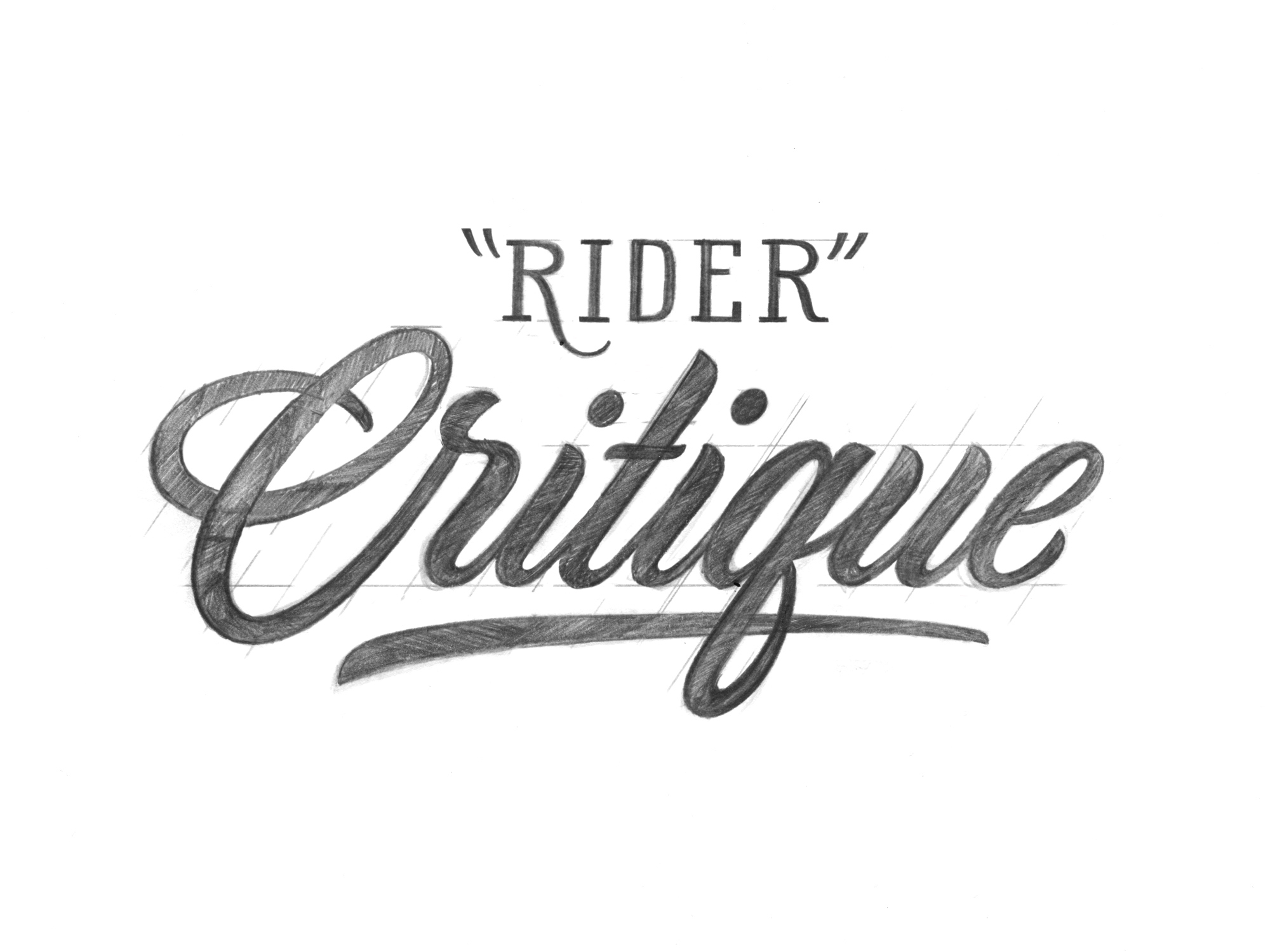
Rider Critique
Jonathan, a subscriber to the Piesletter, came up with an awesome idea for a blog post. He suggested sending me a piece of his own lettering to critique and revise. Jonathan is brave and I am honored to offer my thoughts to him. My hope, is for this critique to be helpful to everyone by offering insight to the thoughts and changes I have for this specific case. I’ll start by listing my positive thoughts and opportunities for imporvments on his original “Rider” illustration. Then, I’ll redraw the lettering, making it as good as I know how to, while retaining as much of the original style as possible.
Original “Rider”
Jonathan sent me two variations, a pencil illustration and a vector trace. The trace had been simplified significantly and lost some of the fun and balance contained within the illustration - for that reason, I’m ignoring the vector and will be focusing on revising the illustration.


My Opinion
Jonathan’s sketch is expressive, refined and considerate. The largest opportunities for improvement are equally distributing the negative space and sovling a few problems relating to overall balance. Specifically, incorporating the capital “R” in a way that feels natural.
Positive Thoughts
Smooth flowing lines.
Subtle areas of similarity (looping R, d, and r)
Great thick and thin consistency.
Smart flourish starting points (leg of R and ascender of d).
All characters stay consistent to the slope.
Opportunities for Improvement
a. The flourish extending from the R is creating too much negative space between the R and the i.
b. The bowl of the R feels too thick and the curve seems to be kinked at the top. Because the bowl is so large, the letter feels clumsy.
c. In general, thick strokes shouldn’t cross other thick strokes. This is happening in two places; where the flourish on the R overlaps itself and where the flourish extending from the d intersects the tittle of the i.
d. The flourish extending from the d feels stiff.
e. e appears to be too small, while the r feels extra large.
f. Thin tips feel too delicate in comparison to the rest of the lettering.
*Noticing flaws and figuring out how to improve lettering is fun and challenging. Being a tough but kind critique of your own work will lead to improvement.
Revised Illustration
Below is my revised illustration and a comparison to the original.
The Changes
My goal for the revised illustration was to stay as close to the original as possible. I wanted to provide solutions that addressed existing problems instead of simply making dramatic changes to the decisions made in Jonathan’s version.
Here’s what I did:
a. The flourish extending from the R is creating too much negative space between the R and the i.
Solution: To help the flourish extending from the leg of the R feel natural, the stroke begins by moving downwards at the angle of the slope. The curve starts further downwards, which allows the i to move left and occupy the negative space.
b. The bowl of the R feels too thick and the curve seems to be kinked at the top. Because the bowl is so large, the letter feels clumsy.
Solution: To help the R feel graceful, I reduced the size of the bowl and revised the curve.
c. In general, thick strokes shouldn’t cross other thick strokes. This is happening in two places; where the flourish on the R overlaps itself and where the flourish extending from the d intersects the tittle of the i.
Solution: R Flourish - I’ve modified the flourish extending from the leg of the R so that there are no thick/thick intersections. Instead of the flourish ending just underneath the R, I’ve added a final, forward moving stroke that helps to make the flourish feel finalized. d Flourish - I updated the flourish on the d so that it does not intersect with the i.
d. The flourish extending from the d feels stiff.
Solution: The flourish on the d became bigger and more curved - It fills the negative space between the tittle on the i and the r.
e. e appears to be too small, while the r feels extra large.
Solution: I’ve slightly increased the height and width of the e and did the opposite to the r.
f. Thin tips feel too delicate in comparison to the rest of the lettering.
Solution: Instead of using thin starting and ending strokes, they’ve become thicker to reflect the upstrokes used in the lowercase letters and the thick stroke of the R. This change helped unify the characters and flourishes.
Conclusion
It didn’t take long to revise Jonathan’s lettering because it was already strong. After a little bit of problem solving and thinking, I was able to resolve issues with the negative space and integrate a new capital R that added balance and consistency to his “Rider”. If you have any questions or just want to get in touch - send me an email at [email protected] - I hope this has been helpful and thank you Jonathan!
JP
Wow. As mentioned previously on an IG comment, I’ve been doing this a long time but always open to learn! This was crazy informative. Thank you for taking the time to critique! I can tell a lot of effort went into just laying it all out so your thought process was easy to understand. Jonathan’s style looks similar to what I see with a lot of tattoo scripts, where many are self-taught. Your version definitely feels more refined and in line with what I see for print, signage, etc. Of course the difference makes sense though, you’re both two different artists with different tastes and styles. Just my own humble opinion, but the inside leg of your “R” - my eye wants it to be thicker and not thin out and not curve in as it slopes down. That’s just my pref though. I learned plenty from much of your critique - thick not crossing thick, using x-height, techniques on balancing neg space, and even just how to critique your own initial sketches before moving fwd with them! Great piece here. Keep ’em going.
admin
JP!
You’re welcome! It’s awesome to hear that my content is helpful. I completely agree with you. Critique ultimately comes down to personal preference, experience and style. After doing one, It seems almost impossible to eliminate personal bias and taste. The thinness of the leg of the “R” is bothering me now that you point that out - It could definitely be thicker!
Thank you and I will!
Jay
This is simply stunning! The thought and reasoning that went into the revisions is incredible and insightful. Hope to see more of these.
admin
Thank you Jay!! I’m so happy it was helpful. There’s more to come, my goal is to post 2-3 times per month.