
Finding Nice Flourishes
Flourishes are decorative elements that can extend from letters or stand on their own. By developing an understanding what to focus on, your options, and learning to revise with patience, they become, in my opinion, the best part of lettering.
Flourishes
Flourishes offer freedom, which makes them intimidating and easy to misuse. Studying examples and building up an understanding of what makes these successful, makes creating flourishes easier. The possibilities are endless, but there are some guidelines.
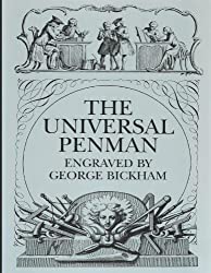
by George Bickham
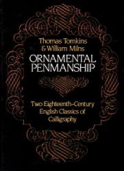
by Thomas Tomkins
Recommended Reading
These are the two books that I’ve learned the most from. Both are compilations of the best flourishes, beautiful calligraphic alphabets, messages and other decorative elements. Having great references is a necessary step in learning to flourish. Both of the books visually communicate ‘the rules’ of flourishing, which can be infinitely expanded on.
Things to Focus On
Making something beautiful with a very limited amount of restriction, requires a high attention to detail and a willingness to consider a wide range of factors. These are some of the factors I’ve learned to consider in my process:
Cohesion - Flourishes should be used in a way that is complimentary and relatable to the letters you are working with. Doing this unifies your letters and flourishes.
Balance - Balance can be created in several ways; through attention to size, complexity and style. It’s important that your flourishes add to the balance of your lettering and never make up all of the balance themselves.
Expressiveness - In Tommy Thompson’s book Script Lettering for Artists he explains, “The student must not think he/she can invent anything. No one has, since the wheel, but we’ve all made a lot of discoveries.” There is a system to flourishing, but just like lettering, the system can be applied in a way that is personal, fresh and new, while still using the logic and structure of the great examples of the past.
Intentional Decisions - Flourishes can be made to feel considerate through intentional interactions with letters and other flourishes. Making ‘considerate flourishes’ is difficult and requires thought and sometimes a lot of revision.
Options
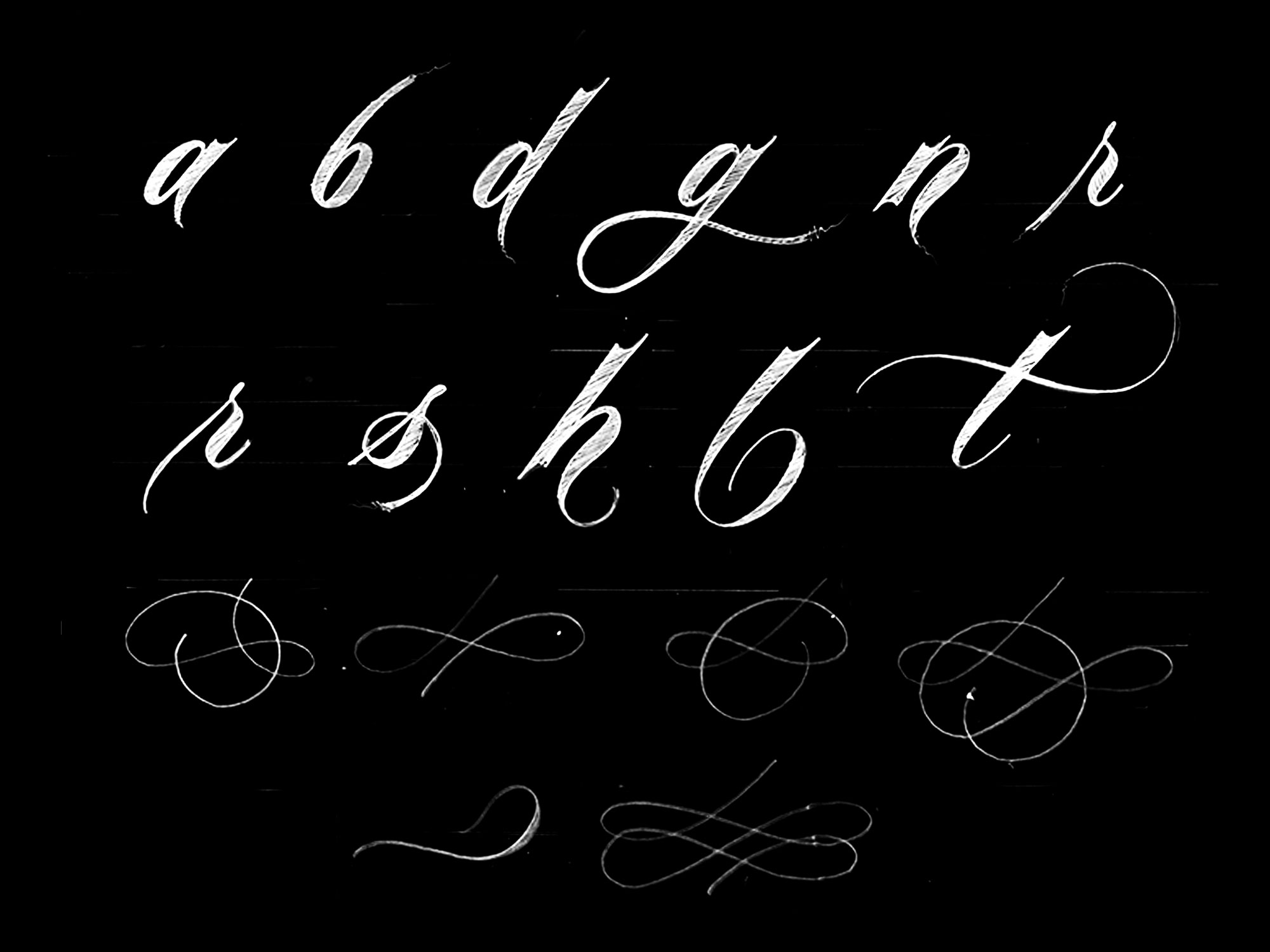
Flourishes can start from a letter or exist as a disconnected element. I use disconnected flourishes as my fall back option when I can’t find a practical way to have a flourish extend from a letter. .
Patience
There’s never a single best solution, so having patience and weighing your options is important. Suffering through the process of finding the solution that you think is best causes growth. With repetition, the process becomes faster, more natural and less frustrating.
MY PROCESS
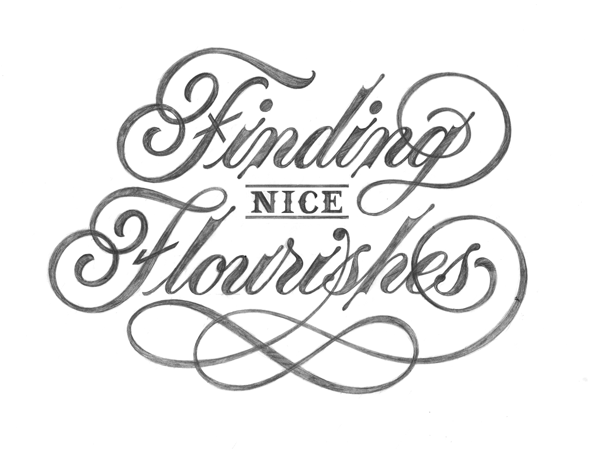
This is the process I used to find the flourishes for my title illustration “Finding Nice Flourishes. I’ve divided the process into three steps; Small Thumbnails, Finding what Works, and Revising what’s Working.
Small Thumbnails
I start by sketching out the phrase and experimenting with adding flourishes in different places. During this process, I pay attention to the natural negative space created by the plain letters and the composition. This helps me decide on where to place my flourishes.
Natural Negative Space - Natural negative space is a term I’ve made up that refers to the negative space created by simply writing out the phrase using a certain composition. In first few sketches, I was using two identical F‘s. The second F was taking up negative space in the middle of the composition. This was a problem because I wanted to include “NICE” in that space. To solve the problem, I used a different style F for “Flourishes”, which opened up negative space in the middle for “NICE”. Making adjustment to the style of letters or your composition can free up and change the natural negative space to provide better flourishing opportunities.
Placing Flourishes - When deciding on where to place flourishes, it’s important to embrace the opportunities provided by your composition and areas of natural negative space. I start by figuring out what spaces I want the flourishes to occupy and then experiment with different starting points and styles.
Placement
I start by focusing on which spaces should be occupied by flourishes, then I figure out how to occupy them. I choose to occupy negative spaces that would balance with the lettering. This helps to make flourishes feel intentional.
Restrictions & Decisions - With “NICE” occupying the middle space, there weren’t too many options for adding flourishes to “Finding” without over-complicating the middle. This influenced my decision to add a flourish at the end of the word (Extending from the g). I had more freedom with the word “Flourishes”, which allowed me to use a more complex flourish that reflected the style of the one extending from the g. They both feel intentional because they are occupying negative space that contributes to balancing the composition and they reflect each other stylistically.
Finding what Works
Above, is my revised sketch based on the features I liked best from the small thumbnail sketches. Here’s what’s working in this sketch:
Flourish Placement - With two flourishes, I was able to occupy targeted areas of negative space in a way that feels natural.
Style - The flourishes share a similar ending loop that cuts through the final two letters.
Similarity - The height of the flourish on the bottom relates well to the height and airiness of the middle space where “NICE” is sitting.
Simplicity - Some of the small thumbnail sketches used more flourishes. The direction I chose only uses two. They are slightly complex, but show restraint and don’t interfere with the message by being too busy.
Breaking Rules
Flourishes don’t have to follow the standard rule of thick downstrokes and thin upstrokes. This gives you an opportunity to create balance and structure by applying weight to flourishes in a creative way.
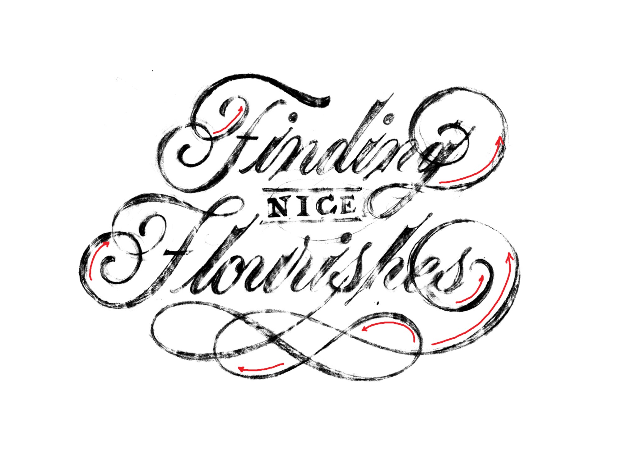
My Strategy - The image above shows all of the places where I’m breaking the rules (Not using thin upstrokes / thick downstrokes). I’m doing this to create positive and negative space balance and to add structure and flow to the flourishes and letterforms.
Revising what’s Working
In the final step, I slowly redraw the lettering. You can learn about my script lettering illustration process here. Taking extra time during this step helps you realize problems and find solutions to them.
Changes I Made:
- Instead of having the bottom flourish start from inside the s I attached it to the tittle of the i. I thought this was a more interesting and creative starting point.
- Instead of using standard crossbars on the capital Fs, I used an x and check-mark, which was a slightly corny and fun way to relate to the process of finding flourishes by abandoning and selecting certain elements.
Alternate Flourishes - I didn’t make any structural changes to the flourishes in this illustration. Sometimes I’ll revise a flourish during this stage if it feels off. Getting feedback from others, reference examples and taking a break are all good ways to find solutions to something that’s bothering you.
Improving the Details - My ultimate goal during this stage is to make sure the line widths of the flourishes reflect the line weight of the letters and that all of the elements in the composition are working together as a whole.
Conclusion
I am not a master and finding nice flourishes is a challenging process. It takes trial and error, thought and persistence. Making something that works is a great feeling and well worth the frustration. By building an understanding of what good flourishes look like, practicing and trying hard, you can learn to make nice flourishes and enjoy doing it.
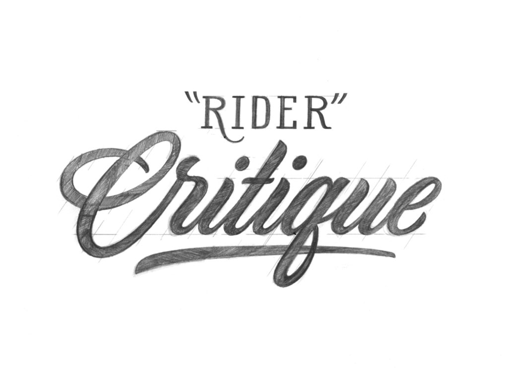
Rider Critique
Read More

Script Lettering Illustration Process
Read More

Tracing with the pen tool using Adobe Illustrator
Read More
No Comments