
Hand lettering is the process of artfully drawing letters. This post is an introduction to the different categories of lettering, the basic styles, using guidelines, my illustration process, supplies and practice tips.
Categories
There are three different categories; Lettering, Calligraphy and Typography. These three categories have similarities and unique differences understanding the methods, similarities and differences between each category is important to drawing good letters.
Here’s a simple explanation:
-
Calligraphy - Written letters made using various writing tools. The tool dictates and limits the style of lines calligraphers write.
-
Lettering - Illustrated letters, constructed using multiple strokes.
-
Typography - The art of arranging type to communicate, this includes selecting typefaces, sizing, line height, lettering spacing, modifications, and strategic decisions based on design objectives.
-
Type Design - The process of creating and designing type; a set of letters, numbers, and symbols that use spacing relationships defined by the designer.
-
How They’re Different
There is a distinct separation between lettering and calligraphy - process. In lettering, everything is illustrated using multiple strokes, in calligraphy, letters are written using and assortment of single strokes. Lettering and calligraphy can look very similar, but the process separates them.
Specifically, Typography is the art of arranging pre-designed type to communicate, but in general, typography is consideration for the technical aspects of lettering. The adapted general definition encompasses all things lettering; hand lettering, calligraphy, digital lettering, graffiti, sign-painting, sculpture, etc…
Examples
To make things easier to understand, here are some examples;
Calligraphy
I don’t consider myself a calligrapher, but I often use calligraphy before starting on a lettering illustration.
With a brush pen, I write out the word(s) I’m working on, using single strokes (Calligraphy). I apply heavy pressure to downstrokes and light pressure to upstrokes. Doing this helps me quickly visualize the word before starting on the illustration (lettering).
Lettering
After I’ve written out the calligraphy, using a pencil I create an illustrated version (Lettering) based on the original. During the process, I sketch out the letters and make slight adjustments to the spacing, thickness, and style - this lettering overlaps into typography because I’m arranging pre-designed letters from the calligraphy version and making slight technical improvements.
Typography
Typography involves working with letters of a complete system, which includes using a font (typography) or designing a font (type-design). In this example, I’ve modified Futura Extra Bold using Adobe Illustrator. Previous to the Digital Age, letter of a typeface existed on individual metal or wooden blocks and had to be set prior to printing. This is where the term typesetting comes from. ‘Typeclicking’ is now a more appropriate term.
Below is an image of the typeface without modifications:
Typography Continued
Typography is the art of arranging type to communicate in a legible and appealing manner - this happens while manipulating a word that uses a pre-designed typeface, while formatting a body of type with headers and content (like what you’re reading right now), and while designing a complete typeface (Type-design).
I’d argue that typography overlaps with lettering and calligraphy because they share similar technical concerns relating to size, spacing and style. They are different because typography / type / type-design deal with full systems of letters, numbers, symbols, and spacing relationships.
Styles
Letters can be divided into three different styles; Serif, Sans-serif, and Script.
Serif
Serif letters have pieces attached to the ends of strokes that help to create structure. They also improve readability by leading your eye from one letter to the next.
Sans-serif
Sans-serif, ‘Sans’ or ‘Gothic’ letters do not have features extending at the ends of strokes. Typically, they are more modern and less readable at small sizes than serif letters.
Script
Script lettering comes from our handwriting and conveys a sense of speed and movement. Usually, script letters are connected.
Using Guidelines
Structure is an important part of lettering and guidelines are a helpful tool used to add structure to lettering.
What are Guidelines?
Guidelines are simply lines that help add uniformity, consistency and balance to a piece of lettering. They can be straight, curved lines or shapes - like lettering, you have the freedom to manipulate and modify them however you want. I have another post, Using Lines and Shapes to Guide Your Lettering, that covers guidelines in more detail. Guidelines should be used to assist you and contribute to improving and achieving the stylistic goals of a design.
Lettering Process
An advantage of illustration is that you can work in stages, in my lettering process, I use three; concept sketches, revised illustration, final illustration. Breaking up the process gives you an opportunity have a specific focus during each stage.
An Important Thought
Finding a process that you love and works for you takes time. These three stages make sense to me, but you do not have to follow them. Your process will change and evolve over time and it’s important to remember that there are no rules.
Concept Sketches
I start most of my lettering projects with calligraphy - Using a soft-lead pencil or brush pen, I simply write out the word or words that I’m going to be lettering on tracing paper. For this example I chose the word Stages. Writing out the word(s) gives you sense of how the letters interact, an overall sense of balance, and a quick look at possible styling options.
Revised Illustration
Once I feel comfortable with a concept sketch (my concept sketches have become increasingly sloppy over time), I move to a revised illustration using cheap print paper. During this process, I slow down and pay attention to making technical improvements to kerning (the space between letters), the weight of the letters and the overall style of the word or composition.
Final Illustration
I usually use smooth bristol paper for my final illustrations, but print paper is fine. During this stage, I go slowly and focus on perfecting the straightness / smoothness of lines. I look for ways to fix problems that exist in the revised illustration - To fix the awkward relationship between the the S to the t, I added a connection (ligature). I also use the final illustration to add in additional detail and make updates to the style, to demonstrate, I updated some of the letters to have strokes that ‘pop into / out of’ the following letter or itself.
I take my time during the final illustration. It’s the only step where I draw neat guidelines and use an eraser. Going slowly during this stage helps me discover ways to make improvements.
As I progress through each stage, my level of care and attention to detail increases. Same with my tidiness - One of the main reasons why I love using multiple stages, is that it gives you an opportunity to be messy and careless in the beginning, which makes it easier to get started.
Supplies
You only need a couple of supplies to get started; something to draw with, something to draw on, and a straight edge.
The Necessities
A pencil, eraser, stack of paper and ruler is all that you need. Here’s what I recommend:
-
Pencil - My favorite pencil is a lead holder, this is a pencil shaped tool that holds a stick of lead. It’s great for rough sketches and final illustrations - lead holders require a special orbital sharpener.
-
Eraser - Any kind of eraser will be fine, I prefer a stick eraser that can be held like a pencil. This turns erasing into drawing and keeps your hand from cramping up.
-
Paper - I do most of my drawing on laser print paper. Pencils slide nicely on it and it’s super cheap.
-
Ruler - I’ve discovered that a sewing ruler is one of the greatest tools for lettering because it’s clear and has multiple openings - this makes drawing guidelines quick and easy.
Here are links to the products mentioned above, if you purchase items using these links I earn a commission from Amazon.
Extra Things
Here are a few additional items that add slight improvements to the lettering process:
-
Dull Soft-Lead Pencil - By applying heavy pressure to downstrokes and light pressure to upstrokes a dull soft-lead pencil can make thick and thin lines. They’re a great tool for concept sketches.
-
Tracing Paper - When I’m working on rough concepts, I use tracing paper to make reiterated ideas quick.
-
Mechanical Pencil - I use a mechanical pencil for my final illustrations. There are a couple advantages; 1) you don’t have to sharpen it, which saves time. 2) Mechanical pencils make consistent lines, while pencils dull and becomes thicker.
-
Smooth Bristol Paper - I use smooth bristol paper for final illustrations. It’s more durable than print paper and it’s nicer to draw on.
Practicing
Lettering is simple, the more you practice, the better you get. Here are some thoughts and tips about practicing:
Tips
-
Love It - Lettering is fun, so it makes sense to have fun while you’re doing it. After you’ve practiced consistently for a couple of months, look back on how far you’ve come and feel great.
-
Be Consistent - I find that when I take breaks (more than a couple of days at a time), it takes longer to get back into the rhythm. Working on something every day makes the process fluid.
-
Don’t Compare - Comparing your work to others is a paralyzing trap. The ultimate defense against this is to love the process of lettering and understand that’s why you do it - This eliminates the need/desire to be at a skill that you’re not, because how good you are doesn’t matter. This strategy allows you to get back to work and keep moving forward.
-
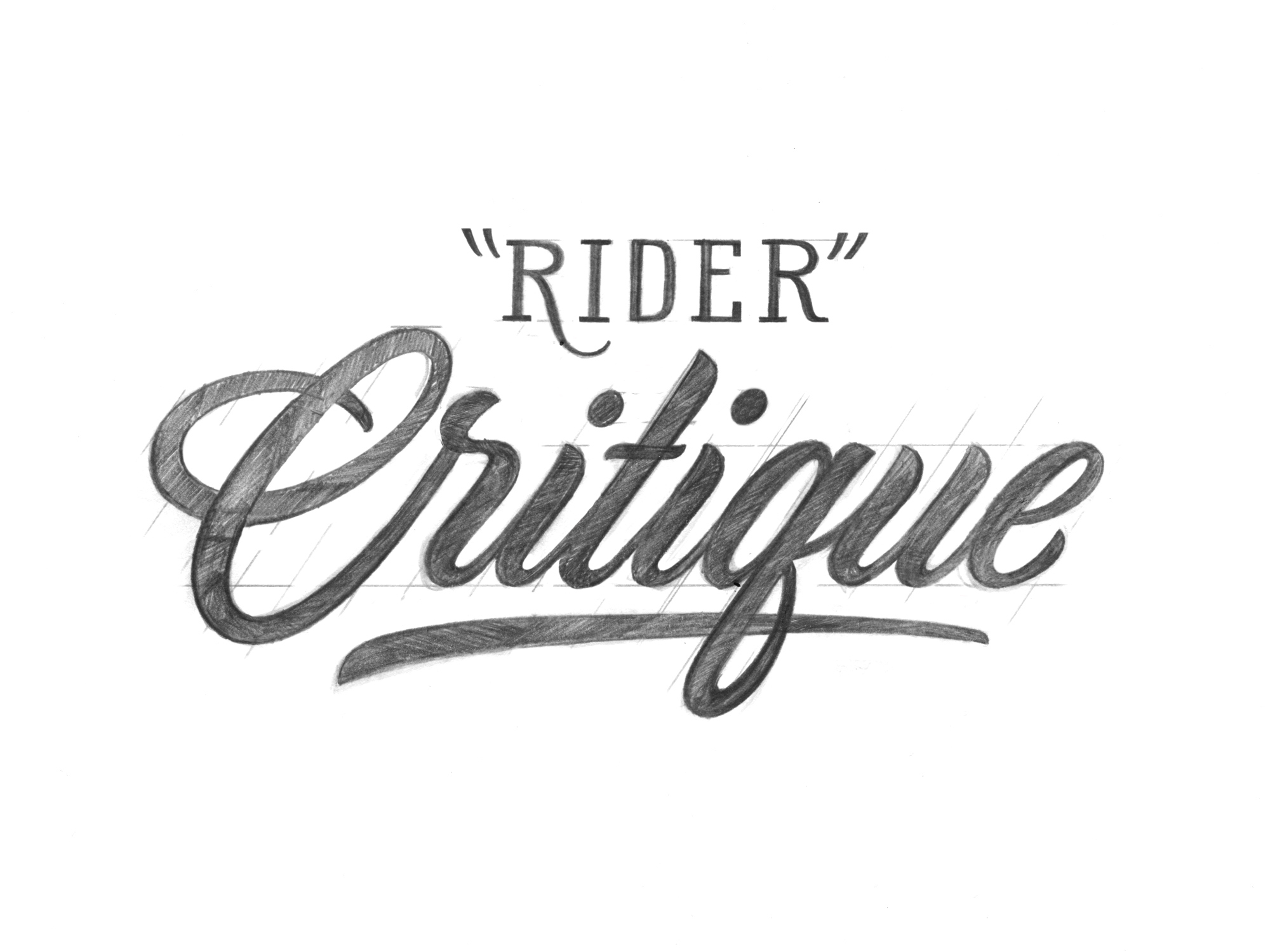
Happily Accept Criticism - This can be personal or external criticism. Any idea that challenges a decision you’ve made is valuable. If you can defend the criticism while being realistic, great, if not, that’s great too because it forces you to find a way to improve and adjust. Every time you make something criticize it, notice your mistakes and work towards improving them next time.
-
Learn - Learning makes you a better critic of your own work. Learning can be done by reading and by looking and thinking. I’ll do a post covering my favorite lettering books in the future. An example of looking and thinking would be finding amazing historic and current examples of lettering, noticing differences between your work and the example, figuring out and understand what they are, and finally letting what you’ve learned sink into your work.
-
Notice Flaws - Do your best to notice flaws, adjust them as best you can and then notice more. In my opinion, this is the most important skill in creating beautiful lettering. Examples would be: letters that look funny, curves that don’t feel smooth, and letters that aren’t spaced nicely (kerning). Noticing flaws raises your attention to detail and will lead to improvement.
Conclusion
Lettering is an art. A predefined set of symbols are your platform and you can expand upon it in any way you’d like. If you’re new to lettering, I hope this post has been helpful, and if you’ve been lettering for awhile, I’m happy you made it this far and I hope you enjoyed it.


despite having been practicing lettering for several months, this helped me a lot to motivate me
Sorry if my English is bad I speak Spanish
That’s awesome to hear Alexis!! I’m happy that it was helpful and inspirational. You’re English is great, I wish my Spanish was as good as your English is.
You rock,
Stephen